Showing posts with label Color Consultant. Show all posts

Monday, December 23, 2013

Merry Christmas and a Happy 2014!!!!

With the best wishes of love, peace, health and prosperity for everybody from

Isabel de Yzaguirre,
La Colorista.


Sunday, January 13, 2013

Good networking practices in LinkedIn.


Dear readers of mine:

today I want to comment something that happend to me recently in LinkedIn. I write blog posts when I can and try always the content to be of interest. Then I share it in my groups trying to develop a good conversation. Lately I wrote two posts publishing interesting Houzz tours with my comment, and posted in my groups. I've always had a positive groupal behaviour, I think: I've been respectful and have tried to make my contribution to others...


Isabel de Yzaguirre, IdY.
La Colorista.

It happens that I publish my content from Bloggers directly to LinkedIn, and I've stated that slide presentations don't show when linked. Instead of that, my photo and Bloggers profile was shown, though I linked to the post. I usually had been posting my content in Color related groups, but since I belong to many Interior Design groups, I thought my posts on Color could be of  interest. And I must state that I had a great and very welcoming response, and a great contribution of fellow Interior Designers on developing conversations on Color. If you scroll down in my blog, you will see that I wrote two of this posts with Houzz content lately. I had a great feedback in general, but had a bad surprise as well. Having had a comment in a group, and wanting to thank it, I came to discover that I had been blocked there! I was shocked, I admit!!!

Then I discovered that my latest posts showed my photo and Bloggers' profile instead of the post content. Could this be the cause why someone flagged my contribution? Could be, of course. But it happened only two times before I realized my mistake, and nobody warned me through any kind of comment or private message, which is the procedure I think should have been followed. Simply put, someone flagged me once and I was blocked! I wrote to the group owner to explain myself and ask him his reconsidering my  being blocked in this Interiors group, but I haven't had any response. I understand group owners are busy, and I understand that spamming is annoying. But I didn't mean to spam the group at all. In fact there were many people interested in what I posted and that engaged in a very interesting conversation, where everybody shared his/her thoughts on the subject. And I wasn't given a single chance when flagged by someone. 

So here go my thoughts: I revised what could have happened and detected the possible cause of the blocking. And the lesson I've learnt: if you post a link from your blog, be careful to do it with an interesting introducing question on the subject, that can begin an interesting conversation. Be careful not to be too showy of yourself or not to seem to be too showy. Even if you think you are behaving correctly, make sure nobody can think on the contrary, for we never know enough about others' level of sensibility.

For me it has been a very unpleasant experience, since I've always tried to be kind to everybody and never post negative criticism on  other people works, posts and blogs. But this happened to me and I've tried to learn from this experience. I'd love to know your thoughts on this question and I hope that this can help others as well. Let me finish with  my best wishes for a wonderful Year 2013 to everybody, which I didn't before for personal reasons.

See you soon with more posts on Color and Interior Design!

Isabel de Yzaguirre,
La  Colorista.

Sunday, December 30, 2012

25 most bookmarked Colourful Homes in Houzz 2012!

I've found this collection of 25 most bookmarked Colourful Homes 2012 in Houzz and really enjoyed the collection. Of course I love some more than others, but all of them are a good example of how color can help to make you feel better in your home. Which ones do you prefer?

As for 2013, I guess blues and greens are going to be on spot...

Thursday, December 6, 2012

Emerald, 17-5641, Pantone's color of the Year 2013!!!

And in the end, the new baby is born!!!

We welcome PANTONE 17-5641 Emerald as the New color of the Year 2013. Remember what I said in a previous post, in October the 14 th.? Go to the end of it.I made my bet for Emerald or Grayed Jade. And I nailed it!!!


Before relating  to the official release, my own thoughts:

this election makes a lot of sense to me. This color is very close to that in the Tangerine and Orange tree leaves, and it marries well with previous Tangerine Tango, being it's complement. We go from the Red-Orange Family to the Blue-Green one. So, ladies having bought some Tangerine Tango clothings, don't worry at all! You can complement them with a beautiful Emerald item...


What does the Pantone's team say about this colour? An image is worth a thousand words:


Associated to the gemstone that bears this name, it's a sophisticated and luxurious color. Since antiquity, it has been the color of beauty of new life in many cultures and religions.


As the executive director of the Pantone Color Institute® Leatrice Eiseman says:

“Green is the most abundant hue in nature – the human eye sees more green than any other color in the spectrum.” 

"Symbolically, Emerald brings a sense of clarity, renewal and rejuvenation, which is so important in today’s complex world. This powerful and universally appealing tone translates easily to both fashion and home interiors.”

Since this is my main interest, how can we introduce this hue in Home Interiors?

Add some accents, accessories and paint in Emerald and you will rejuvenate your Home. This jewel-like hue will add a luxurious sense to any room in your home, and it will shine as an accent wall in your living-room.


Source: Thom Filicia, Via Houzz, Via Isabel in Pinterest


Source: Rikki Snyder © 2012 Houzz,  Via Isabel in Pinterest

Font

Bedding, pillows, bath towels and accessories in Emerald will  help you in creating a relaxed, soothing and energizing atpmosphere at the same time.


Via Isabel in Pinterest, from Houzz

"Lively. Radiant. Lush… A color of elegance and beauty                      
                        that enhances our sense of well-being, balance and harmony."


Welcome be this jewelled, luxurious and healthy hue!
Long Life to Emerald Green!!!

Isabel de Yzaguirre,
La Colorista.

Sunday, October 14, 2012

Which will be next Colour of the Year 2013?


The time has come when we begin to wonder about this question. And I have come back to think about that after reading Azkonobel’s Color Future’s 2013 and after finding an interesting post by Laura Bielecki reporting the predictions made by the prestigious trend forecaster Lidewij Edelkoort in a meeting in Design Days Dubai 2012.


While we don’t know about Pantone’s choice yet, AzkoNobel and its division Dulux have chosen Indigo as their colour of the Year 2013.


What qualities explain this election?

As they say, Indigo is associated with wisdom and honesty, and gives a sense of tranquility which is very restful. It’s a benevolent colour that has the trustworthy nature and elegance of blue at the same time.


 Font

Indigo is a rich and deep colour that, being scarcely accessible in our natural world, instills a sense of wonder and magic in us.


Within a colour palette, indigo is versatile and pairs well with brights of a similar saturation level, citrus, warmer neutrals and other blues, purples and greens.


Curiously, in her seminar in Dubai, Lidewij Edelkoort presented yellow as being the new pink in Interior Design, and that makes sense with its being the complement to the purple family. According to her predictions, yellow will make for vibrant and stimulating colour palettes, fabrics and fittings. And it will come with more staying power than Tangerine Tango, it seems.


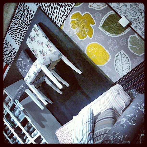
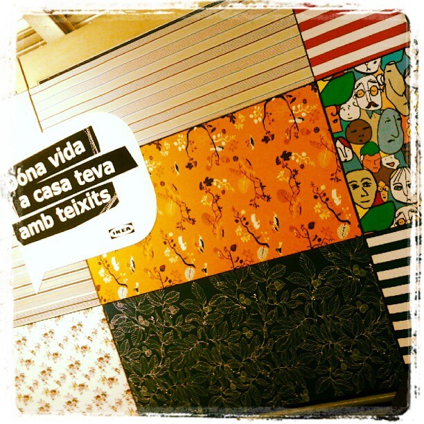
I can say that I have seen that trend for myself in Ikea Barcelona Autumn/Winter Textiles display yet. And yellow adds a vivid and hot accent that makes fabrics look wonderful!


And what about Pantone’s Color of the Year 2013?

Last year they published it in early December, so we won’t know for a while. But there are two colours that I have seen in their Fashion Reports and that have caught my attention. They are Emerald Green and Seafoam, or Grayed Jade, as they call it. If they are not the colour of the Year, I bet something they will be a hit. And they both combine well with blues, purples and yellow families.


While every Corporation publishes its Colour and Trends Forecasting, time will say which of them meet the costumer’s favor. But let me say that, from what I see when comparing Trends Forecasts, all of them are related and interconnected, with special accents to their market.

For me, an exciting Season of the Year has begun, that of Colour Future’s guessing!

Isabel de Yzaguirre,
La Colorista.

Friday, February 3, 2012

Purple

Purple is a trendy color. It was chosen by CMG as Color of the Year 2012 and they named it Boyz'n'Berry:


Recently, Color Strategist Lori Sawaya produced this Colorgraphic that shows Purple's meanings:


Color Marketing Group think that "From office to home, from youth market to luxury goods, purple has as much masculine as feminine appeal.  Confident women and real men wear purple!" I love this turn of purple towards men!

Lori Sawaya has developed a palette of plums and purples in an Infographic that explains how and where you can use purple. If you want it, you can download it in PDF format here:


We are currently seeing purple and its related hues featured in many products, as in this sofa from Anéguil:

Or in this jardinière from the same brand:


Also in this glass washbasin from Courant Verre:


And in this beautiful carpet by Heuga.


As for Colour Palettes combining purple, I love this one created and shared by Kate Smith:


Purple was showcased by CAUS as early as in their 2011-12 Trends Report in GLOBAL ARTISAN TREND. Don't you be reminded of Pantone's Tangerine Tango by some of the hues in this palette?


I love how Jane Hall used purple in this interior:


And how JPM did combine it here:

JPM Design, via Pinterest.

We could go on and on... and it would take long. I only expect you love purple as much as I do,be it trendy or not!
And if you need Color Help, please contact me.
Yours in Color!

Isabel de Yzaguirre,
La Colorista.

Friday, January 20, 2012

Celebration!

I'm feeling so happy, I have something to celebrate! This blog devoted to Colour has reached 10.000 visits this week!


I want to celebrate with friends and visitors. Which could be the best way to? A colourful one, maybe?


Let's send colourful inviting cards...


... dress up in a colourful way!

Jessica Colaluca via Pinterest


Arrange a warm welcoming ambient...


...prepare food with the colours of the rainbow...


...serve colourful drinks...


... have colourful candies...


And let's have specially a sweet Coloured Anniversary Cake!
Which of these do you like best?


All of them wear colours I love. Which are your favorite colours?
If you want to, I can help you to choose Colour, just contact me!