Showing posts with label meanings. Show all posts

Wednesday, November 27, 2013

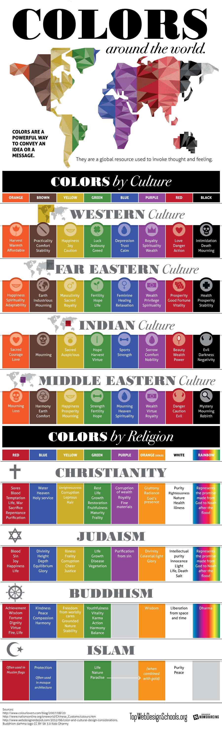
Colours by Culture, an infographic.

Shared today in Google+ by Lori Sawaya, from The Land of Color, I picked this interesting infographic which showcases prefectly how colours have different meanings according to different cultures. This should be carefully taken in account for designers and corporations when creating new products, specially when dealing with clients that come from a culture other than ours. The image comes from Top Web Design Schools. Enjoy! 


Colors by Culture

Isabel de Yzaguirre,
La Colorista

Thursday, December 6, 2012

Emerald, 17-5641, Pantone's color of the Year 2013!!!

And in the end, the new baby is born!!!

We welcome PANTONE 17-5641 Emerald as the New color of the Year 2013. Remember what I said in a previous post, in October the 14 th.? Go to the end of it.I made my bet for Emerald or Grayed Jade. And I nailed it!!!


Before relating  to the official release, my own thoughts:

this election makes a lot of sense to me. This color is very close to that in the Tangerine and Orange tree leaves, and it marries well with previous Tangerine Tango, being it's complement. We go from the Red-Orange Family to the Blue-Green one. So, ladies having bought some Tangerine Tango clothings, don't worry at all! You can complement them with a beautiful Emerald item...


What does the Pantone's team say about this colour? An image is worth a thousand words:


Associated to the gemstone that bears this name, it's a sophisticated and luxurious color. Since antiquity, it has been the color of beauty of new life in many cultures and religions.


As the executive director of the Pantone Color Institute® Leatrice Eiseman says:

“Green is the most abundant hue in nature – the human eye sees more green than any other color in the spectrum.” 

"Symbolically, Emerald brings a sense of clarity, renewal and rejuvenation, which is so important in today’s complex world. This powerful and universally appealing tone translates easily to both fashion and home interiors.”

Since this is my main interest, how can we introduce this hue in Home Interiors?

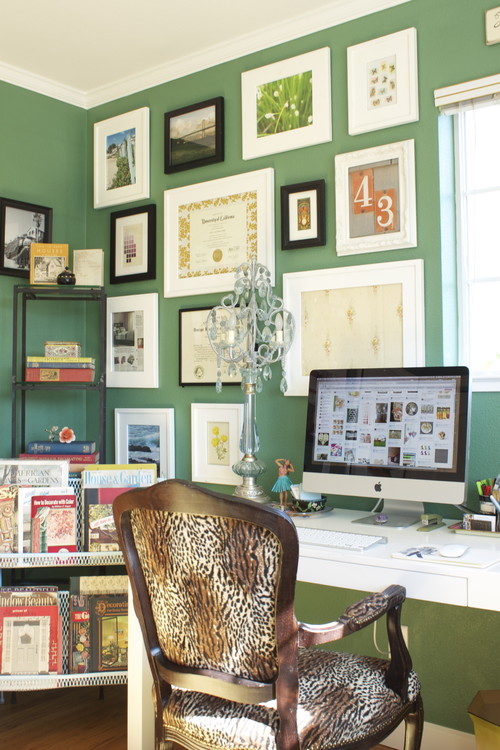
Add some accents, accessories and paint in Emerald and you will rejuvenate your Home. This jewel-like hue will add a luxurious sense to any room in your home, and it will shine as an accent wall in your living-room.


Source: Thom Filicia, Via Houzz, Via Isabel in Pinterest


Source: Rikki Snyder © 2012 Houzz,  Via Isabel in Pinterest

Font

Bedding, pillows, bath towels and accessories in Emerald will  help you in creating a relaxed, soothing and energizing atpmosphere at the same time.


Via Isabel in Pinterest, from Houzz

"Lively. Radiant. Lush… A color of elegance and beauty                      
                        that enhances our sense of well-being, balance and harmony."


Welcome be this jewelled, luxurious and healthy hue!
Long Life to Emerald Green!!!

Isabel de Yzaguirre,
La Colorista.

Thursday, August 9, 2012

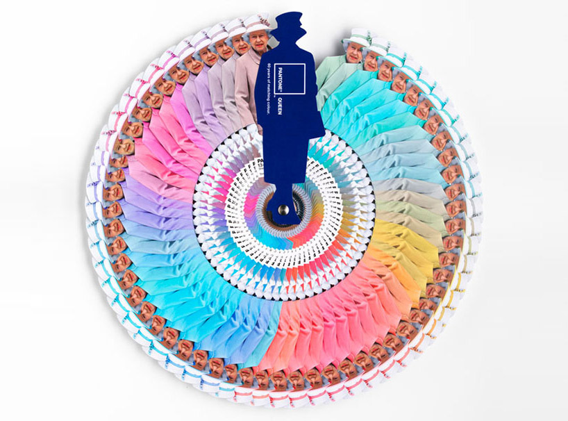
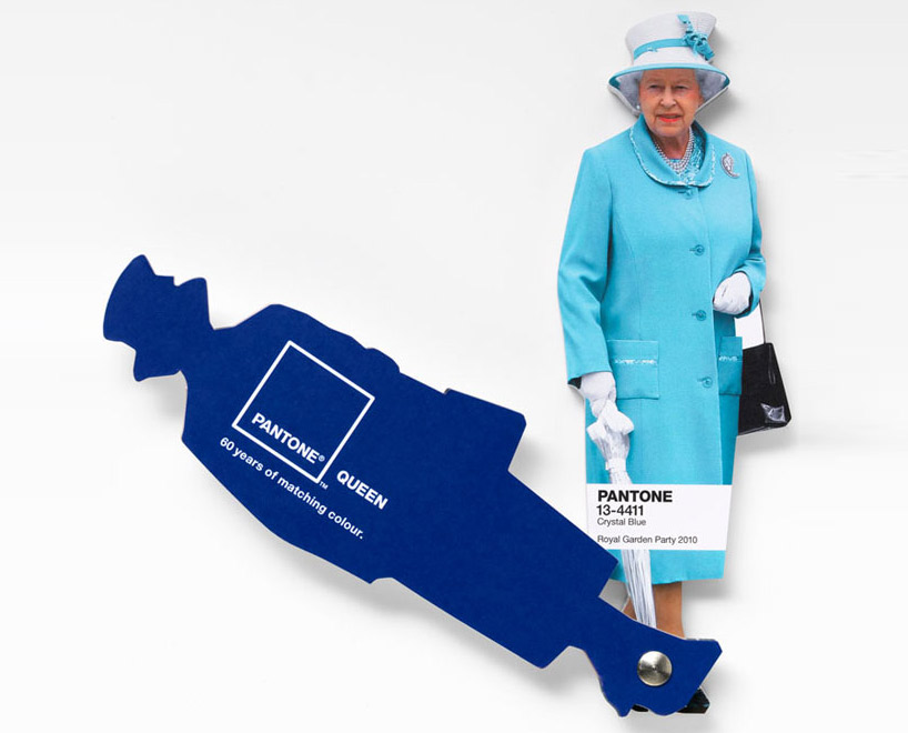
Interesting facts about Pantone Queen Colours Guide

I don't come to explain something new, since this has been in the press for a while. But I found this video so interesting that I thought I would share it with you. Here the different professionals involved in the creation and making of Pantone's Queen Guide explain how everything was done. I hope you enjoy it!


As you know, this was a commission to Leo Burnett London agency and the limited edition of this fan deck of course has been delivered by Pantone.


Designboom

On the other hand Vogue UK also followed the Queen colour choices for one year and made this beautiful chart. It turned out that she wore blue on 29% of her public appearances! Look at the different shades of blue, amazing! This can give you a slight idea on how important colour choices are...

Font

According to Apartment Therapy, Pantone hypothesized that Queen Elizabeth dresses monochromatically to make herself look taller. That makes sense, since cool colours tend to contract or recede visually. 

And remember Colour Psychology

As Kate Smith explains, blue -the colour of the oceans and the sky- is seen as trustworthy, dependable and committed. And this are the most desirable associations that a Queen would love to awaken to the citizens of her Kingdom! So, no wonder about this colour choice. This is the best proof about how COLOUR MATTERS.

So be wise, and if you need colour advice, come and ask for professional help. It will be my pleasure!