Showing posts with label tips. Show all posts

Thursday, August 9, 2012

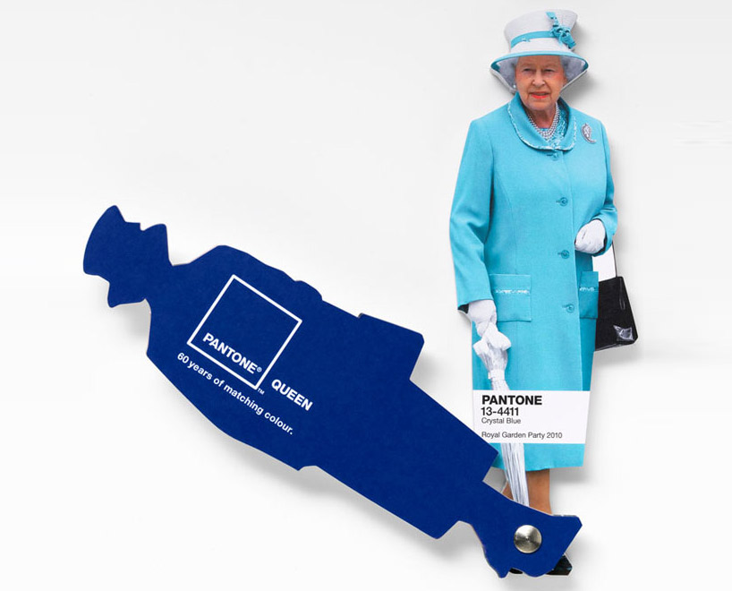
Interesting facts about Pantone Queen Colours Guide

I don't come to explain something new, since this has been in the press for a while. But I found this video so interesting that I thought I would share it with you. Here the different professionals involved in the creation and making of Pantone's Queen Guide explain how everything was done. I hope you enjoy it!


As you know, this was a commission to Leo Burnett London agency and the limited edition of this fan deck of course has been delivered by Pantone.
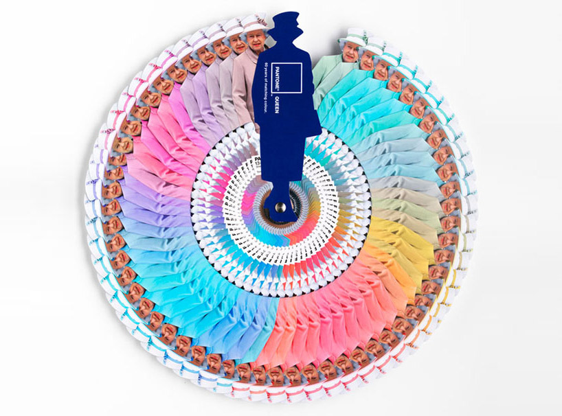


Designboom

On the other hand Vogue UK also followed the Queen colour choices for one year and made this beautiful chart. It turned out that she wore blue on 29% of her public appearances! Look at the different shades of blue, amazing! This can give you a slight idea on how important colour choices are...

Font

According to Apartment Therapy, Pantone hypothesized that Queen Elizabeth dresses monochromatically to make herself look taller. That makes sense, since cool colours tend to contract or recede visually. 

And remember Colour Psychology

As Kate Smith explains, blue -the colour of the oceans and the sky- is seen as trustworthy, dependable and committed. And this are the most desirable associations that a Queen would love to awaken to the citizens of her Kingdom! So, no wonder about this colour choice. This is the best proof about how COLOUR MATTERS.

So be wise, and if you need colour advice, come and ask for professional help. It will be my pleasure!

Sunday, December 18, 2011

Color explained in a few words!

Thursday, July 28, 2011

To create a colour palette out from a beloved object


One way to begin a Colour Consult is to choose an art object we love and create a colour palette to enhance it. This object becomes inspirational because we love its colours, its texture, maybe the memory it awakens or the desired atmosphere we would  like to create around us. At the same time, we could attempt to design the proper scenario to show our treasure at its best. And we would need to choose the right colours for furniture, walls, floor and so on.

This is what I did with this Art-Déco candy box I bought some years ago. And I extracted this collection of beautiful muted rich hues:


I  added some colours of the surrounding furniture to those of the candy box . The palette plays with some complements from the yellow and violet family. There are some analogous as terracotta orange, and silvery and golden hues and  olive green make a great family. Maybe  I will have and accent wall painted in dark red violet and then I will pick the rest of hues...

Friday, April 23, 2010

Saint George's Day


I'm very pleased to launch my own blog devoted to design this april 23 rd. 2010, Saint George's Day. This is  a lovely day for me, even more since my son bears this name. I begin with an image gently sent by one of my correspondents, Avi Tomàs, a very special person.

This is no day for big words on presenting myself. I'll only tell you this blog will talk about design, interiors, colour and decoration. Saint George's rose reminds us about the beauty of flowers. Flowers can make a day so special, a corner so gorgeous or our workplace so gentle! They fill our life with their beauty. So spread flowers in your and others' lives and enjoy!