I have found this fabulous video of the presentation that Christian Dior made of his Spring/Summer Fashion proposals, and just had to share it with you!
Pay atention to colour and style, there is something for everybody, even me, who am 57. I would wear some of these outfits undoubtedly!
Enjoy them!
We welcome PANTONE 17-5641 Emeraldas the New color of the Year 2013. Remember what I said in a previous post, in October the 14 th.? Go to the end of it.I made my bet for Emerald or Grayed Jade. And I nailed it!!!
Before relating to the official release, my own thoughts:
this election makes a lot of sense to me. This color is very close to that in the Tangerine and Orange tree leaves, and it marries well with previous Tangerine Tango, being it's complement. We go from the Red-Orange Family to the Blue-Green one. So, ladies having bought some Tangerine Tango clothings, don't worry at all! You can complement them with a beautiful Emerald item...
Associated to the gemstone that bears this name, it's a sophisticated and luxurious color. Since antiquity, it has been the color of beauty of new life in many cultures and religions.
As the executive director of the Pantone Color Institute® Leatrice Eiseman says:
“Green is the most abundant hue in nature – the human eye sees more green than any other color in the spectrum.”
"Symbolically, Emerald brings a sense of clarity, renewal and rejuvenation, which is so important in today’s complex world. This powerful and universally appealing tone translates easily to both fashion and home interiors.”
Since this is my main interest, how can we introduce this hue in Home Interiors?
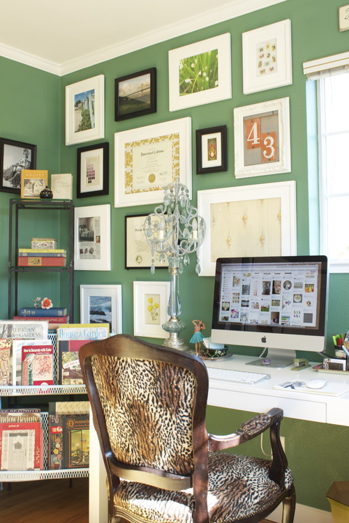
Add some accents, accessories and paint in Emerald and you will rejuvenate your Home. This jewel-like hue will add a luxurious sense to any room in your home, and it will shine as an accent wall in your living-room.
Source: Thom Filicia, Via Houzz, Via Isabel in Pinterest
The time has come when we begin to wonder about this question. And I
have come back to think about that after reading Azkonobel’s Color Future’s 2013 and
after finding an interesting post by Laura
Bielecki reporting the predictions made by the prestigious trend forecaster
Lidewij Edelkoort in a meeting in Design
Days Dubai 2012.
As they say, Indigo is associated with wisdom and honesty, and gives a
sense of tranquility which is very restful. It’s a benevolent colour that has
the trustworthy nature and elegance of blue at the same time.
Within a colour palette, indigo is versatile and pairs well with brights
of a similar saturation level, citrus, warmer neutrals and other blues, purples
and greens.
Curiously, in her seminar in Dubai, Lidewij Edelkoort presented yellow
as being the new pink in Interior Design, and that makes sense with its being
the complement to the purple family. According to her predictions, yellow will
make for vibrant and stimulating colour palettes, fabrics and fittings. And it will come with more staying power than Tangerine Tango, it seems.
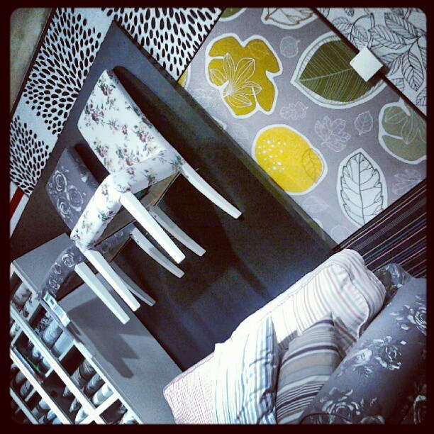
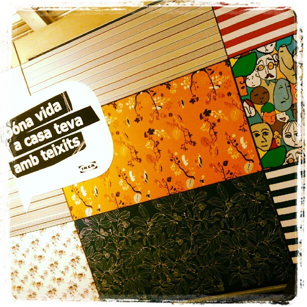
I can say that I have seen that trend for myself in Ikea Barcelona Autumn/Winter Textiles display yet. And yellow adds a vivid and hot accent that makes fabrics look wonderful!
Last year they published it in early December, so we won’t know for a
while. But there are two colours that I have seen in their Fashion Reports and
that have caught my attention. They are Emerald Green and Seafoam, or
Grayed Jade, as they call it. If they are not the colour of the Year, I bet
something they will be a hit. And they both combine well with blues, purples
and yellow families.
While every Corporation publishes its Colour and Trends Forecasting, time will say
which of them meet the costumer’s favor. But let me say that, from what I see
when comparing Trends Forecasts, all of them are related and interconnected,
with special accents to their market.
For me, an exciting Season of the Year has begun, that of Colour Future’s
guessing!
Colour Trends are set a minimum of three years in advance to a certain year, as many of you know. Trend setters work for great Trending Companies, establish trends according to many indicators and then follow the market to see which ones are early adopted or not. All kind of industries consult Color Trends Forecasting Books and Companies, so their products adapt to the market. This is how we see colours adopted and loved by costumers: they are made to enjoy them by industry. As Colour Marketing Group's tagline says, "Color Sells"!
And as Frank H. Mahnke explains in his book "Color and Light in Man-made environments", psychological studies carried in a very serious way demonstrate we humans need colour in our lives. That's why we love it! And we also need variation to avoid boredom.
That is where Trends come to make sense, as well as seasonal colour changes at our homes.
I follow as many fonts as I can in order to know about Colour Trends. I love reading Mix Magazine from Globalcolor, they provide really good information that focuses in different markets. There are many other fonts of course.Then this is up to the Color Detective to make his, her colour work and choose. I'm working on my Colour Focus for the next months in 2011 and yesterday I came through this jewel: AzkoNobel Colour Trends 2012. I will come back soon with very intersting news on that!
This week a friend wrote to me to ask me some color advice. She had bought two blouses, one in pale dusty pink and another in a more bright one. She was said by the shop assistant she could combine it with dark blue and she was told about color blocking being trendy. And here came her adressing to me. My friend is a little bit younger than me and I offered to make her a wide colour palette so she could see that there are really many other options apart form color blocking. It is not that I don't like this trend, but I think this is not for all styles. I took my friend's photo and with the help of Photoshop and my Color Wheel, this is what I sent her:
La Colorista
I tried two differendt grounds, one in light warm gray and another in a deeper gray, so she could see how color changes according to the one being next. From left to right I displayed :
1- Complements and split complements, making a happy and casual combination.
2- Neutrals, for a more classic look.
3- Analogues for soft harmonies.
4- Triadic hues.
It would be easy to pick two different bold and bright hues from these to build a color blocking look if you want to. And this is how because a friend trusted my opinion, I found myself being a Color for Image Stylist for one day. I looked at the matter in the same way I would have done to pick colors for Interior or Architectural design and my goal was to offer a wide range of possible Color Combos to my friend. This color Consult was really a very exciting one for me to do and I admit I loved it. So now I have one more field for fun in the Color world.
To end this post, I looked for something to illustrate the Color Blocking Trend and among what I found was this refreshing home video prepared by two young girls, that have a blog called Clothes Encounters. They explain very well what the trend consists of, act as models and explain in a few well chosen words why they love it. Have a look at it and enjoy!