Showing posts with label styling. Show all posts

Saturday, December 8, 2012

Tiffany's Christmas Window Displays in Barcelona

Yesterday I went to Barcelona and had a walk along Passeig the Gràcia, where you can find some well known Luxury Brands like Chanel, Loewe and many more. 

Since I signed up for Instagram and Tumblr, I have become used to chase images of things I love with my mobile device. It's light, it's easy and it helps networking.I love  chasing colors, and I love chasing Window Displays, since you can learn a lot from them. I confess I didn't know we have a Tiffany&Co in Barcelona, and I was amazed at their Christmas Window Display

Tiffany Barcelona
by IdY (Isabel de Yzaguirre), La Colorista.

They are like a window into a home, where someone has prepared a wonderful present wrapped in, what else could it be? A wonderful Tiffany Blue wrapping paper.

Tiffany Barcelona
by IdY (Isabel de Yzaguirre), La Colorista.

I learnt from haft2, that Richard Moore is the Visual Merchandiser who has designed this beautiful displays. According to him, each window ”reveals a glimpse into the precious moments families celebrate during the holiday season, with love and romance.”As long as I could see yesterday, they have diplayed the same concept in Barcelona, and I love it!

Tiffany Barcelona
by IdY (Isabel de Yzaguirre), La Colorista.

This precious displays remember me of the Catalan tradition of building diorama in Christmas. And what is a diorama? According to  www.dictionary.com "it is 1.a scene, often in miniature, reproduced in three dimensions by placing objects, figures, etc., in front of a painted background. 2.a life-size display representing a scene from nature, a historical event, or the like, using stuffed wildlife, wax figures, real objects, etc., in front of a painted or photographed background. 3.a spectacular picture, partly translucent, for exhibition through an aperture, made more realistic by various illuminating devices. 4.a building or room, often circular, for exhibiting such a scene or picture, esp. as a continuous unit along or against the walls."

Tiffany Barcelona
by IdY (Isabel de Yzaguirre), La Colorista.

We use to reproduce scenes from the Bible and the birth of Jesus in the Christmas Season. Every artisan makes his or her own dioram and we celebrate Exhibits and Contests. And we love to go to watch the wonderful small sceneries made with all kind of details. I wonder if the Tiffany team did know about that?

Tiffany Barcelona
by IdY (Isabel de Yzaguirre), La Colorista.
My son is the best jewel!

I never thought a blue could be so warm as Tiffany's. I find it a precious hue for Christmas, and I confess I crave for Tiffany Blue. Not for diamonds, but yes for something bearing this jewelled color.

Merry Christmas Season to everybody!
With Love from

Isabel de Yzaguirre,
La Colorista.

Thursday, December 6, 2012

Emerald, 17-5641, Pantone's color of the Year 2013!!!

And in the end, the new baby is born!!!

We welcome PANTONE 17-5641 Emerald as the New color of the Year 2013. Remember what I said in a previous post, in October the 14 th.? Go to the end of it.I made my bet for Emerald or Grayed Jade. And I nailed it!!!


Before relating  to the official release, my own thoughts:

this election makes a lot of sense to me. This color is very close to that in the Tangerine and Orange tree leaves, and it marries well with previous Tangerine Tango, being it's complement. We go from the Red-Orange Family to the Blue-Green one. So, ladies having bought some Tangerine Tango clothings, don't worry at all! You can complement them with a beautiful Emerald item...


What does the Pantone's team say about this colour? An image is worth a thousand words:


Associated to the gemstone that bears this name, it's a sophisticated and luxurious color. Since antiquity, it has been the color of beauty of new life in many cultures and religions.


As the executive director of the Pantone Color Institute® Leatrice Eiseman says:

“Green is the most abundant hue in nature – the human eye sees more green than any other color in the spectrum.” 

"Symbolically, Emerald brings a sense of clarity, renewal and rejuvenation, which is so important in today’s complex world. This powerful and universally appealing tone translates easily to both fashion and home interiors.”

Since this is my main interest, how can we introduce this hue in Home Interiors?

Add some accents, accessories and paint in Emerald and you will rejuvenate your Home. This jewel-like hue will add a luxurious sense to any room in your home, and it will shine as an accent wall in your living-room.


Source: Thom Filicia, Via Houzz, Via Isabel in Pinterest


Source: Rikki Snyder © 2012 Houzz,  Via Isabel in Pinterest

Font

Bedding, pillows, bath towels and accessories in Emerald will  help you in creating a relaxed, soothing and energizing atpmosphere at the same time.


Via Isabel in Pinterest, from Houzz

"Lively. Radiant. Lush… A color of elegance and beauty                      
                        that enhances our sense of well-being, balance and harmony."


Welcome be this jewelled, luxurious and healthy hue!
Long Life to Emerald Green!!!

Isabel de Yzaguirre,
La Colorista.

Thursday, August 9, 2012

Interesting facts about Pantone Queen Colours Guide

I don't come to explain something new, since this has been in the press for a while. But I found this video so interesting that I thought I would share it with you. Here the different professionals involved in the creation and making of Pantone's Queen Guide explain how everything was done. I hope you enjoy it!


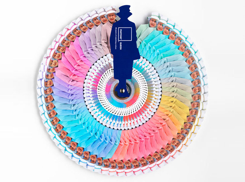
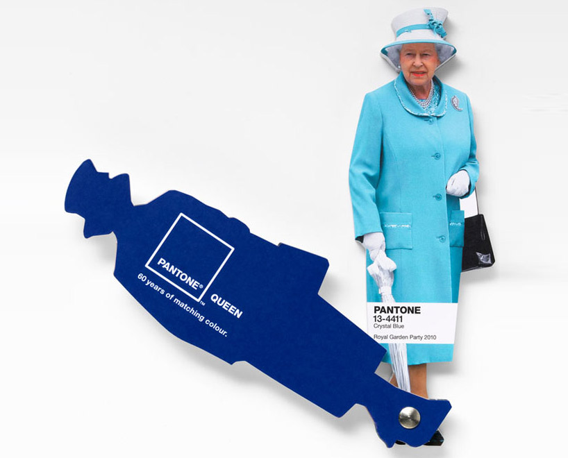
As you know, this was a commission to Leo Burnett London agency and the limited edition of this fan deck of course has been delivered by Pantone.


Designboom

On the other hand Vogue UK also followed the Queen colour choices for one year and made this beautiful chart. It turned out that she wore blue on 29% of her public appearances! Look at the different shades of blue, amazing! This can give you a slight idea on how important colour choices are...

Font

According to Apartment Therapy, Pantone hypothesized that Queen Elizabeth dresses monochromatically to make herself look taller. That makes sense, since cool colours tend to contract or recede visually. 

And remember Colour Psychology

As Kate Smith explains, blue -the colour of the oceans and the sky- is seen as trustworthy, dependable and committed. And this are the most desirable associations that a Queen would love to awaken to the citizens of her Kingdom! So, no wonder about this colour choice. This is the best proof about how COLOUR MATTERS.

So be wise, and if you need colour advice, come and ask for professional help. It will be my pleasure!

Saturday, September 10, 2011

My colour Style...

If I could wear the things I have in my Style Board in Pinterest, today I would choose this beautiful coral-red cardigan to begin:


This would combine with an awsome long skirt in different blues with big flower patterns in white, blue and bold red:


And I would fly rather than walk with these red angel-winged platform shoes!


Red and blue in a perfect Complementary Scheme as you see... Mmm, I love it!!!
I will go on dreaming...

All pictures from Anthropologie.


Friday, July 29, 2011

Color Styling for a Wardrobe and the Color Blocking Trend

This week a friend wrote to me to ask me some color advice. She had bought two blouses, one in pale dusty pink and another in a more bright one. She was said by the shop assistant she could combine it with dark blue and she was told about color blocking being trendy. And here came her adressing to me. My friend is a little bit younger than me and I offered to make her a wide colour palette so she could see that there are really many other options apart form color blocking. It is not that I don't like  this trend, but I think this is not for all styles. I took my friend's photo and with the help of Photoshop and my Color Wheel, this is what I sent her:


La Colorista

I tried two differendt grounds, one in light warm gray and another in a deeper gray, so she could see how color changes according to the one being next. From left to right  I displayed :

1- Complements and split complements, making a happy and casual combination.
2- Neutrals, for a more classic look.
3- Analogues for soft harmonies.
4- Triadic hues.

It would be easy to pick two different bold and bright hues from these to build a color blocking look if you want to. And this is how because a friend trusted my opinion, I found myself being a Color for Image Stylist for one day. I looked at the matter in the same way I would have done to pick colors for Interior or Architectural design and my goal was to offer a wide range of possible Color Combos to my friend. This color Consult was really a very exciting one for me to do and I admit I loved it. So now I have one more field for fun in the Color world


To end this post, I looked for something to illustrate the Color Blocking Trend and among what I found was this refreshing home video prepared by two young girls, that have a blog called Clothes Encounters. They explain very well what the trend consists of, act as models and explain in a few well chosen words why they love it. Have a look at it and enjoy!