Showing posts with label interiors. Show all posts

Sunday, November 2, 2014

COPPER ORANGE, AkzoNobel's 2015 Color of the Year!

As every year these days, AkzoNobel published their 2015 Colour of the Year, Copper Orange, which is defined as

¡SURPRISINGWARM – BEAUTIFUL!


A deep colour in an emerging spectrum of reds, pinks and oranges, it showcases a globally more optimistic trend.


According to the current protagonism of metallic hues in design, this colour reflects and summarizes the Trends identified for 2015 in this field. These are:
  • A warmer attitude and a desire for sharing.
  • Natural earthy colour palettes, from clay tones to sunlit yellow strokes.
  • And last but not least, skin tones that reflect human interaction and sepia hues from the past. 

Sunday, September 28, 2014

Color and Materials Trends 2015-16 by Heimtextil.

Today I present you this interesting video published by Heimtextil. Here you have a very good and visual summary, which explains itself very well. Take notes and enjoy! 


Isabel de Yzaguirre, 
La Colorista.

Tuesday, July 29, 2014

Trends 2014-16: Spring and Jungle Greens.

It seems we are going to see many greens in next Colour Seasons. They are presented either as Spring Greens either as Jungle Greens. No wonders about this choice, which seems to express our desire for green shades with a natural feel. We will see many of them in 2015 and 2016.
This trend celebrates Spring, specially with grass green.
TWO TONE CHAIR by Ichiro Iwasaki.
More tending towards olive is Pedrali's polycarbonate Blitz Chair:
Design by Claudio Dondoli and Marco Pocci.

Wednesday, November 27, 2013

Colours by Culture, an infographic.

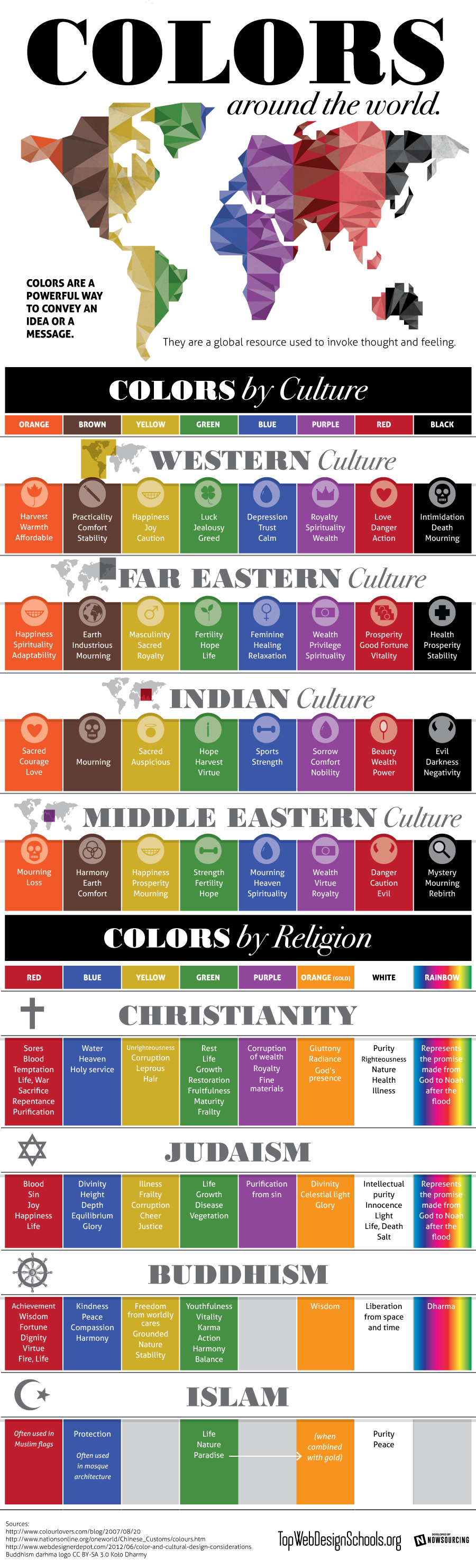
Shared today in Google+ by Lori Sawaya, from The Land of Color, I picked this interesting infographic which showcases prefectly how colours have different meanings according to different cultures. This should be carefully taken in account for designers and corporations when creating new products, specially when dealing with clients that come from a culture other than ours. The image comes from Top Web Design Schools. Enjoy! 


Colors by Culture

Isabel de Yzaguirre,
La Colorista

Thursday, December 6, 2012

Emerald, 17-5641, Pantone's color of the Year 2013!!!

And in the end, the new baby is born!!!

We welcome PANTONE 17-5641 Emerald as the New color of the Year 2013. Remember what I said in a previous post, in October the 14 th.? Go to the end of it.I made my bet for Emerald or Grayed Jade. And I nailed it!!!


Before relating  to the official release, my own thoughts:

this election makes a lot of sense to me. This color is very close to that in the Tangerine and Orange tree leaves, and it marries well with previous Tangerine Tango, being it's complement. We go from the Red-Orange Family to the Blue-Green one. So, ladies having bought some Tangerine Tango clothings, don't worry at all! You can complement them with a beautiful Emerald item...


What does the Pantone's team say about this colour? An image is worth a thousand words:


Associated to the gemstone that bears this name, it's a sophisticated and luxurious color. Since antiquity, it has been the color of beauty of new life in many cultures and religions.


As the executive director of the Pantone Color Institute® Leatrice Eiseman says:

“Green is the most abundant hue in nature – the human eye sees more green than any other color in the spectrum.” 

"Symbolically, Emerald brings a sense of clarity, renewal and rejuvenation, which is so important in today’s complex world. This powerful and universally appealing tone translates easily to both fashion and home interiors.”

Since this is my main interest, how can we introduce this hue in Home Interiors?

Add some accents, accessories and paint in Emerald and you will rejuvenate your Home. This jewel-like hue will add a luxurious sense to any room in your home, and it will shine as an accent wall in your living-room.


Source: Thom Filicia, Via Houzz, Via Isabel in Pinterest


Source: Rikki Snyder © 2012 Houzz,  Via Isabel in Pinterest

Font

Bedding, pillows, bath towels and accessories in Emerald will  help you in creating a relaxed, soothing and energizing atpmosphere at the same time.


Via Isabel in Pinterest, from Houzz

"Lively. Radiant. Lush… A color of elegance and beauty                      
                        that enhances our sense of well-being, balance and harmony."


Welcome be this jewelled, luxurious and healthy hue!
Long Life to Emerald Green!!!

Isabel de Yzaguirre,
La Colorista.

Sunday, October 14, 2012

Which will be next Colour of the Year 2013?


The time has come when we begin to wonder about this question. And I have come back to think about that after reading Azkonobel’s Color Future’s 2013 and after finding an interesting post by Laura Bielecki reporting the predictions made by the prestigious trend forecaster Lidewij Edelkoort in a meeting in Design Days Dubai 2012.


While we don’t know about Pantone’s choice yet, AzkoNobel and its division Dulux have chosen Indigo as their colour of the Year 2013.


What qualities explain this election?

As they say, Indigo is associated with wisdom and honesty, and gives a sense of tranquility which is very restful. It’s a benevolent colour that has the trustworthy nature and elegance of blue at the same time.


 Font

Indigo is a rich and deep colour that, being scarcely accessible in our natural world, instills a sense of wonder and magic in us.


Within a colour palette, indigo is versatile and pairs well with brights of a similar saturation level, citrus, warmer neutrals and other blues, purples and greens.


Curiously, in her seminar in Dubai, Lidewij Edelkoort presented yellow as being the new pink in Interior Design, and that makes sense with its being the complement to the purple family. According to her predictions, yellow will make for vibrant and stimulating colour palettes, fabrics and fittings. And it will come with more staying power than Tangerine Tango, it seems.


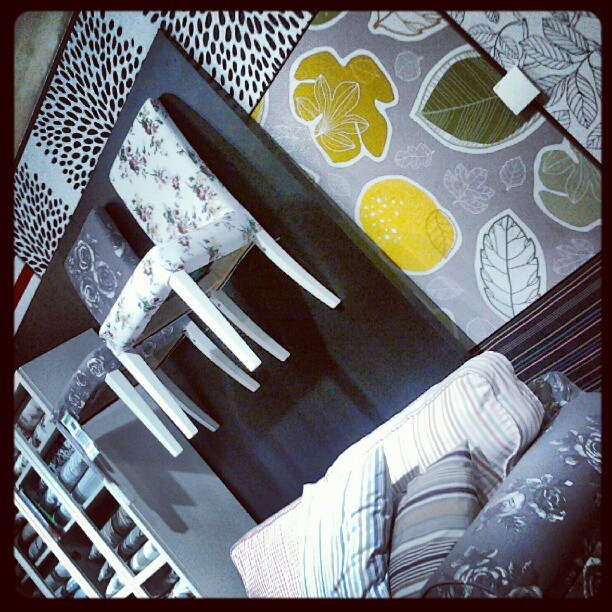
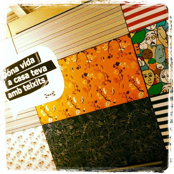
I can say that I have seen that trend for myself in Ikea Barcelona Autumn/Winter Textiles display yet. And yellow adds a vivid and hot accent that makes fabrics look wonderful!


And what about Pantone’s Color of the Year 2013?

Last year they published it in early December, so we won’t know for a while. But there are two colours that I have seen in their Fashion Reports and that have caught my attention. They are Emerald Green and Seafoam, or Grayed Jade, as they call it. If they are not the colour of the Year, I bet something they will be a hit. And they both combine well with blues, purples and yellow families.


While every Corporation publishes its Colour and Trends Forecasting, time will say which of them meet the costumer’s favor. But let me say that, from what I see when comparing Trends Forecasts, all of them are related and interconnected, with special accents to their market.

For me, an exciting Season of the Year has begun, that of Colour Future’s guessing!

Isabel de Yzaguirre,
La Colorista.

Sunday, April 29, 2012

On White.


I have recently created some Colour Ideabooks in my Houzz profile, to collect beautiful images gathered by Colour families. Today I'll begin showcasing White.

Traditionally used in neutral colour schemes, the use of whites was a predominant trend  in the 20 th. Century, between the 50's and the 70's. Considered by some to represent purity and cleanliness  and thought to be an ideal background to colourful decorating items and effects by many Interior Designers, Colour Expert Frank Mahnke devoted a chapter to White in his book "Color and Light in man-made Environment". The Chapter's title was "The Case Against White". There Mahnke argues why, "on a psychological basis, white is sterile" and is not recommended in Hospitals and Old-age Institutions. It seems that we humans need sensory variety in our homes and this can be introduced with the help of colour and the use of texture and patterns (wallpapers, textiles). On the contrary, the predominance of white can become boring and tedious in the end.


There are other issues with white: in contrast with bold colours, it can lead to eye strain, as it requires  "extreme adaptative changes from light to dark".


Being highly light reflectant, too bright whites can cause a distressing glare. This is why, according to Mahnke, white should not be used as a predominant colour in Interiors:


On the other hand, Design Writer Linda O'Keefe has devoted a book to White in Design. There she states that "White has the ability to pull everything together in a way that is kind of seductive". A timeless colour, it endures Seasons and Trend changes and never dates. As she says "all begins and ends with white"...


What do you think on this Colour Trend?
And if I can help you in some way, please contact me!

Isabel de Yzaguirre,
La Colorista.

Monday, February 20, 2012

AzkoNobel's 2012 Color Trends

Color Futures Via YouTube

In this video AzkoNobel's Color Futures features their four 2012 Color Trends, which are:

  • Delicate Mix: about elegant, refined, understated, subtle, luxurious.
  • One Small Seed: about new life, healthy, precious, fragile.
  • Living Scrapbook: about life, collecting, narrating, sharing...
  • Rediscovered Heroes: about legacy of the past, industrial, robust, revitalized, appreciated.
To develop further in future posts.

Saturday, February 11, 2012

Guest blog by Joanna from Design Shuffle: Wonderfully Colorful Walls!

Hi! I’m Joanna, a writer for Design Shuffle, a terrific site featuring everything interior design. On the site you can find the latest designs from prominent designers and up-to-the minute news on the interiors industry. I LOVE my work. I get to spend my time searching the Internet and shelter mags for the most beautiful interior designs and bring them together to share on blogs like La Colorista. Thanks for letting me share today!

If you’re not faint of heart when it comes to wearing or decorating with bright colors, then you know the joy of a boldly hued outfit or interior space. I especially love color, but have a hard time committing to just one. That isn’t a problem for the designers of the rooms below. They went all out when choosing colors that pop for their walls.

  Colorful Walls

A wall doesn’t have to be a solid color to be bold and bright. This wall has all the colors of the rainbow and becomes a cohesive burst of wonderful color.

  Colorful Walls

An accent wall in a modern home office acts as a decorative entrance to a master bedroom.

  Colorful Walls

This dining room (from the same home as above) is full of character and personality with its red and purple
accents.

  Colorful Walls

All pretty in pink, this bedroom design wears the color beautifully. This would be a lovely room to awaken to every morning, don’t you think?

  Colorful Walls

This fun retro room full of 60s charm would be a blast to hang out in with its comfy, stylish seating and brilliant colors.

. Colorful Walls

Mum’s the word in this pretty corner spot. I love the pink velvet chaise and the dramatic black chandelier.

  Colorful Walls

This room may seem as if it is shouting, “look at me!” but I find it dramatic and chic. Does it inspire any ideas for your bedroom design, den design, or any other part of your home?

  Colorful Walls

Honeysuckle and silver cover a bold wall over a daybed. The silhouette adds personality along with rich textures and hues on the throw pillows.

Images 1 | 2 | 3 | 4 | 5 | 6 | 7 | 8 
Longing for even more colorful inspiration? Then head on over to Design Shuffle where you can explore various interior design styles and browse through the portfolios of Chicago interior designers and more!

Friday, February 3, 2012

Purple

Purple is a trendy color. It was chosen by CMG as Color of the Year 2012 and they named it Boyz'n'Berry:


Recently, Color Strategist Lori Sawaya produced this Colorgraphic that shows Purple's meanings:


Color Marketing Group think that "From office to home, from youth market to luxury goods, purple has as much masculine as feminine appeal.  Confident women and real men wear purple!" I love this turn of purple towards men!

Lori Sawaya has developed a palette of plums and purples in an Infographic that explains how and where you can use purple. If you want it, you can download it in PDF format here:


We are currently seeing purple and its related hues featured in many products, as in this sofa from Anéguil:

Or in this jardinière from the same brand:


Also in this glass washbasin from Courant Verre:


And in this beautiful carpet by Heuga.


As for Colour Palettes combining purple, I love this one created and shared by Kate Smith:


Purple was showcased by CAUS as early as in their 2011-12 Trends Report in GLOBAL ARTISAN TREND. Don't you be reminded of Pantone's Tangerine Tango by some of the hues in this palette?


I love how Jane Hall used purple in this interior:


And how JPM did combine it here:

JPM Design, via Pinterest.

We could go on and on... and it would take long. I only expect you love purple as much as I do,be it trendy or not!
And if you need Color Help, please contact me.
Yours in Color!

Isabel de Yzaguirre,
La Colorista.