Showing posts with label design. Show all posts

Saturday, August 29, 2015

News and Projects with Marta Aymerich and some changes in La Colorista®

This year I haven't written much in this blog, and this isn't good at all, at least for marketing oneself... But summer vacation is a good time for keeping in touch and here I go!

Today I'm presenting my good friend  Marta Aymerich, from Marta Aymerich Emotional Comunication. She is a great designer, from head to toe: her designs are fresh, clean and contemporary and so is she!  

Kate Smith  put us in touch in 2011, and from that day a good friendship has been growing between the two of us. Currently we are collaborating in very encouraging projects  and I want to present her to you:


Marta&Isabel
Image by Humberto Pérez Padilla, ARTIST.

Tuesday, July 29, 2014

Trends 2014-16: Spring and Jungle Greens.

It seems we are going to see many greens in next Colour Seasons. They are presented either as Spring Greens either as Jungle Greens. No wonders about this choice, which seems to express our desire for green shades with a natural feel. We will see many of them in 2015 and 2016.
This trend celebrates Spring, specially with grass green.
TWO TONE CHAIR by Ichiro Iwasaki.
More tending towards olive is Pedrali's polycarbonate Blitz Chair:
Design by Claudio Dondoli and Marco Pocci.

Thursday, July 17, 2014

Colour Trends 2014-15: Mid Blue.

From the colours that have been spotted in Design Fairs this year, I'm bringing a very cool one for the Summer Season, Mid Blue. This one reminds of summery skies and, in some shades, Caribbean waters, or the colour of the sea in a rainy day.


Optimistic and summer like, it will help us feel in a better mood after so many gray days in Winter and Spring. Below, the Box Stool adds a fresh and luminous splash to the room's composition:

Wednesday, November 27, 2013

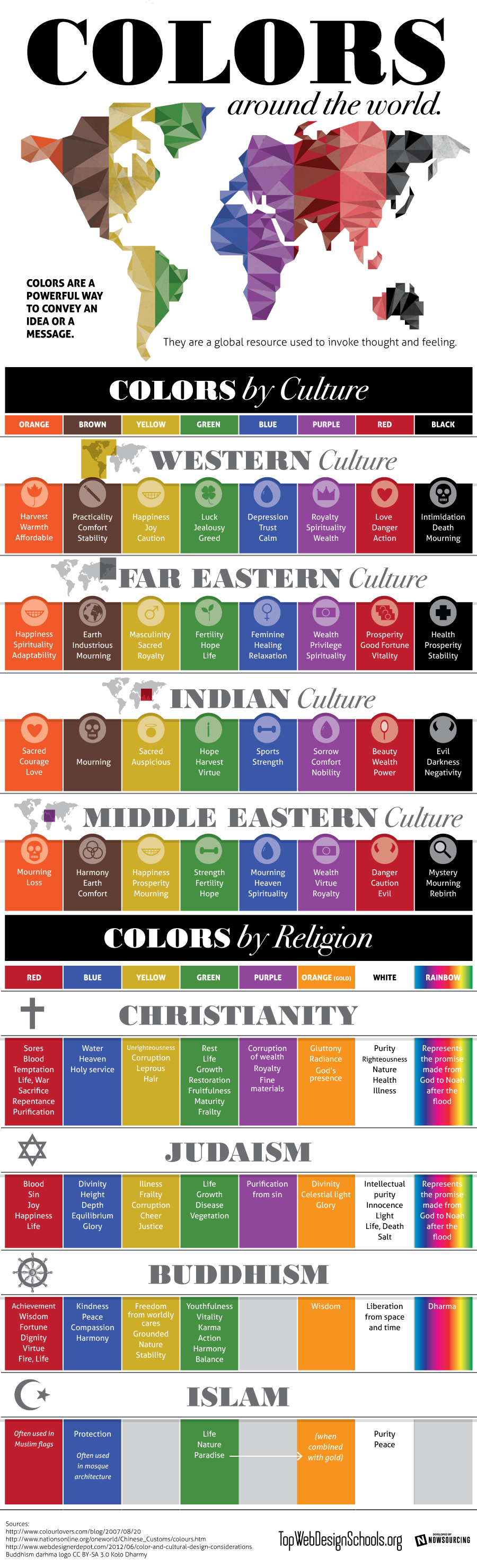
Colours by Culture, an infographic.

Shared today in Google+ by Lori Sawaya, from The Land of Color, I picked this interesting infographic which showcases prefectly how colours have different meanings according to different cultures. This should be carefully taken in account for designers and corporations when creating new products, specially when dealing with clients that come from a culture other than ours. The image comes from Top Web Design Schools. Enjoy! 


Colors by Culture

Isabel de Yzaguirre,
La Colorista

Saturday, May 11, 2013

Vividly Colored Chairs: guest post by Mari from Arcadian Home

About a year ago, I published a guest post on "Decorating with Floral Art",by Arcadian Home. Today I'm very pleased to host AH again with a post on Vividly Colored Chairs, which suits perfectly my love of Color!
Isabel de Yzaguirre,
La Colorista.

Hello, lovely readers! 
I'm from Arcadian Home blog which is a wonderful place for home decor inspirations. There you will find lots of great creative ideas for everything from decorative trays to big wall art and much more. Today, we're going to talk about one of my favorite pieces of furniture. I love all things related to home interiors, but chairs are at the top of my list of furniture obsessions. I am especially fond of colorful chairs, so that's what this little visual tour is all about. Please enjoy! Thanks for letting me stop by to share. ~ Mari 

Monday, April 1, 2013

A project come true: The Four Seasons Mural for a School's yard.

Whoever has followed me since three years ago maybe remembers a  post on a Mural Project for Josep Orriols i Roca School's yard. The School is located in Moià (Barcelona, SPAIN).

I published the project for the first time when I had been working on it for about nine month, and I had serious doubts about its being  painted because of economical crisis in Spain. But luckily parents were very willing to see it done, and to let their sons and daughters have a more colourful School, no matter what it might cost. They organized events to collect money and provided all the colours that I had specified, whith the sponsoring of our local Paints Store. 


Today I can say the mural has come to life and am offering a view of the whole process until its completion.

The initial goal was to have some of the concrete walls of the yard decorated, and we chose the one in the sight: 


La Colorista, 2010.

My project aimed at representing the colours in the natural landscapes around our village all along the Four Seasons of the Year, in the same order that we experience them since the School Term begins: from Fall to Summer. Colours were picked from photographs shot in Moià's surroundings, and the proposed design was this one:


The Four Seasons' Mural, Isabel de Yzaguirre Maura
(La Colorista),2011.

Monday, March 4, 2013

The meaning of Colour in Marketing. And in Interior Design.

A few days ago I found this interesting Infographic on the meaning of colours applied to marketing. I'ts a good brief that can be perfectly applied to Interior Design. And since color increases readership, recognition and comprehension, I hope it will be helpful for you. Enjoy!


Isabel de Yzaguirre, 
La Colorista.

Sunday, January 13, 2013

Good networking practices in LinkedIn.


Dear readers of mine:

today I want to comment something that happend to me recently in LinkedIn. I write blog posts when I can and try always the content to be of interest. Then I share it in my groups trying to develop a good conversation. Lately I wrote two posts publishing interesting Houzz tours with my comment, and posted in my groups. I've always had a positive groupal behaviour, I think: I've been respectful and have tried to make my contribution to others...


Isabel de Yzaguirre, IdY.
La Colorista.

It happens that I publish my content from Bloggers directly to LinkedIn, and I've stated that slide presentations don't show when linked. Instead of that, my photo and Bloggers profile was shown, though I linked to the post. I usually had been posting my content in Color related groups, but since I belong to many Interior Design groups, I thought my posts on Color could be of  interest. And I must state that I had a great and very welcoming response, and a great contribution of fellow Interior Designers on developing conversations on Color. If you scroll down in my blog, you will see that I wrote two of this posts with Houzz content lately. I had a great feedback in general, but had a bad surprise as well. Having had a comment in a group, and wanting to thank it, I came to discover that I had been blocked there! I was shocked, I admit!!!

Then I discovered that my latest posts showed my photo and Bloggers' profile instead of the post content. Could this be the cause why someone flagged my contribution? Could be, of course. But it happened only two times before I realized my mistake, and nobody warned me through any kind of comment or private message, which is the procedure I think should have been followed. Simply put, someone flagged me once and I was blocked! I wrote to the group owner to explain myself and ask him his reconsidering my  being blocked in this Interiors group, but I haven't had any response. I understand group owners are busy, and I understand that spamming is annoying. But I didn't mean to spam the group at all. In fact there were many people interested in what I posted and that engaged in a very interesting conversation, where everybody shared his/her thoughts on the subject. And I wasn't given a single chance when flagged by someone. 

So here go my thoughts: I revised what could have happened and detected the possible cause of the blocking. And the lesson I've learnt: if you post a link from your blog, be careful to do it with an interesting introducing question on the subject, that can begin an interesting conversation. Be careful not to be too showy of yourself or not to seem to be too showy. Even if you think you are behaving correctly, make sure nobody can think on the contrary, for we never know enough about others' level of sensibility.

For me it has been a very unpleasant experience, since I've always tried to be kind to everybody and never post negative criticism on  other people works, posts and blogs. But this happened to me and I've tried to learn from this experience. I'd love to know your thoughts on this question and I hope that this can help others as well. Let me finish with  my best wishes for a wonderful Year 2013 to everybody, which I didn't before for personal reasons.

See you soon with more posts on Color and Interior Design!

Isabel de Yzaguirre,
La  Colorista.

Sunday, December 30, 2012

25 most bookmarked Colourful Homes in Houzz 2012!

I've found this collection of 25 most bookmarked Colourful Homes 2012 in Houzz and really enjoyed the collection. Of course I love some more than others, but all of them are a good example of how color can help to make you feel better in your home. Which ones do you prefer?

As for 2013, I guess blues and greens are going to be on spot...

Monday, November 19, 2012

A year with Tangerine Tango...

The current year is coming to its end and in a few days Pantone will announce their Colour of the Year 2013.Tangerine Tango  was a surprising choice that enlivened our life in 2012. The Orange family is usually  looked at with much controversy: you love it or you hate it, it's something experts know. Personally I love it for it's optimism and energy, not so strong as red, but still very warm.

Yesterday I was looking at the best Tangerine Tango photos published in Pantone's blog and I collected my favorites in  the Interior Design field. And I'm bringing this anthology to you as my humble homage to this happy hue before it's kingdom comes to an end and we forget about it.


How did Tangerine Tango help us?


Infusing life in a sophisticated neutral room...


In beautiful textiles married with white, yellow-green and green hues.


Combined with bright hues in Folk textiles and ambients.


Being the accent to its complementary.


Creating a sensuous atmosphere in a room.


In a contemporay home.


From the 60's? In Antiques.


In this neutral contemporary home, tangerine makes the sofa's corner a cozy one.


In intimate and warm lighting.


Even in the patio!


In furniture.


More textiles, photo by Leslie Williams.

My wishes are that this year with Tangerine Tango may have made us more daring with colour.That may we have good memories of this passionate hue. And that may you have enjoyed this selection I made for you 

Isabel de Yzaguirre, 
La Colorista.

Sunday, November 4, 2012

How color can help a community: the Heidelberg project.

Today I found this interesting post in Houzz that shows how a Color and Art project has helped to save the Heildelberg and Elba street neighborhoods from being demolished. Making a turn to the CMG slogan, we can state that "Color helps".
How powerful a tool to help others!!!


I hope you enjoy it and remember that colour can help in Healthcare Design as well. Be happy!!!

Isabel de Yzaguirre,
La Colorista.

Saturday, June 2, 2012

Pantone Plus Colour Series creation.

It's very interesting to see how Pantone's Colour Series are created and what designers and people  involved in the process say about that. How useful is colour and how it helps to have them well defined and organized. How colour conveys feelings and a meaning, and how it helps in the design process, from fashion to graphic, to product, to interiors and so on. This is about the new Pantone Plus Series, with new PastelsNeons and Metallics. Enjoy!


Colour is a universal language. 
Are you afraid of it? I can help you!

Saturday, August 20, 2011

Focal Art: Vitaly Geyman, Photographer.

I've mentioned before how thanks to the net I have become acquainted to wonderful people. This is how I met Vitaly Geyman, by the way.


Vitaly is an internationally published and licensed artist, devoted to photography.Born in the Ukraine, Vitaly spent the first twelve years of his life in Kiev, a colorful and culturally rich city replete with old cathedrals and large oak trees. At the age of twelve his parents decided to leave what was then the U.S.S.R, as political refugees. After spending time in Italy they immigrated to Australia where Vitaly spent his formative years. The beauty and vastness of Australia touched his heart and it is where he began his love affair with nature. However, it was not until his move to the United States in 2003 that he began to fully immerse himself in the art of photography.


It is Vitaly's belief that "great photographic art transports us into another dimension". His artistic journey is an ongoing exploration of the beauty, simplicity and wisdom of nature.Vitaly’s soulful, dreamlike fine art photography would suit perfectly any place you'd love to accent in your home, business or office.


I have chosen some of the prints he offers in Gliclee Art Prints from Art Prints America to show here. From his Flower  Prints this Sun Flower. Wouldn't it glow in a child's room, for instance?


Wouldn't that make a beautiful contrast with some kind of burgundy or wine red? I even would match it with a wider colour palette, a very whimsical one!

Clic on photos to enlarge and better appreciate colour palettes.

This is only one of many  possibilities...  Paler yellow and blues, more subdued reds and terracota or earth brown would work well here.


From the  Fall Leaves Gallery this is one of my favourites, a color feast for one's eyes! What colour palette will glorify  it? Let's see...


These richer and more subdued hues would make the Art Print pop-up and create a sophisticated look for a room. The rest of elements, should coordinate with these. Bright red is the exception -II'd keep it for an accent.


Vitaly publishes White and Black photos on different themes. Among them, I have  chosen this gorgeous Magnolia Duet.


If you want to create a contemporary sophisticated look with White and Black Art, go for a dynamic palette that combines black and white with grays and a rich jewel hue  like one of these:


I have a strong preference for flowers, but you can find other Nature related themes in Art Prints America. You can create awsome focal points with Tree Bark Art Prints and you have Fall and Winter Art, together with Ocean and Waterfall Giclee Artprints.

In the following video, Vitaly explains what Giclee Art Prints are and why they are better quality ones:


And here he gives some valuable tips to shoot beautiful Botanical photos. I hope you enjoy them!


If you are willing to create a wonderful focal wall in your home, office, commercial or healthcare and need some help, feel free to contact me!

(Information provided by Art Prints America, to whom I'm not affiliated but yes very thankful for their letting me to create Color Palettes with their Giclee Art Prints.)

Friday, June 10, 2011

Barcelona's Art Déco Color Palette 2 - The Umbrella's House


The Bruno Cuadras House is situated in Barcelona, in the well known Ramblas. It was built in 1858 and rebuilt between 1883 -1895 by architect Josep Vilaseca i Casanovas, whose  work is a textbook case of the evolution of late neo-Classicism into Modernisme, which took place in Catalan Architecture towards the end of the 19th century.

This house was known by common people as the Umbrella's House, because of it's decoration, and it's façade is classified as being Eclectic. It had clear Egyptian influences coming from the interest that had awakened towards Oriental Culture and Countries these days in the neighbour France after Napoleon's Expedition to Egypt.  This interest was reinforced by the links existing between the city of Barcelona and Mr. Ferdinand de Lesseps, the constructor of the Suez Channel.

As Mr. Vilaseca experienced Modernism in his last days, I take the risk to classify the color palette I extracted from the photo (shot by myself), under the label of Modernist or Art Déco. What I know about Color in Catalan Modernist buildings makes me confident that I'm in good direction. I hope you enjoy it as much as I do.

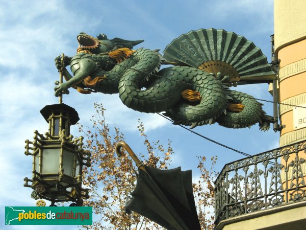
One more curiosity for you: there used to be an elegant boutique in the ground level of the building in old days. Don't you guess what it was devoted to? To fashionable umbrellas, of course!  And to hand fans, so used these days by ladies to fight against heat . If you ever happen to visit Barcelona, don't miss the dragon's  sculpture hanging in the corner of the Umbrella's House. You will love it!


Sunday, April 24, 2011

Barcelona's Art Déco Palette 1


With this one, I begin a sequence of posts on the colours from Barcelona.At the same time that  I try to capture hues, I will explain a few things, in few words, on the chosen places. 

Today I'm leading you to the Modernist or Art-Decó colour palette shown in one of the Houses that were constructed in Parc Güell. Built from 1900 to 1914, the "Parc Güell" was the main work, and the most complete, from Antoni Gaudí, who was comissioned to construct a Park-City according to the model of the ones raised in England in the second half of the XIX th. century. Gaudí, who conceived his work as a closed and fenced residential area provided with all the necessary services, was helped by the also catalan architects Josep Mª Jujol and Joan Rubió i Bellver.

In this photo, correspondig to the so called "Rose House" where Gaudí lived for 20 years, you can observe one of the decorating techniques practiced in this period, called sgraffitto, -in the window borders and also in the façade. It was made scratching through a surface to reveal a lower layer of a contrasted colour. Here we have rich muted tones of rose and red together with sandy beige, which contrast with black in the forged-iron fence and a dark shade of green in the window's wooden blinds. If the day had been a sunny one, this bunch of colours would be enhanced by the bright blue of our Mediterranean sky. I'm sure you would love to visit this wonderful place.

More to come...

P.D. - In catalan we call "Modernisme" the period you know as Art-Déco and Art Noveau in English (I have come to observe that you call Modernism to what we know as Rationalism... Just to avoid misinterpreting!)

Saturday, January 8, 2011

Colors of the Year 2011: which one you choose?

Citrus Yellow is one of the trendy colors this year 2011:


Chosen by multinational AzkoNobel, owner of prestigious paint  brands in many countries, as their Color 2011, it contrasts strongly with Pantone's proposed hue, Honeysuckle Pink. In one hand I must state I wouldn't dare to paint an accent wall with such a strong bold color.In the other, I think this pink can work very well in fashion:


I think also it can lighten  and enhance an Interior as a punch of color in some complements and make it look springlike:


Citrus yellow seems to work best for more extensive use in Interiors in its different hues, from buttery  to sherbet yellow, from canary yellow to the most bright and saturated hues of it.


Let's look at this kitchen as an instance. Published in Apartment Therapy Trends 2001 Report it shows yellow in an up-to-date design. Enlightened by white cabinetry and in a bold contrast with the rich brown of the wooden floor, it sems to dialogue by analogy with the peach orange color in the next room. Some punchs of green here and there balance the whole composition.


 In Fashion we can find all kind of clothings and complements in this warm and yet refreshing color:


Font
 With what I love best from all these I have made my own Trendy Palette 2011. Enjoy!

If you are in Catalonia and would love to update your Home's Color and Décoration, I'm here to help you.
Just contact me and let's talk!

Sunday, July 4, 2010

My Summer Palette 2010


Original image by courtesy from Hornbeck Design Partners

As everybody interested in design knows, Turquoise Blue was declared to be 2010 Colour by Pantone early in January. Surfing LinkedIn I  got acquainted with Jack Bredenfoerder , Design Director at Landor Associates, and could read three really interesting blog posts on Colour by him. There he talks about colour trends for this Summer and explains the meaning of Blue Hues. To luminous tropical Turquoise reminding of a possible escape to Paradise, Jack adds International Klein Blue, which according to him "relates to people’s search for a global, let’s-work-together unifying color" and "represents not only the environmental challenges we must solve together but also the social and political ones".He suggests also  White, "which reflects a desire to simplify and clear the palette in an uncertain economy",Warm golden yellows, "which are linked to a desire for the stability of a new gold standard", and tropical colours as sunset purples and hot hibiscus reds.

 Interior of Danish summer house by LASC Studio

After reading his proposal, and having learnt that Colour Trends are set about three years in advance, I've made my own reflection on which ones I love for Summer, not only because of trends but looking at our Mediterranean colour traditions. There we have white in seashore houses' walls, and blue, green and even red for wooden doors and windows treatment since immemorial times... And of course browns for furnishings or floors. We only need some touch of colour here and maybe an accent wall there to enlighten a cool and relaxing ambient. Seeing this beautiful photo from Hornbeck Design Partners, a California based Interior Design Studio, I realized that in natural entourage we can find all  these colours in perfect harmony.That ensures the durability of my proposal, which I have made extracting the colours in the palette from those in the picture.

My choice is much of white, with some notes of blue maybe combining a range of them in some walls. Add natural browns in  floor treatments and furniture, and then some colour accents that will make the ambient warm. Do it in cushions, windows treatment, art and whatever you enjoy, from bright yellow to orange or leaves' green and ending in purples.This will make a relaxing but warm place to enjoy your summer season.

Turquoise, green and creamy hues indoors.
Colour accent with bunchs of flowers.

Kitchen treatment, from jenjhoner blog and published in
House of Turquoise.

Outdoors come indoors in flowing harmony
Published in House of Turquoise.


Saturday, June 26, 2010

Bimbolles Series: Trissona footlamp


Trissona is a very special footlamp, a genuine design from Joan Sunyer "Moret". Those who are acquainted to him know that he has triplet nephews whom he adores. He was inspired  by them to design this lamp with three branches that are born of a common origin. And we named the lamp Trissona (Triplet) after  the triplet kids. It had to be  this way!


Trissona,  zenital view.

In the Exhibition at ES TALLER, Santanyí , when opening the Showroom and presenting the BimBolles Series, they were shown with lampshades customized by local artist "Mir a mà", very suitable for kids' ambients.

Lampshades customized by "Mir a mà"

Eventually here you are one of Trissona's constructive details. Joan Sunyer "Moret" , as the excellent designer and craftsman he is, takes extreme care of them.


Constructive detail of Trissona's foot, varnished iron tube on Santanyí's stone base.
Hope you enjoy!