Showing posts with label architectural. Show all posts

Monday, April 1, 2013

A project come true: The Four Seasons Mural for a School's yard.

Whoever has followed me since three years ago maybe remembers a  post on a Mural Project for Josep Orriols i Roca School's yard. The School is located in Moià (Barcelona, SPAIN).

I published the project for the first time when I had been working on it for about nine month, and I had serious doubts about its being  painted because of economical crisis in Spain. But luckily parents were very willing to see it done, and to let their sons and daughters have a more colourful School, no matter what it might cost. They organized events to collect money and provided all the colours that I had specified, whith the sponsoring of our local Paints Store. 


Today I can say the mural has come to life and am offering a view of the whole process until its completion.

The initial goal was to have some of the concrete walls of the yard decorated, and we chose the one in the sight: 


La Colorista, 2010.

My project aimed at representing the colours in the natural landscapes around our village all along the Four Seasons of the Year, in the same order that we experience them since the School Term begins: from Fall to Summer. Colours were picked from photographs shot in Moià's surroundings, and the proposed design was this one:


The Four Seasons' Mural, Isabel de Yzaguirre Maura
(La Colorista),2011.

Wednesday, December 26, 2012

Dutch decorating for the Holidays.

Being in Houzz is great, since I can surf looking for wonderful articles like the one I post today, about how they decorate doors in Christmas Season in the Netherlands.

With some natural elements like pine branches and cones, and dried orange's slices, they make wonderful wreaths like the shown in the slideshow. Silver decoration and white elements embellish brick façades and make them look happy, soft and elegant, without being over-decorated. Merry Christmas Season to everybody!


Isabel de  Yzaguirre,
La Colorista.


Sunday, December 16, 2012

A thank you from the heart, and my best wishes...

...to my 20.000 readers in English!!!

By the end of 2011 I reached 10.000 visits. And I have come to 20.000 pretty before the New Year and this means the visits to my blog have increased. I do appreciate the nice comments that some of my pro friends have left. And I have a deep feeling of gratitude for all of you, for your warm welcome. So let me say a big thank you and wish you all the best with this image of Christmas Decoration Colours that I shot some days ago.

La Colorista in Tumblr.

Let the light, the deep blue, turquoise, white and gold soothe and warm your hearts at the same time.
And may your Christmas Season be full of love, peace, prosperity and all kind of blessings!
Merry Chirstmas and Happy 2013!

Isabel de Yzaguirre,
La Colorista,

Thursday, December 6, 2012

Emerald, 17-5641, Pantone's color of the Year 2013!!!

And in the end, the new baby is born!!!

We welcome PANTONE 17-5641 Emerald as the New color of the Year 2013. Remember what I said in a previous post, in October the 14 th.? Go to the end of it.I made my bet for Emerald or Grayed Jade. And I nailed it!!!


Before relating  to the official release, my own thoughts:

this election makes a lot of sense to me. This color is very close to that in the Tangerine and Orange tree leaves, and it marries well with previous Tangerine Tango, being it's complement. We go from the Red-Orange Family to the Blue-Green one. So, ladies having bought some Tangerine Tango clothings, don't worry at all! You can complement them with a beautiful Emerald item...


What does the Pantone's team say about this colour? An image is worth a thousand words:


Associated to the gemstone that bears this name, it's a sophisticated and luxurious color. Since antiquity, it has been the color of beauty of new life in many cultures and religions.


As the executive director of the Pantone Color Institute® Leatrice Eiseman says:

“Green is the most abundant hue in nature – the human eye sees more green than any other color in the spectrum.” 

"Symbolically, Emerald brings a sense of clarity, renewal and rejuvenation, which is so important in today’s complex world. This powerful and universally appealing tone translates easily to both fashion and home interiors.”

Since this is my main interest, how can we introduce this hue in Home Interiors?

Add some accents, accessories and paint in Emerald and you will rejuvenate your Home. This jewel-like hue will add a luxurious sense to any room in your home, and it will shine as an accent wall in your living-room.


Source: Thom Filicia, Via Houzz, Via Isabel in Pinterest


Source: Rikki Snyder © 2012 Houzz,  Via Isabel in Pinterest

Font

Bedding, pillows, bath towels and accessories in Emerald will  help you in creating a relaxed, soothing and energizing atpmosphere at the same time.


Via Isabel in Pinterest, from Houzz

"Lively. Radiant. Lush… A color of elegance and beauty                      
                        that enhances our sense of well-being, balance and harmony."


Welcome be this jewelled, luxurious and healthy hue!
Long Life to Emerald Green!!!

Isabel de Yzaguirre,
La Colorista.

Saturday, November 17, 2012

Dance with Color!

Thanks to the many sites I vist in the net while looking for Color and Design news, I found this beautiful video. Not Tango music, but wonderful as well as the chorepgraphy. Dance with color and Enjoy!


Isabel de Yzaguirre, 
La Colorista

Monday, May 28, 2012

Moià's Architectural Colours (1).

Moià is a small village 50 Km. away from Barcelona, right in Catalonia's countryside. This is where I live. I haven't been doing my colour palettes for a while and I was truly missing that. A few days ago I went to the Medical Center and I could capture this image from there. I have a project in mind. It is about studying the colours of this place, both in landscape and in architecture. I'd love to do the same with some places in Catalonia, and I have a specific idea about Barcelona's Art Déco colour palettes. Time to time.

What did I love from this image? The citrus yellow in the old small house against the blue mediterranean sky. I could extract this olive green which pairs well with yellow and yellowish white. Together with pastel and sky blue and dark blue, they make a happy, luminous and well balanced colour palette. I'd love to gather my own collection of colours!
Enjoy!

Thursday, August 25, 2011

AzkoNobel's Colour for the year 2012, Juicy Ripe Berry Red.

As I said a couple of days ago, I have interesting news from AzkoNobel's Color Futures 2012. And here it goes. Colour of the year 2012 proposed by this Company is:


Juicy  Ripe Berry Red!


This  lively and radiant colour is at once whimsical and serious,dynamic and soft, and in such a changing period of history reminds us not to look for simple solutions.


It evolves from paler tints of colours of previous years into something more confident to warm our hearts for 2012. I feel  we need that in such a troubled days we all are living!


"Within a palette of hues, red allows contrasting one colour, another to recede. Or it brightens a cool quality in the next one. It can change the game in an instant!"


A powerful mood modifier,red is held in high regard around the world for its many symbolic purposes. In China it is associated with good fortune; in India signals marital bliss... In many Western societies is the colour of passion, power and festivity. Children prefer it clearly and we grown-ups admire those who dare to wear red in public. It conveys value and meaning and is also used to alert us to danger.


The KEY WORDS for the Red Family proposed by AzkoNobel are: BERRY, RIPE, ROMANTIC, EDIBLE.

It's KEY COLOUR is defined as " a deep-warm blush of pinkish, tropical red with a subtle hint of peach and a misty aspect... Quite a chameleon: reassuring or edgy, solft or bright, depending on what it is paired with."


Red's transition

"The intense fiery quality of 2011's red is toned down by a misty, dusky veil, making the new red slightly more enigmatic and versatile".


I can't but relate it to Pantone's 2011 Honeysuckle Pink  and think about it as a logical evolution. Pantone has not published it's chosen Colour 2012 but will do soon, I guess. In the meanwhile, I admit I fell in love with this Berry Red at first glance!

If you need to consult any question related to Color, feel free to contact me :)

NOTE: All the images shown here have been extracted from AzkoNobel's Color Futures 2012, linked at the beginning of this post. And written information has been quoted from there, sometimes literally, sometimes interpreted under my judgement. Therefore, original images and information belong to AzkoNobel. And this Blog Post remains propriety of the Blog's Author. You can quote and reproduce, only please recognize and be gentle to link back here! Thank you :)!

Wednesday, August 24, 2011

How Colour Trends are set

Colour Trends are set a minimum of three years in advance to a certain year, as many of you know. Trend setters work for great Trending Companies, establish trends according to many indicators and then follow the market to see which ones are early adopted or not. All kind of industries consult Color Trends Forecasting Books and Companies, so their products adapt to the market. This is how we see colours adopted and loved by costumers: they are made to enjoy them by industry. As Colour Marketing Group's tagline says, "Color Sells"!


And as Frank H. Mahnke explains in his book "Color and Light in Man-made environments", psychological studies carried in a very serious way demonstrate we humans need colour in our lives. That's why we love it! And we also need variation to avoid boredom.


That is where Trends come to make sense, as well as seasonal colour changes at our homes. 

I follow as many fonts as I can in order to know about Colour Trends. I love reading Mix Magazine from Globalcolor, they provide really good information that focuses in different markets. There are many other fonts of course.Then this is up to the Color Detective to make his, her colour work and choose. I'm working on my Colour Focus for the next months in 2011 and yesterday I came through this jewel: AzkoNobel Colour Trends 2012. I will come back soon with very intersting news on that!

Friday, August 5, 2011

Mediterranean coastal architectural colour plaettes 1

This week I went to visit  Vilassar de Mar, a catalan coastal village. I've always been in love with our seashore resorts, I'm fond of their old summer villas and their colours. About a year ago I did something I was wishing to since long time ago. And I did it with the guidance of who has become my paint teacher, Mrs. Marina Berdalet. I dived into the Color World.


I also learned how to create Color Moods for Interior Design with Kate Smith. And thanks to my contacting many Color Consultants worldwide, I  came to discover how Architectural Color for Exteriors is so well worked out in other countries.

Back to my trip to Vilassar, I was fascinated by a collection of old beautifully painted villas raised in the late years of XIX th. century.  Lucky that I had my Android, for I hadn't thought of taking my cam! I shot plenty of photos, pretty enough to begin writing a series of posts on Architectural Color in Catalan coastal villages . Colours here are warm and luminous as our Mediterranean sea...

I will begin with this building, known as  Ca l'Amat, designed by an unknown architect.


Isabel de Yzaguirre, 2011.

As you can see in the archs and can be checked in Wikipedia, this is a XIX th. century building, a historicist one, that mimics arab style. Sgraffitto and ceramic tiles are their more outstanding decorative characteristics.


Isabel de Yzaguirre, 2011

We can see them around doors and windows. Their richness and chromaticity bring the memory of the broad heritage arabs left in Spain many centuries ago.


Isabel de Yzaguirre, 2011.

This is the rich colour palette that was used in this villa's façade: 

Colour palette by La Colorista

This palette has some luminous colours and some muted ones. They are typical in the Catalan Seashore villages and  were most used in the end of  the XIX th. and beginning of the XX th. centuries. They were usual in the period that we know as Modernisme Català, .

I will go on extracting colour palettes and will do a post about some fascinating doors and windows I saw, even if they are not straightly related with colour. Here is one of them, aside of which I left a testimonial of my visit to Vilassar.


IdY, La Colorista.

If you need an improvement or redo in you Architectural Colours, feel free to contact me. I will be happy to help you!

Friday, June 10, 2011

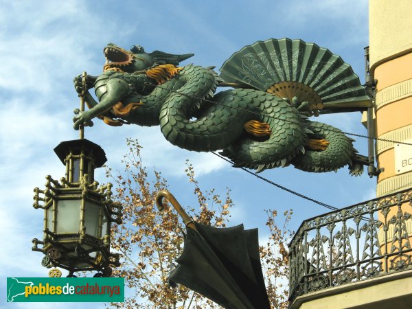
Barcelona's Art Déco Color Palette 2 - The Umbrella's House


The Bruno Cuadras House is situated in Barcelona, in the well known Ramblas. It was built in 1858 and rebuilt between 1883 -1895 by architect Josep Vilaseca i Casanovas, whose  work is a textbook case of the evolution of late neo-Classicism into Modernisme, which took place in Catalan Architecture towards the end of the 19th century.

This house was known by common people as the Umbrella's House, because of it's decoration, and it's façade is classified as being Eclectic. It had clear Egyptian influences coming from the interest that had awakened towards Oriental Culture and Countries these days in the neighbour France after Napoleon's Expedition to Egypt.  This interest was reinforced by the links existing between the city of Barcelona and Mr. Ferdinand de Lesseps, the constructor of the Suez Channel.

As Mr. Vilaseca experienced Modernism in his last days, I take the risk to classify the color palette I extracted from the photo (shot by myself), under the label of Modernist or Art Déco. What I know about Color in Catalan Modernist buildings makes me confident that I'm in good direction. I hope you enjoy it as much as I do.

One more curiosity for you: there used to be an elegant boutique in the ground level of the building in old days. Don't you guess what it was devoted to? To fashionable umbrellas, of course!  And to hand fans, so used these days by ladies to fight against heat . If you ever happen to visit Barcelona, don't miss the dragon's  sculpture hanging in the corner of the Umbrella's House. You will love it!