Showing posts with label designers. Show all posts

Wednesday, November 27, 2013

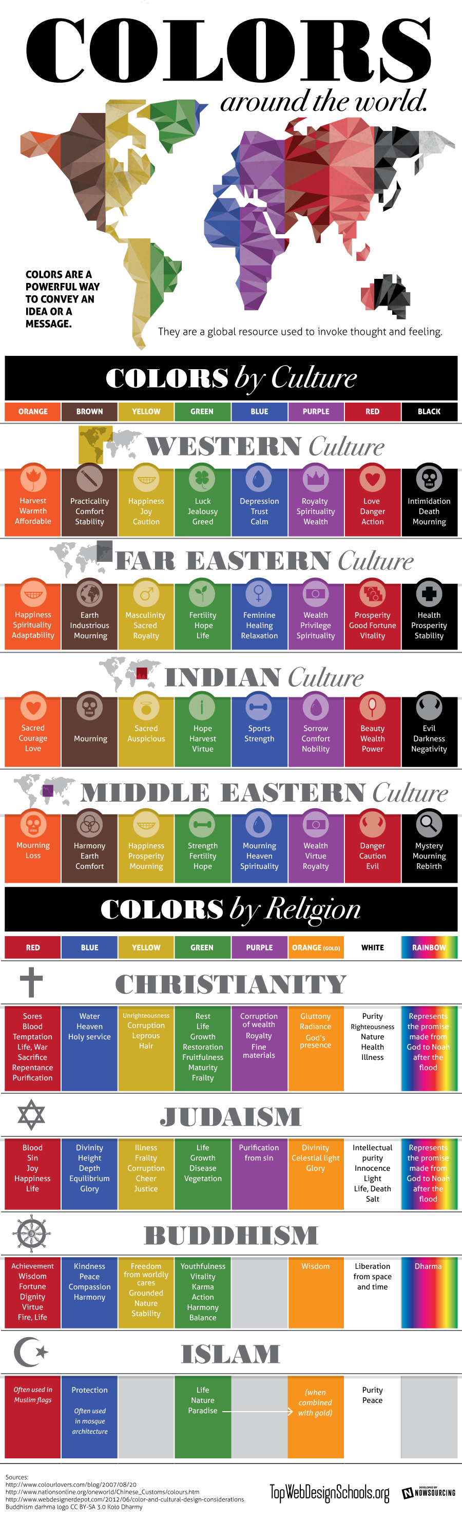
Colours by Culture, an infographic.

Shared today in Google+ by Lori Sawaya, from The Land of Color, I picked this interesting infographic which showcases prefectly how colours have different meanings according to different cultures. This should be carefully taken in account for designers and corporations when creating new products, specially when dealing with clients that come from a culture other than ours. The image comes from Top Web Design Schools. Enjoy! 


Colors by Culture

Isabel de Yzaguirre,
La Colorista

Saturday, June 2, 2012

Pantone Plus Colour Series creation.

It's very interesting to see how Pantone's Colour Series are created and what designers and people  involved in the process say about that. How useful is colour and how it helps to have them well defined and organized. How colour conveys feelings and a meaning, and how it helps in the design process, from fashion to graphic, to product, to interiors and so on. This is about the new Pantone Plus Series, with new PastelsNeons and Metallics. Enjoy!


Colour is a universal language. 
Are you afraid of it? I can help you!

Sunday, May 20, 2012

2012 Kips Bay Show House in New York

As Lawrence Karol explains in an article featured in Houzz, top New York designers have transformed two 6,000-square-foot two-storey apartments for the Kips Bay Decorator House. The Show has payed tribute to the legendary Decorator Albert Hadley and is full of Color  everywhere!

Go and see yourself in the showcased slideshow. Enjoy!

Sunday, April 24, 2011

Barcelona's Art Déco Palette 1


With this one, I begin a sequence of posts on the colours from Barcelona.At the same time that  I try to capture hues, I will explain a few things, in few words, on the chosen places. 

Today I'm leading you to the Modernist or Art-Decó colour palette shown in one of the Houses that were constructed in Parc Güell. Built from 1900 to 1914, the "Parc Güell" was the main work, and the most complete, from Antoni Gaudí, who was comissioned to construct a Park-City according to the model of the ones raised in England in the second half of the XIX th. century. Gaudí, who conceived his work as a closed and fenced residential area provided with all the necessary services, was helped by the also catalan architects Josep Mª Jujol and Joan Rubió i Bellver.

In this photo, correspondig to the so called "Rose House" where Gaudí lived for 20 years, you can observe one of the decorating techniques practiced in this period, called sgraffitto, -in the window borders and also in the façade. It was made scratching through a surface to reveal a lower layer of a contrasted colour. Here we have rich muted tones of rose and red together with sandy beige, which contrast with black in the forged-iron fence and a dark shade of green in the window's wooden blinds. If the day had been a sunny one, this bunch of colours would be enhanced by the bright blue of our Mediterranean sky. I'm sure you would love to visit this wonderful place.

More to come...

P.D. - In catalan we call "Modernisme" the period you know as Art-Déco and Art Noveau in English (I have come to observe that you call Modernism to what we know as Rationalism... Just to avoid misinterpreting!)

Monday, April 18, 2011

Mural project for a School's Yard

Busy as I was with my Colour for Your Home Consultant Certification at Sensationalcolor, I had given up writing in my blogs for an essential lack of time. Now that I have finished my Winter Class, here I am with a very special project I did in 2010-11. This is  a Mural Project to decorate a concret wall in a yard at the school  where I work, in Moià (Barcelona, SPAIN). I began it in summertime and delivered my work in January. I tried to capture the colours that we can find in nature in different yearly Seasons. Then I translated them into an imagined landscape that shows the Seasons in the same order in which we enjoy them at School, from September to June. From the left of the image to its right we go from Autumn to Summer. And from the bottom to the top of the wall are represented the colours from earth to sky, also according to the Seasons. Here is the final sketch:


This is the wall to be painted:


I picked colours from photos that I had shot in all the annual Seasons and I produced this first messy colour palette ( I have a bit more of phtoshop knowledge right now, but this is a little bit naïve and I love it, between us...) :


After that I translated colours to printable ones  in Pantone Solid Coated, and I arranged seasonal groups and a colour palette for every Season. I have used many colours -not all of them- in the final project. Here you are my Seasonal Colour Palettes:


Winter colour palette, La Colorista


Spring colour palette, La Colorista .

Summer colour palette, La Colorista


Autumn colour palette, La Colorista

As unluckily we are suffering a tough economical recession, our annual  School's budget has currently been reduced about a twenty per cent and we don't know when the mural will be painted. But pupils, parents and my peer teachers seem to love the project and want it done as it is. So I'm feeling happy!!! What else could I ask for?

My next goal is specialising in colour for Architectural Exteriors. Will it be possible for me to fly to USA in 2012? I'd love to!

Saturday, January 8, 2011

Colors of the Year 2011: which one you choose?

Citrus Yellow is one of the trendy colors this year 2011:


Chosen by multinational AzkoNobel, owner of prestigious paint  brands in many countries, as their Color 2011, it contrasts strongly with Pantone's proposed hue, Honeysuckle Pink. In one hand I must state I wouldn't dare to paint an accent wall with such a strong bold color.In the other, I think this pink can work very well in fashion:


I think also it can lighten  and enhance an Interior as a punch of color in some complements and make it look springlike:


Citrus yellow seems to work best for more extensive use in Interiors in its different hues, from buttery  to sherbet yellow, from canary yellow to the most bright and saturated hues of it.


Let's look at this kitchen as an instance. Published in Apartment Therapy Trends 2001 Report it shows yellow in an up-to-date design. Enlightened by white cabinetry and in a bold contrast with the rich brown of the wooden floor, it sems to dialogue by analogy with the peach orange color in the next room. Some punchs of green here and there balance the whole composition.


 In Fashion we can find all kind of clothings and complements in this warm and yet refreshing color:


Font
 With what I love best from all these I have made my own Trendy Palette 2011. Enjoy!

If you are in Catalonia and would love to update your Home's Color and Décoration, I'm here to help you.
Just contact me and let's talk!

Sunday, July 4, 2010

My Summer Palette 2010


Original image by courtesy from Hornbeck Design Partners

As everybody interested in design knows, Turquoise Blue was declared to be 2010 Colour by Pantone early in January. Surfing LinkedIn I  got acquainted with Jack Bredenfoerder , Design Director at Landor Associates, and could read three really interesting blog posts on Colour by him. There he talks about colour trends for this Summer and explains the meaning of Blue Hues. To luminous tropical Turquoise reminding of a possible escape to Paradise, Jack adds International Klein Blue, which according to him "relates to people’s search for a global, let’s-work-together unifying color" and "represents not only the environmental challenges we must solve together but also the social and political ones".He suggests also  White, "which reflects a desire to simplify and clear the palette in an uncertain economy",Warm golden yellows, "which are linked to a desire for the stability of a new gold standard", and tropical colours as sunset purples and hot hibiscus reds.

 Interior of Danish summer house by LASC Studio

After reading his proposal, and having learnt that Colour Trends are set about three years in advance, I've made my own reflection on which ones I love for Summer, not only because of trends but looking at our Mediterranean colour traditions. There we have white in seashore houses' walls, and blue, green and even red for wooden doors and windows treatment since immemorial times... And of course browns for furnishings or floors. We only need some touch of colour here and maybe an accent wall there to enlighten a cool and relaxing ambient. Seeing this beautiful photo from Hornbeck Design Partners, a California based Interior Design Studio, I realized that in natural entourage we can find all  these colours in perfect harmony.That ensures the durability of my proposal, which I have made extracting the colours in the palette from those in the picture.

My choice is much of white, with some notes of blue maybe combining a range of them in some walls. Add natural browns in  floor treatments and furniture, and then some colour accents that will make the ambient warm. Do it in cushions, windows treatment, art and whatever you enjoy, from bright yellow to orange or leaves' green and ending in purples.This will make a relaxing but warm place to enjoy your summer season.

Turquoise, green and creamy hues indoors.
Colour accent with bunchs of flowers.

Kitchen treatment, from jenjhoner blog and published in
House of Turquoise.

Outdoors come indoors in flowing harmony
Published in House of Turquoise.


Saturday, June 26, 2010

Bimbolles Series: Trissona footlamp


Trissona is a very special footlamp, a genuine design from Joan Sunyer "Moret". Those who are acquainted to him know that he has triplet nephews whom he adores. He was inspired  by them to design this lamp with three branches that are born of a common origin. And we named the lamp Trissona (Triplet) after  the triplet kids. It had to be  this way!


Trissona,  zenital view.

In the Exhibition at ES TALLER, Santanyí , when opening the Showroom and presenting the BimBolles Series, they were shown with lampshades customized by local artist "Mir a mà", very suitable for kids' ambients.

Lampshades customized by "Mir a mà"

Eventually here you are one of Trissona's constructive details. Joan Sunyer "Moret" , as the excellent designer and craftsman he is, takes extreme care of them.


Constructive detail of Trissona's foot, varnished iron tube on Santanyí's stone base.
Hope you enjoy!

Sunday, June 13, 2010

The meaning of colour in different Cultures


Since a year ago I've been learning about Social Media, positioning in Google and so. I've positioned myself in LinkedIn, in Twitter and I'm more and more present in Facebook. Being in that places has lead me to meet wonderful people and designers and to make some discoveries like the one I'm presenting today.
Interior Designers and Decorators have to handle with COLOUR daily, something I personally love. In Spain it is not usual for people to ask professional advice on this issue. COLOURS have different meanings according to DIVERSE CULTURES in our world, as you see in the pic above.This is something to be very careful about when attending a consultancy from a client belonging to a Culture other than the Designer's one.  I thank so much MODENUS, who published the pic in Twitter: this will be very useful for myself. And anybody who needs it, please use it!


Reading blogs in the net I've realized that colour marketing is something carefully planned. I'll be soon publishing my 2010 SUMMER PALETTE, according to tendencies but adapted to my taste and to Mediterranean countries. And long lasting.

Sunday, May 2, 2010

BimBolles: the beginning.


BimBolles lighitngs: first sketches.

Once upon a time  Joan  and Mariantònia had some rice paper lanterns and wished to do something new with them. They wished to design new linghtings by adding some value to this beautiful white spheres. Joan told me about that and I began sketching. That's how the BimBolles were born. Joan was pleased with my drawings and encouraged me to explore many possibilities -table lighting, cieling and wall lighting... He chose the ones that pleased him and developed them, or created new ones. He did the hard part: he worked on the prototypes and solved problems on them.


Bimbolles: a tree lighitng.

 On march 27th. 2010  ES TALLER JOAN MORET was launched at Santanyí (Mallorca, SPAIN) and our Bimbolles were presented to our friends and guests.They wore lanterns customized by four young local artists:  Catalina Obrador, Catalina Vidal Oliver -known as Mir a mà-, Gabriela Meunié and Guillem Vicens, all of them from Santanyí. We had also our dear Marina Ramos, from JiM.

The BimBolles series consists of different lights, all of them handicrafted at ES TALLER, where you can buy them on request. The first I'll show you is the smallest one, Ble.


Bimbolles lighting: Ble

With Santanyí stone foot and varnished tubular iron, Joan Sunyer "Moret"  designed the mechanism that lets the light to hold the lantern, as this was designed in origin to hang.
Ble, BimBolles lighting family.

Ble can be done in different heigths. So you can have two or three of them and play with  their sizes to decorate a room. Maybe one for your coffee table, another in that special corner you love...and you'll easily create a symphony that will lighten your home and make it worm.

Blens have a walk...

Ble are so joyfull and gentle and all together make such a happy familiy that I can only say: if you wish some light in your life have a Ble

Friday, April 23, 2010

Saint George's Day


I'm very pleased to launch my own blog devoted to design this april 23 rd. 2010, Saint George's Day. This is  a lovely day for me, even more since my son bears this name. I begin with an image gently sent by one of my correspondents, Avi Tomàs, a very special person.

This is no day for big words on presenting myself. I'll only tell you this blog will talk about design, interiors, colour and decoration. Saint George's rose reminds us about the beauty of flowers. Flowers can make a day so special, a corner so gorgeous or our workplace so gentle! They fill our life with their beauty. So spread flowers in your and others' lives and enjoy!