Showing posts with label Green. Show all posts

Tuesday, July 29, 2014

Trends 2014-16: Spring and Jungle Greens.

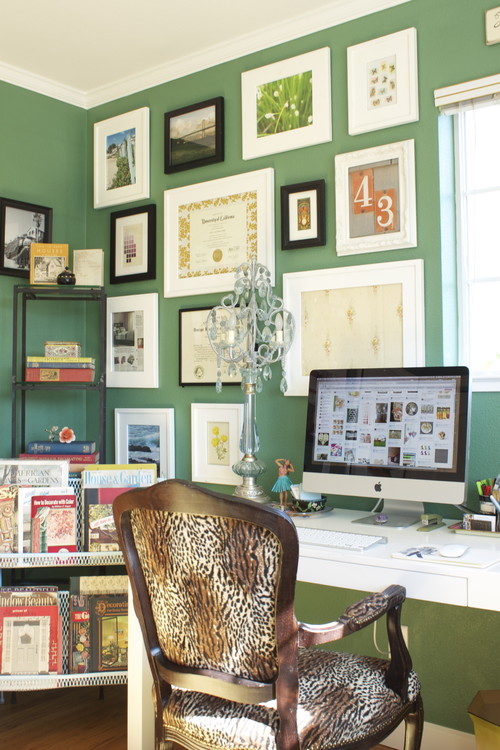
It seems we are going to see many greens in next Colour Seasons. They are presented either as Spring Greens either as Jungle Greens. No wonders about this choice, which seems to express our desire for green shades with a natural feel. We will see many of them in 2015 and 2016.
This trend celebrates Spring, specially with grass green.
TWO TONE CHAIR by Ichiro Iwasaki.
More tending towards olive is Pedrali's polycarbonate Blitz Chair:
Design by Claudio Dondoli and Marco Pocci.

Thursday, December 6, 2012

Emerald, 17-5641, Pantone's color of the Year 2013!!!

And in the end, the new baby is born!!!

We welcome PANTONE 17-5641 Emerald as the New color of the Year 2013. Remember what I said in a previous post, in October the 14 th.? Go to the end of it.I made my bet for Emerald or Grayed Jade. And I nailed it!!!


Before relating  to the official release, my own thoughts:

this election makes a lot of sense to me. This color is very close to that in the Tangerine and Orange tree leaves, and it marries well with previous Tangerine Tango, being it's complement. We go from the Red-Orange Family to the Blue-Green one. So, ladies having bought some Tangerine Tango clothings, don't worry at all! You can complement them with a beautiful Emerald item...


What does the Pantone's team say about this colour? An image is worth a thousand words:


Associated to the gemstone that bears this name, it's a sophisticated and luxurious color. Since antiquity, it has been the color of beauty of new life in many cultures and religions.


As the executive director of the Pantone Color Institute® Leatrice Eiseman says:

“Green is the most abundant hue in nature – the human eye sees more green than any other color in the spectrum.” 

"Symbolically, Emerald brings a sense of clarity, renewal and rejuvenation, which is so important in today’s complex world. This powerful and universally appealing tone translates easily to both fashion and home interiors.”

Since this is my main interest, how can we introduce this hue in Home Interiors?

Add some accents, accessories and paint in Emerald and you will rejuvenate your Home. This jewel-like hue will add a luxurious sense to any room in your home, and it will shine as an accent wall in your living-room.


Source: Thom Filicia, Via Houzz, Via Isabel in Pinterest


Source: Rikki Snyder © 2012 Houzz,  Via Isabel in Pinterest

Font

Bedding, pillows, bath towels and accessories in Emerald will  help you in creating a relaxed, soothing and energizing atpmosphere at the same time.


Via Isabel in Pinterest, from Houzz

"Lively. Radiant. Lush… A color of elegance and beauty                      
                        that enhances our sense of well-being, balance and harmony."


Welcome be this jewelled, luxurious and healthy hue!
Long Life to Emerald Green!!!

Isabel de Yzaguirre,
La Colorista.

Sunday, October 14, 2012

Which will be next Colour of the Year 2013?


The time has come when we begin to wonder about this question. And I have come back to think about that after reading Azkonobel’s Color Future’s 2013 and after finding an interesting post by Laura Bielecki reporting the predictions made by the prestigious trend forecaster Lidewij Edelkoort in a meeting in Design Days Dubai 2012.


While we don’t know about Pantone’s choice yet, AzkoNobel and its division Dulux have chosen Indigo as their colour of the Year 2013.


What qualities explain this election?

As they say, Indigo is associated with wisdom and honesty, and gives a sense of tranquility which is very restful. It’s a benevolent colour that has the trustworthy nature and elegance of blue at the same time.


 Font

Indigo is a rich and deep colour that, being scarcely accessible in our natural world, instills a sense of wonder and magic in us.


Within a colour palette, indigo is versatile and pairs well with brights of a similar saturation level, citrus, warmer neutrals and other blues, purples and greens.


Curiously, in her seminar in Dubai, Lidewij Edelkoort presented yellow as being the new pink in Interior Design, and that makes sense with its being the complement to the purple family. According to her predictions, yellow will make for vibrant and stimulating colour palettes, fabrics and fittings. And it will come with more staying power than Tangerine Tango, it seems.


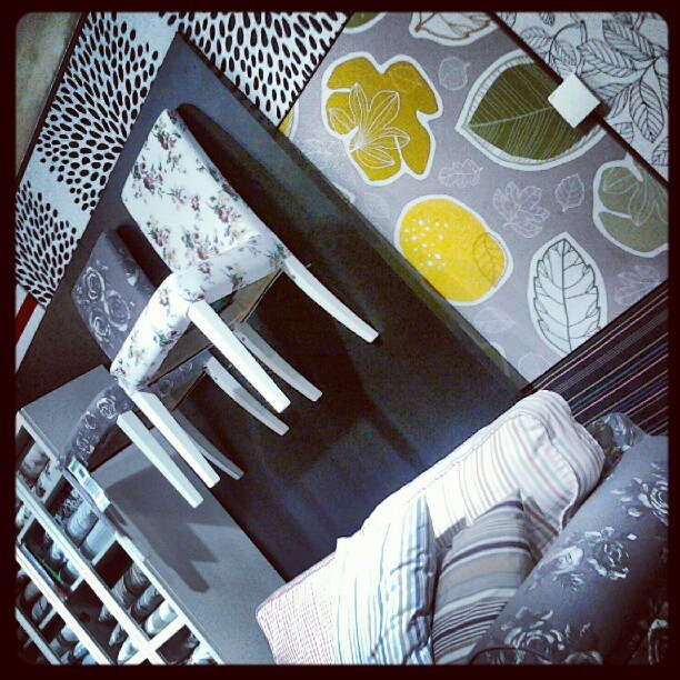
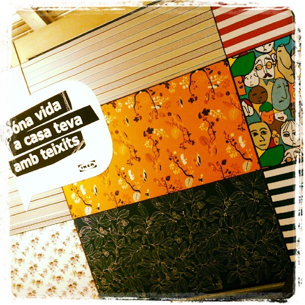
I can say that I have seen that trend for myself in Ikea Barcelona Autumn/Winter Textiles display yet. And yellow adds a vivid and hot accent that makes fabrics look wonderful!


And what about Pantone’s Color of the Year 2013?

Last year they published it in early December, so we won’t know for a while. But there are two colours that I have seen in their Fashion Reports and that have caught my attention. They are Emerald Green and Seafoam, or Grayed Jade, as they call it. If they are not the colour of the Year, I bet something they will be a hit. And they both combine well with blues, purples and yellow families.


While every Corporation publishes its Colour and Trends Forecasting, time will say which of them meet the costumer’s favor. But let me say that, from what I see when comparing Trends Forecasts, all of them are related and interconnected, with special accents to their market.

For me, an exciting Season of the Year has begun, that of Colour Future’s guessing!

Isabel de Yzaguirre,
La Colorista.

Monday, May 28, 2012

Moià's Architectural Colours (1).

Moià is a small village 50 Km. away from Barcelona, right in Catalonia's countryside. This is where I live. I haven't been doing my colour palettes for a while and I was truly missing that. A few days ago I went to the Medical Center and I could capture this image from there. I have a project in mind. It is about studying the colours of this place, both in landscape and in architecture. I'd love to do the same with some places in Catalonia, and I have a specific idea about Barcelona's Art Déco colour palettes. Time to time.

What did I love from this image? The citrus yellow in the old small house against the blue mediterranean sky. I could extract this olive green which pairs well with yellow and yellowish white. Together with pastel and sky blue and dark blue, they make a happy, luminous and well balanced colour palette. I'd love to gather my own collection of colours!
Enjoy!

Friday, January 6, 2012

The three Holy Kings.

In Spain, children aren't' given their presents in Christmas day, they are in Kings' Day. That is in the mornig of the 6th. of January. This has to do with the influence of Catholic Church in our country, in past days. As the Three Magic Kings are said to have taken presents of Gold, Incense and Myrrh to the newborn Jesus, children are given presents this day, provided they have been good in the preceeding year.Children write a letter to the Kings and ask for what they would love to be given.


And in the night of January the 5th., all children and their parents go to welcome the Three Magic Kings who visit their town to accomplish their so important mission. And so have done again today in the small village where I live.


Someone even was wearing white Angel wings... and a blue cap!


There is a tradition that belongs specifically to this place. While attending for the Kigs to arrive, parents and children light fires that burn big bunches of dried lavender. I think in old days this was meant to guide the Three Kings to the village, with the help of the small flames shining in the night, and of the purifying odour of burning lavender.


Children also make and light paper lanterns, with the help of their parents.


This year, the Magic Kings' Caravan was open by an Angel in the first carriage.


Then, according to the tradition, came the White King, as children call him.


The Kings wear rich clothings, throw candies to children and wave hands! 


The White-haired King exhibited wintery blue and purple hues, together with white, black and sparkles of gold and red.

After him came the Blond King, wearing traditional Chirstmas colours: red, green and gold.


And in last but not least place, the Black King, by far the children's favourite since I have memory as a child.  And it's still the same today.


All children are wishing to talk to him and tell him they have been good enough to deserve their presents!


As you can see, all the Kings' robes and carriages' garments were in rich jewel tones, according to their rank. I'm willing to create some royal color palettes as soon as I can!

After welcoming the Three Kings, children go home and must go to sleep soon after dinner. If they are awake when the Kings go to visit them, might be they would not be given any presents! When I was a child my parents always left some dry bread and a bowl filled with water in the balcony, to feed the royal camels. I assumed that as the Kings were magicians, the camels could fly to a fourth flat and they could open the doors and come into all the houses. Once, I heard the camel's bells ringing... and was lucky enough to stay absolutely quiet in bed! At home there was always some sweet wine and biscuits for the Kings to eat and drink. Their's was a hard work: they had to visit all the children in the world in one only night to bring them their presents. It was fair to help them have a rest and get their strength back. And in the morning, the first thing we did was to check that camels had eaten bread and drunk water. Then, findig where the Kings had left our presents was a happy game!

Now that I'm a grown up, I love to go to welcome the Kings with my son. And this day, which means the closing of Christmas Season for us, still makes me feel joyful! 

Wednesday, October 5, 2011

Color Focus 2011, Autumn-Winter.

The year 2011 has seen Pale Blue, Chocolate and Olive pop, and Spring Greens are announced for Autumn-Winter 2011-2012. Gray and White go on as neutrals and Tangerine and Vintage Mustard Yellow will play the accents. Lilac will  complement emerging Pale Aubergine.


Pale blue has moved from accessories to large pieces of upholstered and treated furniture in 2011. Prominent in Maison & Objet 2011, it makes a perfect contrast to rich dark woods and to Chocolate, a rich and dramatic colour that has come for a re-visit in some Luxury Interiors.


WA Teppan - Sushi Bar Palmas (Santa Fe, Ciudad de México)


Nobis Hotel (Stockholm)

Flexible and seductive, Chocolate brings back a  retro message with a vibe to the 70's. It matches with  deep Midnight Blue and with Black,Turquoise and Aqua.


Pale blue has been seen in textiles and china and will have a strong presence for all 2011.


Ruche Sofa by Inga Sempe for Ligne Roset

Another popping colour in 2011, Olive, brings a touch of earth and a sense of tradition. It works well in interiors, matches both chocolate and blue and fits classic designs like Chesterfield sofas or armchairs with a retro feeling. This colour will go on in a paler shade in the Epiphany Trend from Mix, in Spring-Summer 2012, together with grays - that have been going on trend in  2011 as a symbol of understated elegance.


Aphrodite by by Tadao Hoshino for Ligne Roset


Gray will be seen from paint to soft furnishings, as shown above. And White, it remains a core colour for most furniture collections and provides the perfect finish for tableware.

Today tableware by Gianinni

We will see 70's nostalgic Tangerine for accents, as in this wonderful carpet by Serge Lesage:


For a warm and cozy accent, down to earth Vintage Mustard Yellow drives attention in 2012 Vanity  Trend by Mix Trends.See it in Patricia Urquiola's Bohemian design for Moroso, displayed in its rich upholstery:


It's been found as well in furniture...


... and in textiles:


To end this color  focus, lilac appears as a complement to emerging pale aubergine. It will provide a background to darker purples and will sweeten the colour palette in wallpapers, bed linen, fabrics and home accessories:


The Brocatto Papers, by Farrow&Ball.


Kazan, from Intuicion collection by Gastón y Daniela.

These are trends: maybe you love them, maybe not. If you are trying to find your own direction amongst this  sea of colors, contact me. I can help you!