Showing posts with label psychology. Show all posts

Sunday, December 16, 2012

A thank you from the heart, and my best wishes...

...to my 20.000 readers in English!!!

By the end of 2011 I reached 10.000 visits. And I have come to 20.000 pretty before the New Year and this means the visits to my blog have increased. I do appreciate the nice comments that some of my pro friends have left. And I have a deep feeling of gratitude for all of you, for your warm welcome. So let me say a big thank you and wish you all the best with this image of Christmas Decoration Colours that I shot some days ago.

La Colorista in Tumblr.

Let the light, the deep blue, turquoise, white and gold soothe and warm your hearts at the same time.
And may your Christmas Season be full of love, peace, prosperity and all kind of blessings!
Merry Chirstmas and Happy 2013!

Isabel de Yzaguirre,
La Colorista,

Sunday, November 4, 2012

How color can help a community: the Heidelberg project.

Today I found this interesting post in Houzz that shows how a Color and Art project has helped to save the Heildelberg and Elba street neighborhoods from being demolished. Making a turn to the CMG slogan, we can state that "Color helps".
How powerful a tool to help others!!!


I hope you enjoy it and remember that colour can help in Healthcare Design as well. Be happy!!!

Isabel de Yzaguirre,
La Colorista.

Thursday, August 9, 2012

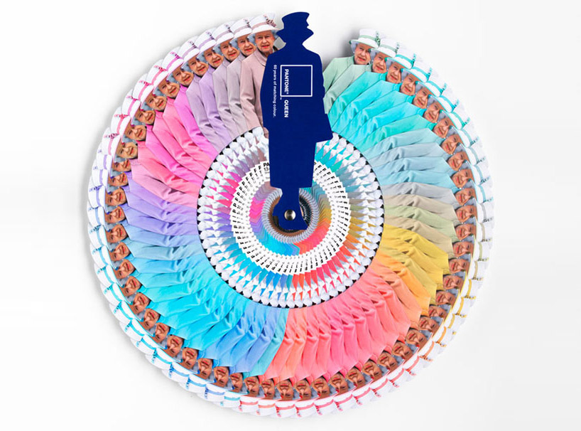
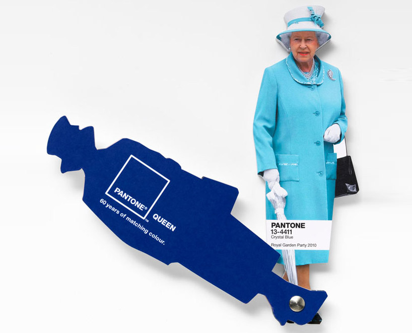
Interesting facts about Pantone Queen Colours Guide

I don't come to explain something new, since this has been in the press for a while. But I found this video so interesting that I thought I would share it with you. Here the different professionals involved in the creation and making of Pantone's Queen Guide explain how everything was done. I hope you enjoy it!


As you know, this was a commission to Leo Burnett London agency and the limited edition of this fan deck of course has been delivered by Pantone.


Designboom

On the other hand Vogue UK also followed the Queen colour choices for one year and made this beautiful chart. It turned out that she wore blue on 29% of her public appearances! Look at the different shades of blue, amazing! This can give you a slight idea on how important colour choices are...

Font

According to Apartment Therapy, Pantone hypothesized that Queen Elizabeth dresses monochromatically to make herself look taller. That makes sense, since cool colours tend to contract or recede visually. 

And remember Colour Psychology

As Kate Smith explains, blue -the colour of the oceans and the sky- is seen as trustworthy, dependable and committed. And this are the most desirable associations that a Queen would love to awaken to the citizens of her Kingdom! So, no wonder about this colour choice. This is the best proof about how COLOUR MATTERS.

So be wise, and if you need colour advice, come and ask for professional help. It will be my pleasure!

Sunday, April 29, 2012

On White.


I have recently created some Colour Ideabooks in my Houzz profile, to collect beautiful images gathered by Colour families. Today I'll begin showcasing White.

Traditionally used in neutral colour schemes, the use of whites was a predominant trend  in the 20 th. Century, between the 50's and the 70's. Considered by some to represent purity and cleanliness  and thought to be an ideal background to colourful decorating items and effects by many Interior Designers, Colour Expert Frank Mahnke devoted a chapter to White in his book "Color and Light in man-made Environment". The Chapter's title was "The Case Against White". There Mahnke argues why, "on a psychological basis, white is sterile" and is not recommended in Hospitals and Old-age Institutions. It seems that we humans need sensory variety in our homes and this can be introduced with the help of colour and the use of texture and patterns (wallpapers, textiles). On the contrary, the predominance of white can become boring and tedious in the end.


There are other issues with white: in contrast with bold colours, it can lead to eye strain, as it requires  "extreme adaptative changes from light to dark".


Being highly light reflectant, too bright whites can cause a distressing glare. This is why, according to Mahnke, white should not be used as a predominant colour in Interiors:


On the other hand, Design Writer Linda O'Keefe has devoted a book to White in Design. There she states that "White has the ability to pull everything together in a way that is kind of seductive". A timeless colour, it endures Seasons and Trend changes and never dates. As she says "all begins and ends with white"...


What do you think on this Colour Trend?
And if I can help you in some way, please contact me!

Isabel de Yzaguirre,
La Colorista.