Showing posts with label AzkoNobel. Show all posts

Saturday, November 15, 2014

AkzoNobel's Color Trends for 2015

Since I'm blogging about AkzoNobel's 2015 Color Trends in my Spanish blog, I invite you to read about them there. Of course you have a Google Translator Gadget that will let you understand. I'm writing about this in 10Decoración as well, where I'm their Color Expert, of which I'm very happy.

But in case you want to have a quick view, watch this video and you'll get a close idea:


They are:

Sunday, November 2, 2014

COPPER ORANGE, AkzoNobel's 2015 Color of the Year!
As every year these days, AkzoNobel published their 2015 Colour of the Year, Copper Orange, which is defined as

¡SURPRISINGWARM – BEAUTIFUL!


A deep colour in an emerging spectrum of reds, pinks and oranges, it showcases a globally more optimistic trend.


According to the current protagonism of metallic hues in design, this colour reflects and summarizes the Trends identified for 2015 in this field. These are:
  • A warmer attitude and a desire for sharing.
  • Natural earthy colour palettes, from clay tones to sunlit yellow strokes.
  • And last but not least, skin tones that reflect human interaction and sepia hues from the past. 

Sunday, October 14, 2012

Which will be next Colour of the Year 2013?


The time has come when we begin to wonder about this question. And I have come back to think about that after reading Azkonobel’s Color Future’s 2013 and after finding an interesting post by Laura Bielecki reporting the predictions made by the prestigious trend forecaster Lidewij Edelkoort in a meeting in Design Days Dubai 2012.


While we don’t know about Pantone’s choice yet, AzkoNobel and its division Dulux have chosen Indigo as their colour of the Year 2013.


What qualities explain this election?

As they say, Indigo is associated with wisdom and honesty, and gives a sense of tranquility which is very restful. It’s a benevolent colour that has the trustworthy nature and elegance of blue at the same time.


 Font

Indigo is a rich and deep colour that, being scarcely accessible in our natural world, instills a sense of wonder and magic in us.


Within a colour palette, indigo is versatile and pairs well with brights of a similar saturation level, citrus, warmer neutrals and other blues, purples and greens.


Curiously, in her seminar in Dubai, Lidewij Edelkoort presented yellow as being the new pink in Interior Design, and that makes sense with its being the complement to the purple family. According to her predictions, yellow will make for vibrant and stimulating colour palettes, fabrics and fittings. And it will come with more staying power than Tangerine Tango, it seems.


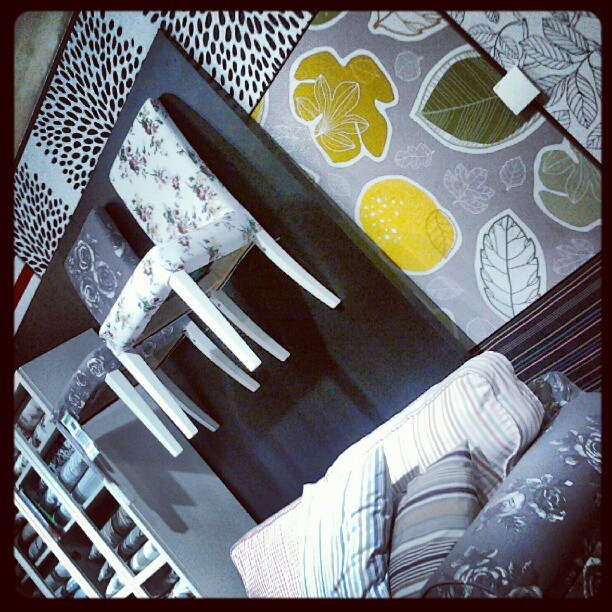
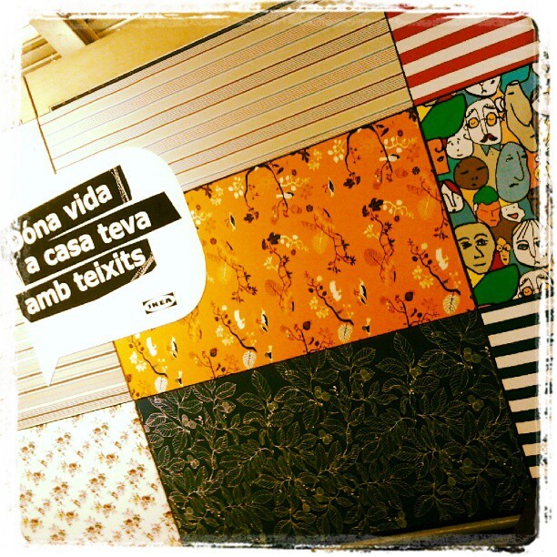
I can say that I have seen that trend for myself in Ikea Barcelona Autumn/Winter Textiles display yet. And yellow adds a vivid and hot accent that makes fabrics look wonderful!


And what about Pantone’s Color of the Year 2013?

Last year they published it in early December, so we won’t know for a while. But there are two colours that I have seen in their Fashion Reports and that have caught my attention. They are Emerald Green and Seafoam, or Grayed Jade, as they call it. If they are not the colour of the Year, I bet something they will be a hit. And they both combine well with blues, purples and yellow families.


While every Corporation publishes its Colour and Trends Forecasting, time will say which of them meet the costumer’s favor. But let me say that, from what I see when comparing Trends Forecasts, all of them are related and interconnected, with special accents to their market.

For me, an exciting Season of the Year has begun, that of Colour Future’s guessing!

Isabel de Yzaguirre,
La Colorista.

Thursday, December 8, 2011

TANGERINE TANGO, Pantone's color of the Year 2012!

Pantone today is announcing the new Color of the year 2012 and this is...

TANGERINE TANGO
Pantone 17-1463

“Reminiscent of the radiant shadings of a sunset, Tangerine Tango marries the vivaciousness and adrenaline rush of red with the friendliness and warmth of yellow, to form a high-visibility, magnetic hue that emanates heat and energy.” (Leatrice Eiseman)


According to Pantone "The 2011 color of the year, PANTONE 18-2120 Honeysuckle, encouraged us to face everyday troubles with verve and vigor. Tangerine Tango, a spirited reddish orange, continues to provide the energy boost we need to recharge and move forward."

It is known that Color Trends are set in advance, according to many events, and Color Forecast let us know where we are going to. So this is not magic, there are many professionals studying the market's evolution, people's and societies' trends. But I'm glad to see the info I released in early Autumn about AzkoNobel's Color of the Year 2012 was good. I also included Tangerine as an accent color for this Fall-Winter 2011-12  in my Color Focus 2011, Autumn-Winter, as shown below:


Carpet by Serge Lesage.

This Color reminds me as well  of Farrow & Ball Charlotte's Locks and of Phidias, the chosen by CMG (Color Marketing Group).

Fashion designers featured in the PANTONE Fashion Color Report Spring 2012, including Tommy Hilfiger, Nanette Lepore, Cynthia Steffe by Shaun Kearney, Elie Tahari and Adrienne Vittadini, are incorporating this attractive orange into their spring collections:


...accompained by...


A very interesting fact is that Pantone has partnered with Sephorathe leading beauty specialty retailer, to create an extraordinary collection that will change how consumers wear, feel and think about color.  SEPHORA + PANTONE UNIVERSE™ will deliver their Color forecasting in Spring 2012. To celebrate the launch, SEPHORA + PANTONE UNIVERSE proudly presents the first Color of the Year beauty collection.The limited edition collection features a variety of products including eye shadow, lipstick, lip gloss, nail polish and accessories, and will be available in Sephora Americas beginning March 2012.

As for Interiors, Pantone's proposal is to energize interior spaces with Tangerine Tango patterned home accessories like pillows, bedspreads and tabletop accessories. See carpet above! You can  incorporate Tangerine Tango appliances and personal electronics for an unexpected pop of color.


Are you willing to make your home more cheerful? Make it easy: "Paint a wall in Tangerine Tango for a dynamic burst of energy in the kitchen, entryway or hallway." And if you are not afraid, you can add it to your living room!


To be honest, I must state that orange, together with it's complementary, blue, are my favourite color combo. So I'm happy with what is coming for next year! Remember that Benjamin Moore have chosen a very pale blue for their Color of the Year 2012.


You can pair it perfectly with pops of orange for a moden look! Or a chic one.


Styleestate

If you need a redo in your Interiors and need some Color Help, contact me!

Tuesday, October 11, 2011

Charlotte's Locks Red by Farrow&Balls, their colour 2012?


I love this colour from Farrow&Ball!!!I received it in their Newsletter today and I can't stop watching it!
It reminds me of Juicy Ripe Berry Red, the Colour of the Year proposed by AzkoNobel  for 2012.

Farrow&Ball are highlighting this colour in their UK website and it's beautiful and suggestive name is Charlotte's Locks.The upper half of the image corresponds to this colour in Estate Emulsion and the lower part is the same colour in Full Gloss. This way, a striking, textured look is created and the high sheen gloss finish constrasts wonderfully with the chalky matt appearance of Estate Emulsion for an ultra contemporary feel


According to F&B, "Full Gloss offers an extremely robust and durable finish wherever it is used, inside or outside the home. Ideal for all interior and exterior woodwork and metal and available in 132 colours, its 95% sheen gives a striking finish." It suits front doors, furniture in a need of up-dating, walls and radiators.


I'm seeing lots of red announced everywhere.  For instance, CMG has chosen a red they have called Phidias as the 2012 color for Europe.It has something to do with Juicy Ripe Berry Red...


Or not?

I  had never thought of red in the way I do now. And you? Would you have red in your home?
If you  need any advice, just contact me. I'm here to help you!

Thursday, August 25, 2011

AzkoNobel's Colour for the year 2012, Juicy Ripe Berry Red.

As I said a couple of days ago, I have interesting news from AzkoNobel's Color Futures 2012. And here it goes. Colour of the year 2012 proposed by this Company is:


Juicy  Ripe Berry Red!


This  lively and radiant colour is at once whimsical and serious,dynamic and soft, and in such a changing period of history reminds us not to look for simple solutions.


It evolves from paler tints of colours of previous years into something more confident to warm our hearts for 2012. I feel  we need that in such a troubled days we all are living!


"Within a palette of hues, red allows contrasting one colour, another to recede. Or it brightens a cool quality in the next one. It can change the game in an instant!"


A powerful mood modifier,red is held in high regard around the world for its many symbolic purposes. In China it is associated with good fortune; in India signals marital bliss... In many Western societies is the colour of passion, power and festivity. Children prefer it clearly and we grown-ups admire those who dare to wear red in public. It conveys value and meaning and is also used to alert us to danger.


The KEY WORDS for the Red Family proposed by AzkoNobel are: BERRY, RIPE, ROMANTIC, EDIBLE.

It's KEY COLOUR is defined as " a deep-warm blush of pinkish, tropical red with a subtle hint of peach and a misty aspect... Quite a chameleon: reassuring or edgy, solft or bright, depending on what it is paired with."


Red's transition

"The intense fiery quality of 2011's red is toned down by a misty, dusky veil, making the new red slightly more enigmatic and versatile".


I can't but relate it to Pantone's 2011 Honeysuckle Pink  and think about it as a logical evolution. Pantone has not published it's chosen Colour 2012 but will do soon, I guess. In the meanwhile, I admit I fell in love with this Berry Red at first glance!

If you need to consult any question related to Color, feel free to contact me :)

NOTE: All the images shown here have been extracted from AzkoNobel's Color Futures 2012, linked at the beginning of this post. And written information has been quoted from there, sometimes literally, sometimes interpreted under my judgement. Therefore, original images and information belong to AzkoNobel. And this Blog Post remains propriety of the Blog's Author. You can quote and reproduce, only please recognize and be gentle to link back here! Thank you :)!