Showing posts with label 2012. Show all posts

Monday, April 1, 2013

A project come true: The Four Seasons Mural for a School's yard.

Whoever has followed me since three years ago maybe remembers a  post on a Mural Project for Josep Orriols i Roca School's yard. The School is located in Moià (Barcelona, SPAIN).

I published the project for the first time when I had been working on it for about nine month, and I had serious doubts about its being  painted because of economical crisis in Spain. But luckily parents were very willing to see it done, and to let their sons and daughters have a more colourful School, no matter what it might cost. They organized events to collect money and provided all the colours that I had specified, whith the sponsoring of our local Paints Store. 


Today I can say the mural has come to life and am offering a view of the whole process until its completion.

The initial goal was to have some of the concrete walls of the yard decorated, and we chose the one in the sight: 


La Colorista, 2010.

My project aimed at representing the colours in the natural landscapes around our village all along the Four Seasons of the Year, in the same order that we experience them since the School Term begins: from Fall to Summer. Colours were picked from photographs shot in Moià's surroundings, and the proposed design was this one:


The Four Seasons' Mural, Isabel de Yzaguirre Maura
(La Colorista),2011.

Sunday, December 30, 2012

25 most bookmarked Colourful Homes in Houzz 2012!

I've found this collection of 25 most bookmarked Colourful Homes 2012 in Houzz and really enjoyed the collection. Of course I love some more than others, but all of them are a good example of how color can help to make you feel better in your home. Which ones do you prefer?

As for 2013, I guess blues and greens are going to be on spot...

Wednesday, December 26, 2012

Dutch decorating for the Holidays.

Being in Houzz is great, since I can surf looking for wonderful articles like the one I post today, about how they decorate doors in Christmas Season in the Netherlands.

With some natural elements like pine branches and cones, and dried orange's slices, they make wonderful wreaths like the shown in the slideshow. Silver decoration and white elements embellish brick façades and make them look happy, soft and elegant, without being over-decorated. Merry Christmas Season to everybody!


Isabel de  Yzaguirre,
La Colorista.


Sunday, December 16, 2012

A thank you from the heart, and my best wishes...

...to my 20.000 readers in English!!!

By the end of 2011 I reached 10.000 visits. And I have come to 20.000 pretty before the New Year and this means the visits to my blog have increased. I do appreciate the nice comments that some of my pro friends have left. And I have a deep feeling of gratitude for all of you, for your warm welcome. So let me say a big thank you and wish you all the best with this image of Christmas Decoration Colours that I shot some days ago.

La Colorista in Tumblr.

Let the light, the deep blue, turquoise, white and gold soothe and warm your hearts at the same time.
And may your Christmas Season be full of love, peace, prosperity and all kind of blessings!
Merry Chirstmas and Happy 2013!

Isabel de Yzaguirre,
La Colorista,

Saturday, December 8, 2012

Tiffany's Christmas Window Displays in Barcelona

Yesterday I went to Barcelona and had a walk along Passeig the Gràcia, where you can find some well known Luxury Brands like Chanel, Loewe and many more. 

Since I signed up for Instagram and Tumblr, I have become used to chase images of things I love with my mobile device. It's light, it's easy and it helps networking.I love  chasing colors, and I love chasing Window Displays, since you can learn a lot from them. I confess I didn't know we have a Tiffany&Co in Barcelona, and I was amazed at their Christmas Window Display

Tiffany Barcelona
by IdY (Isabel de Yzaguirre), La Colorista.

They are like a window into a home, where someone has prepared a wonderful present wrapped in, what else could it be? A wonderful Tiffany Blue wrapping paper.

Tiffany Barcelona
by IdY (Isabel de Yzaguirre), La Colorista.

I learnt from haft2, that Richard Moore is the Visual Merchandiser who has designed this beautiful displays. According to him, each window ”reveals a glimpse into the precious moments families celebrate during the holiday season, with love and romance.”As long as I could see yesterday, they have diplayed the same concept in Barcelona, and I love it!

Tiffany Barcelona
by IdY (Isabel de Yzaguirre), La Colorista.

This precious displays remember me of the Catalan tradition of building diorama in Christmas. And what is a diorama? According to  www.dictionary.com "it is 1.a scene, often in miniature, reproduced in three dimensions by placing objects, figures, etc., in front of a painted background. 2.a life-size display representing a scene from nature, a historical event, or the like, using stuffed wildlife, wax figures, real objects, etc., in front of a painted or photographed background. 3.a spectacular picture, partly translucent, for exhibition through an aperture, made more realistic by various illuminating devices. 4.a building or room, often circular, for exhibiting such a scene or picture, esp. as a continuous unit along or against the walls."

Tiffany Barcelona
by IdY (Isabel de Yzaguirre), La Colorista.

We use to reproduce scenes from the Bible and the birth of Jesus in the Christmas Season. Every artisan makes his or her own dioram and we celebrate Exhibits and Contests. And we love to go to watch the wonderful small sceneries made with all kind of details. I wonder if the Tiffany team did know about that?

Tiffany Barcelona
by IdY (Isabel de Yzaguirre), La Colorista.
My son is the best jewel!

I never thought a blue could be so warm as Tiffany's. I find it a precious hue for Christmas, and I confess I crave for Tiffany Blue. Not for diamonds, but yes for something bearing this jewelled color.

Merry Christmas Season to everybody!
With Love from

Isabel de Yzaguirre,
La Colorista.

Monday, November 19, 2012

A year with Tangerine Tango...

The current year is coming to its end and in a few days Pantone will announce their Colour of the Year 2013.Tangerine Tango  was a surprising choice that enlivened our life in 2012. The Orange family is usually  looked at with much controversy: you love it or you hate it, it's something experts know. Personally I love it for it's optimism and energy, not so strong as red, but still very warm.

Yesterday I was looking at the best Tangerine Tango photos published in Pantone's blog and I collected my favorites in  the Interior Design field. And I'm bringing this anthology to you as my humble homage to this happy hue before it's kingdom comes to an end and we forget about it.


How did Tangerine Tango help us?


Infusing life in a sophisticated neutral room...


In beautiful textiles married with white, yellow-green and green hues.


Combined with bright hues in Folk textiles and ambients.


Being the accent to its complementary.


Creating a sensuous atmosphere in a room.


In a contemporay home.


From the 60's? In Antiques.


In this neutral contemporary home, tangerine makes the sofa's corner a cozy one.


In intimate and warm lighting.


Even in the patio!


In furniture.


More textiles, photo by Leslie Williams.

My wishes are that this year with Tangerine Tango may have made us more daring with colour.That may we have good memories of this passionate hue. And that may you have enjoyed this selection I made for you 

Isabel de Yzaguirre, 
La Colorista.

Thursday, August 9, 2012

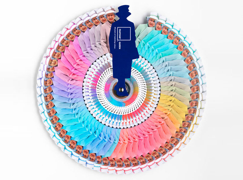
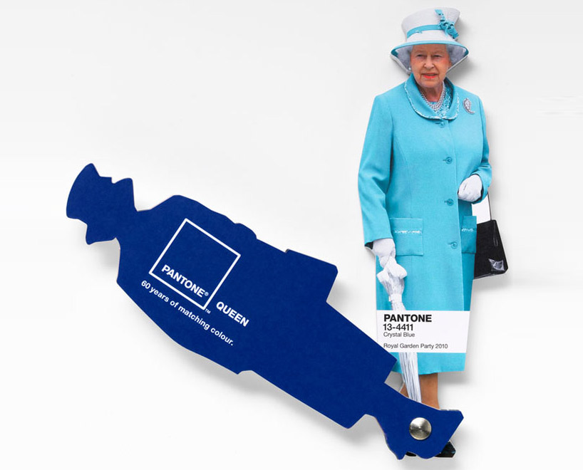
Interesting facts about Pantone Queen Colours Guide

I don't come to explain something new, since this has been in the press for a while. But I found this video so interesting that I thought I would share it with you. Here the different professionals involved in the creation and making of Pantone's Queen Guide explain how everything was done. I hope you enjoy it!


As you know, this was a commission to Leo Burnett London agency and the limited edition of this fan deck of course has been delivered by Pantone.


Designboom

On the other hand Vogue UK also followed the Queen colour choices for one year and made this beautiful chart. It turned out that she wore blue on 29% of her public appearances! Look at the different shades of blue, amazing! This can give you a slight idea on how important colour choices are...

Font

According to Apartment Therapy, Pantone hypothesized that Queen Elizabeth dresses monochromatically to make herself look taller. That makes sense, since cool colours tend to contract or recede visually. 

And remember Colour Psychology

As Kate Smith explains, blue -the colour of the oceans and the sky- is seen as trustworthy, dependable and committed. And this are the most desirable associations that a Queen would love to awaken to the citizens of her Kingdom! So, no wonder about this colour choice. This is the best proof about how COLOUR MATTERS.

So be wise, and if you need colour advice, come and ask for professional help. It will be my pleasure!

Saturday, July 28, 2012

Furniture and Product Trends 2013, Maison & Objet.

Product and furniture of the near future are presented in this video by  Trendease. Here you will find  2012-13 Trends as seen in Maison&Objet early this year.Translation to English provided. Enjoy!

Sunday, May 20, 2012

2012 Kips Bay Show House in New York

As Lawrence Karol explains in an article featured in Houzz, top New York designers have transformed two 6,000-square-foot two-storey apartments for the Kips Bay Decorator House. The Show has payed tribute to the legendary Decorator Albert Hadley and is full of Color  everywhere!

Go and see yourself in the showcased slideshow. Enjoy!

Monday, February 20, 2012

AzkoNobel's 2012 Color Trends

Color Futures Via YouTube

In this video AzkoNobel's Color Futures features their four 2012 Color Trends, which are:

  • Delicate Mix: about elegant, refined, understated, subtle, luxurious.
  • One Small Seed: about new life, healthy, precious, fragile.
  • Living Scrapbook: about life, collecting, narrating, sharing...
  • Rediscovered Heroes: about legacy of the past, industrial, robust, revitalized, appreciated.
To develop further in future posts.

Friday, January 20, 2012

Celebration!

I'm feeling so happy, I have something to celebrate! This blog devoted to Colour has reached 10.000 visits this week!


I want to celebrate with friends and visitors. Which could be the best way to? A colourful one, maybe?


Let's send colourful inviting cards...


... dress up in a colourful way!

Jessica Colaluca via Pinterest


Arrange a warm welcoming ambient...


...prepare food with the colours of the rainbow...


...serve colourful drinks...


... have colourful candies...


And let's have specially a sweet Coloured Anniversary Cake!
Which of these do you like best?


All of them wear colours I love. Which are your favorite colours?
If you want to, I can help you to choose Colour, just contact me!

Wednesday, December 28, 2011

The year of La Colorista.

If I look backwards, this has been a busy year! 

I had decided to go back to Art Classes in 2010, and there I explored color with Mrs. Marina Berdalet, and I went on in 2011. Those were Happy Days!

Liliums, by Isabel.

I begun doing digital Colour Paletes, just because I liked to. I thank Jaume Orriols for his Photoshop classes. Also  Joan Sunyer Moret, for teaching me some pro tricks and for his conceptual and technical help with my La Colorista logos and card. And Hornbeck Design Partners were so kind to let me use their Monterrey photograph for my now Insignia Palette:

Monterrey Palette.

I wanted to learn Color Consultancy in a more scientific way that I had been taught at the Art School. There are no such studies in Spain and I looked for Online Classes. The one that looked the best was by Sensational Color. I wasn't disappointed at all. I earned my Color for Your Home Consultant Certification with Color Expert Kate Smith. She was and excellent teacher and now is a friend!


In the last days of 2010 I had bought the domain lacolorista.es and very shyly opened a Facebook bizz Page. Now it has 218 followers! To all of you, many, many thanks!!!

I have  gone on publishing my blog in three languages, and this means writing three blogs in one. My English one is the more read and has lead me a lot of traffic -don't forget, I'm a small fish... I have gone from about 3000 visits in the beginning of 2011 to nearly 9000 today. I could never have imagined that. So, to all that have come here to read my posts, or maybe just to have a look at them, many thanks for spending part of your time here!!!

I have tried to do things in my way and have explored trends as well. And my 2011 more read posts have been:

466 visualizations

426 visualizations.


358 visualizations.


And the Winning Award goes to:

586 visualizations until this moment.


Maybe this will seem not much to some, but I had never dreamed of being read by so much people!


To end this yearly review, I designed my logo and card and am launching my service locally.I had Joan Moret's help as mentioned above. But I have a special thank you for Color Expert Teresa Tullio, who kindly offered some free ideas from which my current logo was bornt.

And I have made many wonderful Color Friends. So what else could I ask for? 

Just one thing: please, come back in 2012!!!
Happy New Year to all!!!

Monday, December 12, 2011

Some trends for 2012

I thank you Fiona Jenvey, CEO at Mudpie, for sharing this interesting presentation about Trends for 2012.

JWT 10 Trends for 2012 Executive Summary
View more presentations from JWTIntelligence

And if you are interested in Consumer Trends, you have a 12 Crucial Consumer Trends for 2012 Inform at Trendwatching.com

Thursday, December 8, 2011

TANGERINE TANGO, Pantone's color of the Year 2012!

Pantone today is announcing the new Color of the year 2012 and this is...

TANGERINE TANGO
Pantone 17-1463

“Reminiscent of the radiant shadings of a sunset, Tangerine Tango marries the vivaciousness and adrenaline rush of red with the friendliness and warmth of yellow, to form a high-visibility, magnetic hue that emanates heat and energy.” (Leatrice Eiseman)


According to Pantone "The 2011 color of the year, PANTONE 18-2120 Honeysuckle, encouraged us to face everyday troubles with verve and vigor. Tangerine Tango, a spirited reddish orange, continues to provide the energy boost we need to recharge and move forward."

It is known that Color Trends are set in advance, according to many events, and Color Forecast let us know where we are going to. So this is not magic, there are many professionals studying the market's evolution, people's and societies' trends. But I'm glad to see the info I released in early Autumn about AzkoNobel's Color of the Year 2012 was good. I also included Tangerine as an accent color for this Fall-Winter 2011-12  in my Color Focus 2011, Autumn-Winter, as shown below:


Carpet by Serge Lesage.

This Color reminds me as well  of Farrow & Ball Charlotte's Locks and of Phidias, the chosen by CMG (Color Marketing Group).

Fashion designers featured in the PANTONE Fashion Color Report Spring 2012, including Tommy Hilfiger, Nanette Lepore, Cynthia Steffe by Shaun Kearney, Elie Tahari and Adrienne Vittadini, are incorporating this attractive orange into their spring collections:


...accompained by...


A very interesting fact is that Pantone has partnered with Sephorathe leading beauty specialty retailer, to create an extraordinary collection that will change how consumers wear, feel and think about color.  SEPHORA + PANTONE UNIVERSE™ will deliver their Color forecasting in Spring 2012. To celebrate the launch, SEPHORA + PANTONE UNIVERSE proudly presents the first Color of the Year beauty collection.The limited edition collection features a variety of products including eye shadow, lipstick, lip gloss, nail polish and accessories, and will be available in Sephora Americas beginning March 2012.

As for Interiors, Pantone's proposal is to energize interior spaces with Tangerine Tango patterned home accessories like pillows, bedspreads and tabletop accessories. See carpet above! You can  incorporate Tangerine Tango appliances and personal electronics for an unexpected pop of color.


Are you willing to make your home more cheerful? Make it easy: "Paint a wall in Tangerine Tango for a dynamic burst of energy in the kitchen, entryway or hallway." And if you are not afraid, you can add it to your living room!


To be honest, I must state that orange, together with it's complementary, blue, are my favourite color combo. So I'm happy with what is coming for next year! Remember that Benjamin Moore have chosen a very pale blue for their Color of the Year 2012.


You can pair it perfectly with pops of orange for a moden look! Or a chic one.


Styleestate

If you need a redo in your Interiors and need some Color Help, contact me!