Showing posts with label colors. Show all posts

Saturday, October 4, 2014

Christian Dior Spring/Sumer 2015

Dear readers of mine:

I have found this fabulous  video of the presentation that Christian Dior made of his Spring/Summer Fashion proposals, and just had to share it with you!
Pay atention to colour and style, there is something for everybody, even me, who am 57. I would wear some of these outfits undoubtedly!
Enjoy them!


Isabel de Yzaguirre, 
La Colorista.

Wednesday, November 27, 2013

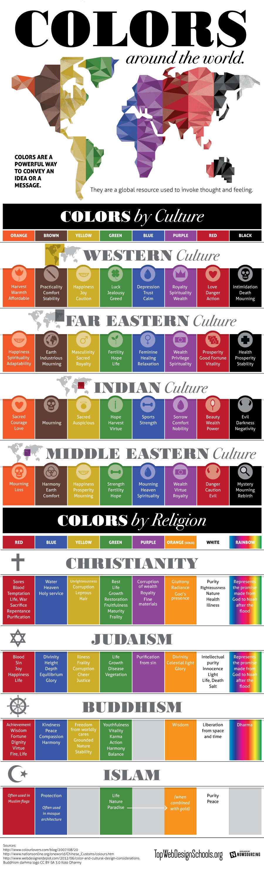
Colours by Culture, an infographic.

Shared today in Google+ by Lori Sawaya, from The Land of Color, I picked this interesting infographic which showcases prefectly how colours have different meanings according to different cultures. This should be carefully taken in account for designers and corporations when creating new products, specially when dealing with clients that come from a culture other than ours. The image comes from Top Web Design Schools. Enjoy! 


Colors by Culture

Isabel de Yzaguirre,
La Colorista

Saturday, May 11, 2013

Vividly Colored Chairs: guest post by Mari from Arcadian Home

About a year ago, I published a guest post on "Decorating with Floral Art",by Arcadian Home. Today I'm very pleased to host AH again with a post on Vividly Colored Chairs, which suits perfectly my love of Color!
Isabel de Yzaguirre,
La Colorista.

Hello, lovely readers! 
I'm from Arcadian Home blog which is a wonderful place for home decor inspirations. There you will find lots of great creative ideas for everything from decorative trays to big wall art and much more. Today, we're going to talk about one of my favorite pieces of furniture. I love all things related to home interiors, but chairs are at the top of my list of furniture obsessions. I am especially fond of colorful chairs, so that's what this little visual tour is all about. Please enjoy! Thanks for letting me stop by to share. ~ Mari 

Monday, April 1, 2013

A project come true: The Four Seasons Mural for a School's yard.

Whoever has followed me since three years ago maybe remembers a  post on a Mural Project for Josep Orriols i Roca School's yard. The School is located in Moià (Barcelona, SPAIN).

I published the project for the first time when I had been working on it for about nine month, and I had serious doubts about its being  painted because of economical crisis in Spain. But luckily parents were very willing to see it done, and to let their sons and daughters have a more colourful School, no matter what it might cost. They organized events to collect money and provided all the colours that I had specified, whith the sponsoring of our local Paints Store. 


Today I can say the mural has come to life and am offering a view of the whole process until its completion.

The initial goal was to have some of the concrete walls of the yard decorated, and we chose the one in the sight: 


La Colorista, 2010.

My project aimed at representing the colours in the natural landscapes around our village all along the Four Seasons of the Year, in the same order that we experience them since the School Term begins: from Fall to Summer. Colours were picked from photographs shot in Moià's surroundings, and the proposed design was this one:


The Four Seasons' Mural, Isabel de Yzaguirre Maura
(La Colorista),2011.

Wednesday, December 26, 2012

Dutch decorating for the Holidays.

Being in Houzz is great, since I can surf looking for wonderful articles like the one I post today, about how they decorate doors in Christmas Season in the Netherlands.

With some natural elements like pine branches and cones, and dried orange's slices, they make wonderful wreaths like the shown in the slideshow. Silver decoration and white elements embellish brick façades and make them look happy, soft and elegant, without being over-decorated. Merry Christmas Season to everybody!


Isabel de  Yzaguirre,
La Colorista.


Sunday, December 16, 2012

A thank you from the heart, and my best wishes...

...to my 20.000 readers in English!!!

By the end of 2011 I reached 10.000 visits. And I have come to 20.000 pretty before the New Year and this means the visits to my blog have increased. I do appreciate the nice comments that some of my pro friends have left. And I have a deep feeling of gratitude for all of you, for your warm welcome. So let me say a big thank you and wish you all the best with this image of Christmas Decoration Colours that I shot some days ago.

La Colorista in Tumblr.

Let the light, the deep blue, turquoise, white and gold soothe and warm your hearts at the same time.
And may your Christmas Season be full of love, peace, prosperity and all kind of blessings!
Merry Chirstmas and Happy 2013!

Isabel de Yzaguirre,
La Colorista,

Saturday, December 8, 2012

Tiffany's Christmas Window Displays in Barcelona

Yesterday I went to Barcelona and had a walk along Passeig the Gràcia, where you can find some well known Luxury Brands like Chanel, Loewe and many more. 

Since I signed up for Instagram and Tumblr, I have become used to chase images of things I love with my mobile device. It's light, it's easy and it helps networking.I love  chasing colors, and I love chasing Window Displays, since you can learn a lot from them. I confess I didn't know we have a Tiffany&Co in Barcelona, and I was amazed at their Christmas Window Display

Tiffany Barcelona
by IdY (Isabel de Yzaguirre), La Colorista.

They are like a window into a home, where someone has prepared a wonderful present wrapped in, what else could it be? A wonderful Tiffany Blue wrapping paper.

Tiffany Barcelona
by IdY (Isabel de Yzaguirre), La Colorista.

I learnt from haft2, that Richard Moore is the Visual Merchandiser who has designed this beautiful displays. According to him, each window ”reveals a glimpse into the precious moments families celebrate during the holiday season, with love and romance.”As long as I could see yesterday, they have diplayed the same concept in Barcelona, and I love it!

Tiffany Barcelona
by IdY (Isabel de Yzaguirre), La Colorista.

This precious displays remember me of the Catalan tradition of building diorama in Christmas. And what is a diorama? According to  www.dictionary.com "it is 1.a scene, often in miniature, reproduced in three dimensions by placing objects, figures, etc., in front of a painted background. 2.a life-size display representing a scene from nature, a historical event, or the like, using stuffed wildlife, wax figures, real objects, etc., in front of a painted or photographed background. 3.a spectacular picture, partly translucent, for exhibition through an aperture, made more realistic by various illuminating devices. 4.a building or room, often circular, for exhibiting such a scene or picture, esp. as a continuous unit along or against the walls."

Tiffany Barcelona
by IdY (Isabel de Yzaguirre), La Colorista.

We use to reproduce scenes from the Bible and the birth of Jesus in the Christmas Season. Every artisan makes his or her own dioram and we celebrate Exhibits and Contests. And we love to go to watch the wonderful small sceneries made with all kind of details. I wonder if the Tiffany team did know about that?

Tiffany Barcelona
by IdY (Isabel de Yzaguirre), La Colorista.
My son is the best jewel!

I never thought a blue could be so warm as Tiffany's. I find it a precious hue for Christmas, and I confess I crave for Tiffany Blue. Not for diamonds, but yes for something bearing this jewelled color.

Merry Christmas Season to everybody!
With Love from

Isabel de Yzaguirre,
La Colorista.

Saturday, November 17, 2012

Dance with Color!

Thanks to the many sites I vist in the net while looking for Color and Design news, I found this beautiful video. Not Tango music, but wonderful as well as the chorepgraphy. Dance with color and Enjoy!


Isabel de Yzaguirre, 
La Colorista

Sunday, November 11, 2012

Christmas Decoration in all the rainbow colours.

It's a little bit early, but it's never too early to prepare your Christmas decoration, and I found a collection of wonderful ideas in Houzz this week. They have thought even of countries celebrating Christmas in summertime!


Houzz

You will find ideas in all kind of colours, not only white, red and green. And I hope you will find  something that will fit your personal taste. Enjoy!

Isabel de Yzaguirre,
La Colorista.

Thursday, August 9, 2012

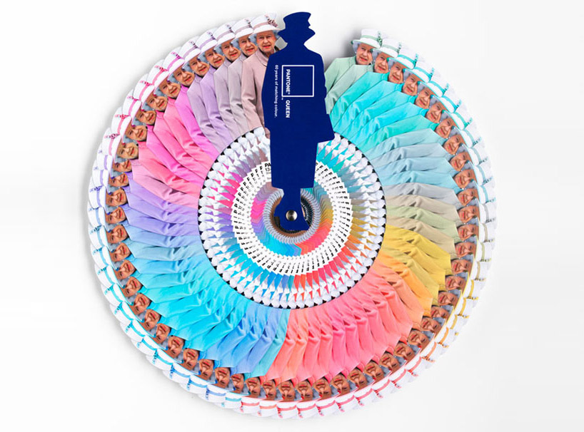
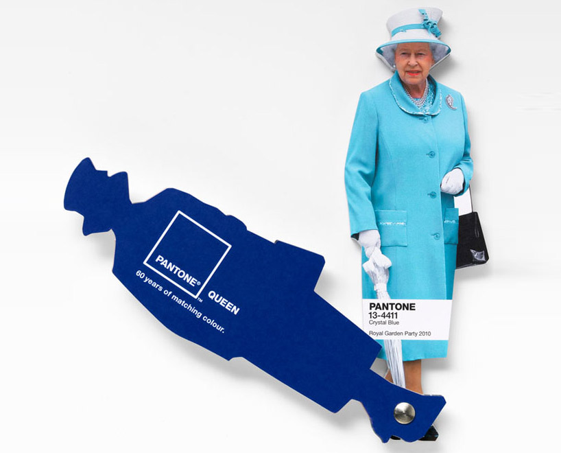
Interesting facts about Pantone Queen Colours Guide

I don't come to explain something new, since this has been in the press for a while. But I found this video so interesting that I thought I would share it with you. Here the different professionals involved in the creation and making of Pantone's Queen Guide explain how everything was done. I hope you enjoy it!


As you know, this was a commission to Leo Burnett London agency and the limited edition of this fan deck of course has been delivered by Pantone.


Designboom

On the other hand Vogue UK also followed the Queen colour choices for one year and made this beautiful chart. It turned out that she wore blue on 29% of her public appearances! Look at the different shades of blue, amazing! This can give you a slight idea on how important colour choices are...

Font

According to Apartment Therapy, Pantone hypothesized that Queen Elizabeth dresses monochromatically to make herself look taller. That makes sense, since cool colours tend to contract or recede visually. 

And remember Colour Psychology

As Kate Smith explains, blue -the colour of the oceans and the sky- is seen as trustworthy, dependable and committed. And this are the most desirable associations that a Queen would love to awaken to the citizens of her Kingdom! So, no wonder about this colour choice. This is the best proof about how COLOUR MATTERS.

So be wise, and if you need colour advice, come and ask for professional help. It will be my pleasure!

Saturday, April 7, 2012

"Mona de Pasqua", an Easter's Catalan Traditional Cake.

Today I want to present a Catalan Easter's Tradition to my international friends. It is a sweet and colourful one. It's about a cake we call "Mona de Pasqua", Easter Mona. The traditional one looks like this:


It is a sweet cake that was eaten togehter with boiled eggs, chocolate and a kind of dried pork sausage that we call "llonganissa". The name comes from "munus", which in ancient greek meant "Present". Or maybe from the arab word "munna", which means "food for the mouth". The Mona is known by its name since the XV th. century. It meant the end of the fasting period previous to Easter.

Un parrain offrant une mona à son filleul. Vers 1865-1866.


This evolved to the current Mona, which can be made with butter,candied fruits and chocolate. And it is usually decorated with colourful feathers and yellow chiks.


This tradition is specifical to Catalonia and Valencia. There, the Godfather  or the Granpa used to give the Mona as a present to Godsons  and Goddaughters or to Grandchildren on Easter's Day. And it was eaten as a dessert on Monday's Easter familie's celebrations. 

The Egg seams to be a symbol of the Resurrection of  the Earth in Spring. It is found from Catalonia to England to Ukraine. And we can relate it with the tradition of Easter Eggs in Northern Europe and USA.


Isn't this a sweet tradition? I hope you will love to know about it as much as we do.
By the way,I hope a resurrection of colours in Spring.!
Happy Easter to everybody!!!


Isabel de Yzaguirre,
La Colorista.

Friday, January 20, 2012

Celebration!

I'm feeling so happy, I have something to celebrate! This blog devoted to Colour has reached 10.000 visits this week!


I want to celebrate with friends and visitors. Which could be the best way to? A colourful one, maybe?


Let's send colourful inviting cards...


... dress up in a colourful way!

Jessica Colaluca via Pinterest


Arrange a warm welcoming ambient...


...prepare food with the colours of the rainbow...


...serve colourful drinks...


... have colourful candies...


And let's have specially a sweet Coloured Anniversary Cake!
Which of these do you like best?


All of them wear colours I love. Which are your favorite colours?
If you want to, I can help you to choose Colour, just contact me!

Thursday, August 25, 2011

AzkoNobel's Colour for the year 2012, Juicy Ripe Berry Red.

As I said a couple of days ago, I have interesting news from AzkoNobel's Color Futures 2012. And here it goes. Colour of the year 2012 proposed by this Company is:


Juicy  Ripe Berry Red!


This  lively and radiant colour is at once whimsical and serious,dynamic and soft, and in such a changing period of history reminds us not to look for simple solutions.


It evolves from paler tints of colours of previous years into something more confident to warm our hearts for 2012. I feel  we need that in such a troubled days we all are living!


"Within a palette of hues, red allows contrasting one colour, another to recede. Or it brightens a cool quality in the next one. It can change the game in an instant!"


A powerful mood modifier,red is held in high regard around the world for its many symbolic purposes. In China it is associated with good fortune; in India signals marital bliss... In many Western societies is the colour of passion, power and festivity. Children prefer it clearly and we grown-ups admire those who dare to wear red in public. It conveys value and meaning and is also used to alert us to danger.


The KEY WORDS for the Red Family proposed by AzkoNobel are: BERRY, RIPE, ROMANTIC, EDIBLE.

It's KEY COLOUR is defined as " a deep-warm blush of pinkish, tropical red with a subtle hint of peach and a misty aspect... Quite a chameleon: reassuring or edgy, solft or bright, depending on what it is paired with."


Red's transition

"The intense fiery quality of 2011's red is toned down by a misty, dusky veil, making the new red slightly more enigmatic and versatile".


I can't but relate it to Pantone's 2011 Honeysuckle Pink  and think about it as a logical evolution. Pantone has not published it's chosen Colour 2012 but will do soon, I guess. In the meanwhile, I admit I fell in love with this Berry Red at first glance!

If you need to consult any question related to Color, feel free to contact me :)

NOTE: All the images shown here have been extracted from AzkoNobel's Color Futures 2012, linked at the beginning of this post. And written information has been quoted from there, sometimes literally, sometimes interpreted under my judgement. Therefore, original images and information belong to AzkoNobel. And this Blog Post remains propriety of the Blog's Author. You can quote and reproduce, only please recognize and be gentle to link back here! Thank you :)!

Saturday, August 20, 2011

Focal Art: Vitaly Geyman, Photographer.

I've mentioned before how thanks to the net I have become acquainted to wonderful people. This is how I met Vitaly Geyman, by the way.


Vitaly is an internationally published and licensed artist, devoted to photography.Born in the Ukraine, Vitaly spent the first twelve years of his life in Kiev, a colorful and culturally rich city replete with old cathedrals and large oak trees. At the age of twelve his parents decided to leave what was then the U.S.S.R, as political refugees. After spending time in Italy they immigrated to Australia where Vitaly spent his formative years. The beauty and vastness of Australia touched his heart and it is where he began his love affair with nature. However, it was not until his move to the United States in 2003 that he began to fully immerse himself in the art of photography.


It is Vitaly's belief that "great photographic art transports us into another dimension". His artistic journey is an ongoing exploration of the beauty, simplicity and wisdom of nature.Vitaly’s soulful, dreamlike fine art photography would suit perfectly any place you'd love to accent in your home, business or office.


I have chosen some of the prints he offers in Gliclee Art Prints from Art Prints America to show here. From his Flower  Prints this Sun Flower. Wouldn't it glow in a child's room, for instance?


Wouldn't that make a beautiful contrast with some kind of burgundy or wine red? I even would match it with a wider colour palette, a very whimsical one!

Clic on photos to enlarge and better appreciate colour palettes.

This is only one of many  possibilities...  Paler yellow and blues, more subdued reds and terracota or earth brown would work well here.


From the  Fall Leaves Gallery this is one of my favourites, a color feast for one's eyes! What colour palette will glorify  it? Let's see...


These richer and more subdued hues would make the Art Print pop-up and create a sophisticated look for a room. The rest of elements, should coordinate with these. Bright red is the exception -II'd keep it for an accent.


Vitaly publishes White and Black photos on different themes. Among them, I have  chosen this gorgeous Magnolia Duet.


If you want to create a contemporary sophisticated look with White and Black Art, go for a dynamic palette that combines black and white with grays and a rich jewel hue  like one of these:


I have a strong preference for flowers, but you can find other Nature related themes in Art Prints America. You can create awsome focal points with Tree Bark Art Prints and you have Fall and Winter Art, together with Ocean and Waterfall Giclee Artprints.

In the following video, Vitaly explains what Giclee Art Prints are and why they are better quality ones:


And here he gives some valuable tips to shoot beautiful Botanical photos. I hope you enjoy them!


If you are willing to create a wonderful focal wall in your home, office, commercial or healthcare and need some help, feel free to contact me!

(Information provided by Art Prints America, to whom I'm not affiliated but yes very thankful for their letting me to create Color Palettes with their Giclee Art Prints.)

Friday, August 5, 2011

Mediterranean coastal architectural colour plaettes 1

This week I went to visit  Vilassar de Mar, a catalan coastal village. I've always been in love with our seashore resorts, I'm fond of their old summer villas and their colours. About a year ago I did something I was wishing to since long time ago. And I did it with the guidance of who has become my paint teacher, Mrs. Marina Berdalet. I dived into the Color World.


I also learned how to create Color Moods for Interior Design with Kate Smith. And thanks to my contacting many Color Consultants worldwide, I  came to discover how Architectural Color for Exteriors is so well worked out in other countries.

Back to my trip to Vilassar, I was fascinated by a collection of old beautifully painted villas raised in the late years of XIX th. century.  Lucky that I had my Android, for I hadn't thought of taking my cam! I shot plenty of photos, pretty enough to begin writing a series of posts on Architectural Color in Catalan coastal villages . Colours here are warm and luminous as our Mediterranean sea...

I will begin with this building, known as  Ca l'Amat, designed by an unknown architect.


Isabel de Yzaguirre, 2011.

As you can see in the archs and can be checked in Wikipedia, this is a XIX th. century building, a historicist one, that mimics arab style. Sgraffitto and ceramic tiles are their more outstanding decorative characteristics.


Isabel de Yzaguirre, 2011

We can see them around doors and windows. Their richness and chromaticity bring the memory of the broad heritage arabs left in Spain many centuries ago.


Isabel de Yzaguirre, 2011.

This is the rich colour palette that was used in this villa's façade: 

Colour palette by La Colorista

This palette has some luminous colours and some muted ones. They are typical in the Catalan Seashore villages and  were most used in the end of  the XIX th. and beginning of the XX th. centuries. They were usual in the period that we know as Modernisme Català, .

I will go on extracting colour palettes and will do a post about some fascinating doors and windows I saw, even if they are not straightly related with colour. Here is one of them, aside of which I left a testimonial of my visit to Vilassar.


IdY, La Colorista.

If you need an improvement or redo in you Architectural Colours, feel free to contact me. I will be happy to help you!

Sunday, April 24, 2011

Barcelona's Art Déco Palette 1


With this one, I begin a sequence of posts on the colours from Barcelona.At the same time that  I try to capture hues, I will explain a few things, in few words, on the chosen places. 

Today I'm leading you to the Modernist or Art-Decó colour palette shown in one of the Houses that were constructed in Parc Güell. Built from 1900 to 1914, the "Parc Güell" was the main work, and the most complete, from Antoni Gaudí, who was comissioned to construct a Park-City according to the model of the ones raised in England in the second half of the XIX th. century. Gaudí, who conceived his work as a closed and fenced residential area provided with all the necessary services, was helped by the also catalan architects Josep Mª Jujol and Joan Rubió i Bellver.

In this photo, correspondig to the so called "Rose House" where Gaudí lived for 20 years, you can observe one of the decorating techniques practiced in this period, called sgraffitto, -in the window borders and also in the façade. It was made scratching through a surface to reveal a lower layer of a contrasted colour. Here we have rich muted tones of rose and red together with sandy beige, which contrast with black in the forged-iron fence and a dark shade of green in the window's wooden blinds. If the day had been a sunny one, this bunch of colours would be enhanced by the bright blue of our Mediterranean sky. I'm sure you would love to visit this wonderful place.

More to come...

P.D. - In catalan we call "Modernisme" the period you know as Art-Déco and Art Noveau in English (I have come to observe that you call Modernism to what we know as Rationalism... Just to avoid misinterpreting!)

Tuesday, November 23, 2010

Autumn Tableware Palette

Autumn Tableware Palette

A few time ago I was asked for my friend designer Joan Moret to create a Color Palette for a Seasonal Tableware in Murano Compatible Glass. I made some investigation and through Ceramist Matoko Araki knew of the japanese tradition to change the Tableware according to the Season of the year. In Japan people have special names for the hues of leaves in the Fall Season and I searched for some inspirational images from there.And these are the colors I selected from the pictures. I imagined how they would look in the precious materials that were supposed to be employed to make an Autumn Tableware and I just loved them!

I made an attempt to draw and paint some plates and dishes, with the help of Photshop and this palette, though not being an expert, and they looked like this:


It was a funny exercise to test some possible combinations to do. As you see, I'm not a real Tableware designer, but I enjoyed triying. I even did a Winter Tableware Palette, but I will show when the White Season begins.