Showing posts with label Barcelona. Show all posts

Saturday, August 29, 2015

News and Projects with Marta Aymerich and some changes in La Colorista®

This year I haven't written much in this blog, and this isn't good at all, at least for marketing oneself... But summer vacation is a good time for keeping in touch and here I go!

Today I'm presenting my good friend  Marta Aymerich, from Marta Aymerich Emotional Comunication. She is a great designer, from head to toe: her designs are fresh, clean and contemporary and so is she!  

Kate Smith  put us in touch in 2011, and from that day a good friendship has been growing between the two of us. Currently we are collaborating in very encouraging projects  and I want to present her to you:


Marta&Isabel
Image by Humberto Pérez Padilla, ARTIST.

Saturday, January 3, 2015

Happy Year 2015!

May it be a Colourful one for you!
Best wishes!!!

isabel de Yzaguirre
La Colorista®

Sunday, September 28, 2014

My comment on Color Trends World's Forecast 2016 to be revealed at CMG International Summit.

A few days ago, CMG announced the reveal of their World's Color Forecast for 2016, which will be presented in depth at their International Summit next November. If you're interested, gather information here. But if you want a sneak a peek of it, here it goes, and my comparison with what I have been observing about Colour Trends in the net recently. This is the announced World's 2016 Color Palette:


Source, CMG.

Monday, December 23, 2013

Merry Christmas and a Happy 2014!!!!

With the best wishes of love, peace, health and prosperity for everybody from

Isabel de Yzaguirre,
La Colorista.


Friday, July 12, 2013

Colour Trends in the first half of the year.

According to what Tamsin Kingswell says in Mix Trends Newsletter, which  I'm subscribed to, the Summer is a good time to make an overview of colour trends as seen in the first half of the year.In Tamsin's words, "So far we’ve noticed metallics broadening out to include all things shiny (much on show at DMY), a romance with clear materials or those with just a hint of a tint and our love affair with green going ever deeper into the forest with a lovely, almost Loden-like shade. And we still don’t seem to have shaken off the collective passion for pastels and neons although at Mix our enthusiasm is waning fast. Instead we are waiting for a move towards darker, more sober colours that counterbalance all that candyfloss knocking about at the moment. "

From what I've seen in the streets here in the small Barcelona's area village where I live, I can confirm the love of pastels and neons among people, together with emerald green and floral colors such as pink, red and sunny yellow.


Cal Gavi, Moià (Barcelona).
Photo credits and colour  palette by
(c)-Isabel de Yzaguirre Maura, 2013.
www.lacolorista.com

Saturday, May 11, 2013

Vividly Colored Chairs: guest post by Mari from Arcadian Home

About a year ago, I published a guest post on "Decorating with Floral Art",by Arcadian Home. Today I'm very pleased to host AH again with a post on Vividly Colored Chairs, which suits perfectly my love of Color!
Isabel de Yzaguirre,
La Colorista.

Hello, lovely readers! 
I'm from Arcadian Home blog which is a wonderful place for home decor inspirations. There you will find lots of great creative ideas for everything from decorative trays to big wall art and much more. Today, we're going to talk about one of my favorite pieces of furniture. I love all things related to home interiors, but chairs are at the top of my list of furniture obsessions. I am especially fond of colorful chairs, so that's what this little visual tour is all about. Please enjoy! Thanks for letting me stop by to share. ~ Mari 

Sunday, December 30, 2012

25 most bookmarked Colourful Homes in Houzz 2012!

I've found this collection of 25 most bookmarked Colourful Homes 2012 in Houzz and really enjoyed the collection. Of course I love some more than others, but all of them are a good example of how color can help to make you feel better in your home. Which ones do you prefer?

As for 2013, I guess blues and greens are going to be on spot...

Saturday, December 8, 2012

Tiffany's Christmas Window Displays in Barcelona

Yesterday I went to Barcelona and had a walk along Passeig the Gràcia, where you can find some well known Luxury Brands like Chanel, Loewe and many more. 

Since I signed up for Instagram and Tumblr, I have become used to chase images of things I love with my mobile device. It's light, it's easy and it helps networking.I love  chasing colors, and I love chasing Window Displays, since you can learn a lot from them. I confess I didn't know we have a Tiffany&Co in Barcelona, and I was amazed at their Christmas Window Display

Tiffany Barcelona
by IdY (Isabel de Yzaguirre), La Colorista.

They are like a window into a home, where someone has prepared a wonderful present wrapped in, what else could it be? A wonderful Tiffany Blue wrapping paper.

Tiffany Barcelona
by IdY (Isabel de Yzaguirre), La Colorista.

I learnt from haft2, that Richard Moore is the Visual Merchandiser who has designed this beautiful displays. According to him, each window ”reveals a glimpse into the precious moments families celebrate during the holiday season, with love and romance.”As long as I could see yesterday, they have diplayed the same concept in Barcelona, and I love it!

Tiffany Barcelona
by IdY (Isabel de Yzaguirre), La Colorista.

This precious displays remember me of the Catalan tradition of building diorama in Christmas. And what is a diorama? According to  www.dictionary.com "it is 1.a scene, often in miniature, reproduced in three dimensions by placing objects, figures, etc., in front of a painted background. 2.a life-size display representing a scene from nature, a historical event, or the like, using stuffed wildlife, wax figures, real objects, etc., in front of a painted or photographed background. 3.a spectacular picture, partly translucent, for exhibition through an aperture, made more realistic by various illuminating devices. 4.a building or room, often circular, for exhibiting such a scene or picture, esp. as a continuous unit along or against the walls."

Tiffany Barcelona
by IdY (Isabel de Yzaguirre), La Colorista.

We use to reproduce scenes from the Bible and the birth of Jesus in the Christmas Season. Every artisan makes his or her own dioram and we celebrate Exhibits and Contests. And we love to go to watch the wonderful small sceneries made with all kind of details. I wonder if the Tiffany team did know about that?

Tiffany Barcelona
by IdY (Isabel de Yzaguirre), La Colorista.
My son is the best jewel!

I never thought a blue could be so warm as Tiffany's. I find it a precious hue for Christmas, and I confess I crave for Tiffany Blue. Not for diamonds, but yes for something bearing this jewelled color.

Merry Christmas Season to everybody!
With Love from

Isabel de Yzaguirre,
La Colorista.

Sunday, October 14, 2012

Which will be next Colour of the Year 2013?


The time has come when we begin to wonder about this question. And I have come back to think about that after reading Azkonobel’s Color Future’s 2013 and after finding an interesting post by Laura Bielecki reporting the predictions made by the prestigious trend forecaster Lidewij Edelkoort in a meeting in Design Days Dubai 2012.


While we don’t know about Pantone’s choice yet, AzkoNobel and its division Dulux have chosen Indigo as their colour of the Year 2013.


What qualities explain this election?

As they say, Indigo is associated with wisdom and honesty, and gives a sense of tranquility which is very restful. It’s a benevolent colour that has the trustworthy nature and elegance of blue at the same time.


 Font

Indigo is a rich and deep colour that, being scarcely accessible in our natural world, instills a sense of wonder and magic in us.


Within a colour palette, indigo is versatile and pairs well with brights of a similar saturation level, citrus, warmer neutrals and other blues, purples and greens.


Curiously, in her seminar in Dubai, Lidewij Edelkoort presented yellow as being the new pink in Interior Design, and that makes sense with its being the complement to the purple family. According to her predictions, yellow will make for vibrant and stimulating colour palettes, fabrics and fittings. And it will come with more staying power than Tangerine Tango, it seems.


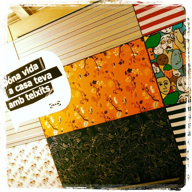
I can say that I have seen that trend for myself in Ikea Barcelona Autumn/Winter Textiles display yet. And yellow adds a vivid and hot accent that makes fabrics look wonderful!


And what about Pantone’s Color of the Year 2013?

Last year they published it in early December, so we won’t know for a while. But there are two colours that I have seen in their Fashion Reports and that have caught my attention. They are Emerald Green and Seafoam, or Grayed Jade, as they call it. If they are not the colour of the Year, I bet something they will be a hit. And they both combine well with blues, purples and yellow families.


While every Corporation publishes its Colour and Trends Forecasting, time will say which of them meet the costumer’s favor. But let me say that, from what I see when comparing Trends Forecasts, all of them are related and interconnected, with special accents to their market.

For me, an exciting Season of the Year has begun, that of Colour Future’s guessing!

Isabel de Yzaguirre,
La Colorista.

Saturday, April 7, 2012

"Mona de Pasqua", an Easter's Catalan Traditional Cake.

Today I want to present a Catalan Easter's Tradition to my international friends. It is a sweet and colourful one. It's about a cake we call "Mona de Pasqua", Easter Mona. The traditional one looks like this:


It is a sweet cake that was eaten togehter with boiled eggs, chocolate and a kind of dried pork sausage that we call "llonganissa". The name comes from "munus", which in ancient greek meant "Present". Or maybe from the arab word "munna", which means "food for the mouth". The Mona is known by its name since the XV th. century. It meant the end of the fasting period previous to Easter.

Un parrain offrant une mona à son filleul. Vers 1865-1866.


This evolved to the current Mona, which can be made with butter,candied fruits and chocolate. And it is usually decorated with colourful feathers and yellow chiks.


This tradition is specifical to Catalonia and Valencia. There, the Godfather  or the Granpa used to give the Mona as a present to Godsons  and Goddaughters or to Grandchildren on Easter's Day. And it was eaten as a dessert on Monday's Easter familie's celebrations. 

The Egg seams to be a symbol of the Resurrection of  the Earth in Spring. It is found from Catalonia to England to Ukraine. And we can relate it with the tradition of Easter Eggs in Northern Europe and USA.


Isn't this a sweet tradition? I hope you will love to know about it as much as we do.
By the way,I hope a resurrection of colours in Spring.!
Happy Easter to everybody!!!


Isabel de Yzaguirre,
La Colorista.

Saturday, February 11, 2012

Guest blog by Joanna from Design Shuffle: Wonderfully Colorful Walls!

Hi! I’m Joanna, a writer for Design Shuffle, a terrific site featuring everything interior design. On the site you can find the latest designs from prominent designers and up-to-the minute news on the interiors industry. I LOVE my work. I get to spend my time searching the Internet and shelter mags for the most beautiful interior designs and bring them together to share on blogs like La Colorista. Thanks for letting me share today!
If you’re not faint of heart when it comes to wearing or decorating with bright colors, then you know the joy of a boldly hued outfit or interior space. I especially love color, but have a hard time committing to just one. That isn’t a problem for the designers of the rooms below. They went all out when choosing colors that pop for their walls.

  Colorful Walls

A wall doesn’t have to be a solid color to be bold and bright. This wall has all the colors of the rainbow and becomes a cohesive burst of wonderful color.

  Colorful Walls

An accent wall in a modern home office acts as a decorative entrance to a master bedroom.

  Colorful Walls

This dining room (from the same home as above) is full of character and personality with its red and purple
accents.

  Colorful Walls

All pretty in pink, this bedroom design wears the color beautifully. This would be a lovely room to awaken to every morning, don’t you think?

  Colorful Walls

This fun retro room full of 60s charm would be a blast to hang out in with its comfy, stylish seating and brilliant colors.

. Colorful Walls

Mum’s the word in this pretty corner spot. I love the pink velvet chaise and the dramatic black chandelier.

  Colorful Walls

This room may seem as if it is shouting, “look at me!” but I find it dramatic and chic. Does it inspire any ideas for your bedroom design, den design, or any other part of your home?

  Colorful Walls

Honeysuckle and silver cover a bold wall over a daybed. The silhouette adds personality along with rich textures and hues on the throw pillows.

Images 1 | 2 | 3 | 4 | 5 | 6 | 7 | 8 
Longing for even more colorful inspiration? Then head on over to Design Shuffle where you can explore various interior design styles and browse through the portfolios of Chicago interior designers and more!

Friday, January 20, 2012

Celebration!

I'm feeling so happy, I have something to celebrate! This blog devoted to Colour has reached 10.000 visits this week!


I want to celebrate with friends and visitors. Which could be the best way to? A colourful one, maybe?


Let's send colourful inviting cards...


... dress up in a colourful way!

Jessica Colaluca via Pinterest


Arrange a warm welcoming ambient...


...prepare food with the colours of the rainbow...


...serve colourful drinks...


... have colourful candies...


And let's have specially a sweet Coloured Anniversary Cake!
Which of these do you like best?


All of them wear colours I love. Which are your favorite colours?
If you want to, I can help you to choose Colour, just contact me!