Showing posts with label 2013. Show all posts

Monday, December 23, 2013

Merry Christmas and a Happy 2014!!!!

With the best wishes of love, peace, health and prosperity for everybody from

Isabel de Yzaguirre,
La Colorista.


Friday, July 12, 2013

Colour Trends in the first half of the year.

According to what Tamsin Kingswell says in Mix Trends Newsletter, which  I'm subscribed to, the Summer is a good time to make an overview of colour trends as seen in the first half of the year.In Tamsin's words, "So far we’ve noticed metallics broadening out to include all things shiny (much on show at DMY), a romance with clear materials or those with just a hint of a tint and our love affair with green going ever deeper into the forest with a lovely, almost Loden-like shade. And we still don’t seem to have shaken off the collective passion for pastels and neons although at Mix our enthusiasm is waning fast. Instead we are waiting for a move towards darker, more sober colours that counterbalance all that candyfloss knocking about at the moment. "

From what I've seen in the streets here in the small Barcelona's area village where I live, I can confirm the love of pastels and neons among people, together with emerald green and floral colors such as pink, red and sunny yellow.


Cal Gavi, Moià (Barcelona).
Photo credits and colour  palette by
(c)-Isabel de Yzaguirre Maura, 2013.
www.lacolorista.com

Monday, April 1, 2013

A project come true: The Four Seasons Mural for a School's yard.

Whoever has followed me since three years ago maybe remembers a  post on a Mural Project for Josep Orriols i Roca School's yard. The School is located in Moià (Barcelona, SPAIN).

I published the project for the first time when I had been working on it for about nine month, and I had serious doubts about its being  painted because of economical crisis in Spain. But luckily parents were very willing to see it done, and to let their sons and daughters have a more colourful School, no matter what it might cost. They organized events to collect money and provided all the colours that I had specified, whith the sponsoring of our local Paints Store. 


Today I can say the mural has come to life and am offering a view of the whole process until its completion.

The initial goal was to have some of the concrete walls of the yard decorated, and we chose the one in the sight: 


La Colorista, 2010.

My project aimed at representing the colours in the natural landscapes around our village all along the Four Seasons of the Year, in the same order that we experience them since the School Term begins: from Fall to Summer. Colours were picked from photographs shot in Moià's surroundings, and the proposed design was this one:


The Four Seasons' Mural, Isabel de Yzaguirre Maura
(La Colorista),2011.

Wednesday, December 26, 2012

Dutch decorating for the Holidays.

Being in Houzz is great, since I can surf looking for wonderful articles like the one I post today, about how they decorate doors in Christmas Season in the Netherlands.

With some natural elements like pine branches and cones, and dried orange's slices, they make wonderful wreaths like the shown in the slideshow. Silver decoration and white elements embellish brick façades and make them look happy, soft and elegant, without being over-decorated. Merry Christmas Season to everybody!


Isabel de  Yzaguirre,
La Colorista.


Sunday, December 16, 2012

A thank you from the heart, and my best wishes...

...to my 20.000 readers in English!!!

By the end of 2011 I reached 10.000 visits. And I have come to 20.000 pretty before the New Year and this means the visits to my blog have increased. I do appreciate the nice comments that some of my pro friends have left. And I have a deep feeling of gratitude for all of you, for your warm welcome. So let me say a big thank you and wish you all the best with this image of Christmas Decoration Colours that I shot some days ago.

La Colorista in Tumblr.

Let the light, the deep blue, turquoise, white and gold soothe and warm your hearts at the same time.
And may your Christmas Season be full of love, peace, prosperity and all kind of blessings!
Merry Chirstmas and Happy 2013!

Isabel de Yzaguirre,
La Colorista,

Thursday, December 6, 2012

Emerald, 17-5641, Pantone's color of the Year 2013!!!

And in the end, the new baby is born!!!

We welcome PANTONE 17-5641 Emerald as the New color of the Year 2013. Remember what I said in a previous post, in October the 14 th.? Go to the end of it.I made my bet for Emerald or Grayed Jade. And I nailed it!!!


Before relating  to the official release, my own thoughts:

this election makes a lot of sense to me. This color is very close to that in the Tangerine and Orange tree leaves, and it marries well with previous Tangerine Tango, being it's complement. We go from the Red-Orange Family to the Blue-Green one. So, ladies having bought some Tangerine Tango clothings, don't worry at all! You can complement them with a beautiful Emerald item...


What does the Pantone's team say about this colour? An image is worth a thousand words:


Associated to the gemstone that bears this name, it's a sophisticated and luxurious color. Since antiquity, it has been the color of beauty of new life in many cultures and religions.


As the executive director of the Pantone Color Institute® Leatrice Eiseman says:

“Green is the most abundant hue in nature – the human eye sees more green than any other color in the spectrum.” 

"Symbolically, Emerald brings a sense of clarity, renewal and rejuvenation, which is so important in today’s complex world. This powerful and universally appealing tone translates easily to both fashion and home interiors.”

Since this is my main interest, how can we introduce this hue in Home Interiors?

Add some accents, accessories and paint in Emerald and you will rejuvenate your Home. This jewel-like hue will add a luxurious sense to any room in your home, and it will shine as an accent wall in your living-room.


Source: Thom Filicia, Via Houzz, Via Isabel in Pinterest


Source: Rikki Snyder © 2012 Houzz,  Via Isabel in Pinterest

Font

Bedding, pillows, bath towels and accessories in Emerald will  help you in creating a relaxed, soothing and energizing atpmosphere at the same time.


Via Isabel in Pinterest, from Houzz

"Lively. Radiant. Lush… A color of elegance and beauty                      
                        that enhances our sense of well-being, balance and harmony."


Welcome be this jewelled, luxurious and healthy hue!
Long Life to Emerald Green!!!

Isabel de Yzaguirre,
La Colorista.

Sunday, October 14, 2012

Which will be next Colour of the Year 2013?


The time has come when we begin to wonder about this question. And I have come back to think about that after reading Azkonobel’s Color Future’s 2013 and after finding an interesting post by Laura Bielecki reporting the predictions made by the prestigious trend forecaster Lidewij Edelkoort in a meeting in Design Days Dubai 2012.


While we don’t know about Pantone’s choice yet, AzkoNobel and its division Dulux have chosen Indigo as their colour of the Year 2013.


What qualities explain this election?

As they say, Indigo is associated with wisdom and honesty, and gives a sense of tranquility which is very restful. It’s a benevolent colour that has the trustworthy nature and elegance of blue at the same time.


 Font

Indigo is a rich and deep colour that, being scarcely accessible in our natural world, instills a sense of wonder and magic in us.


Within a colour palette, indigo is versatile and pairs well with brights of a similar saturation level, citrus, warmer neutrals and other blues, purples and greens.


Curiously, in her seminar in Dubai, Lidewij Edelkoort presented yellow as being the new pink in Interior Design, and that makes sense with its being the complement to the purple family. According to her predictions, yellow will make for vibrant and stimulating colour palettes, fabrics and fittings. And it will come with more staying power than Tangerine Tango, it seems.


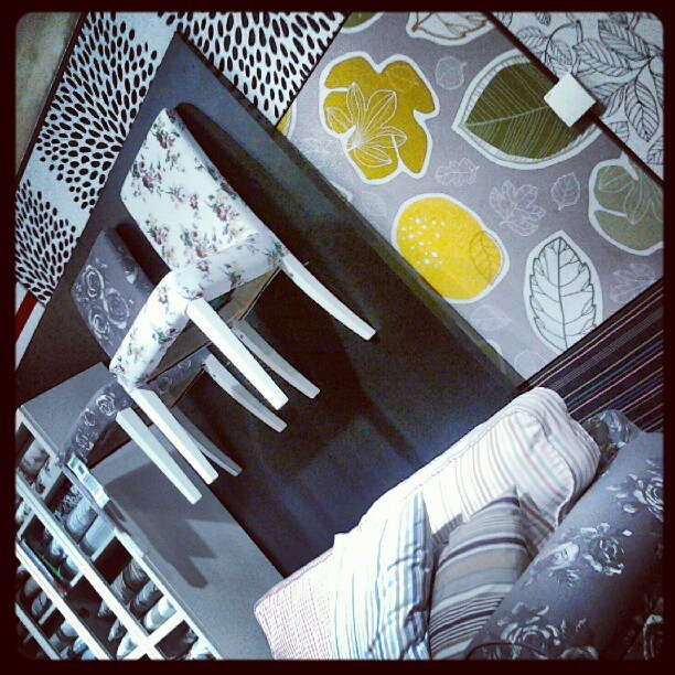
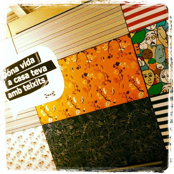
I can say that I have seen that trend for myself in Ikea Barcelona Autumn/Winter Textiles display yet. And yellow adds a vivid and hot accent that makes fabrics look wonderful!


And what about Pantone’s Color of the Year 2013?

Last year they published it in early December, so we won’t know for a while. But there are two colours that I have seen in their Fashion Reports and that have caught my attention. They are Emerald Green and Seafoam, or Grayed Jade, as they call it. If they are not the colour of the Year, I bet something they will be a hit. And they both combine well with blues, purples and yellow families.


While every Corporation publishes its Colour and Trends Forecasting, time will say which of them meet the costumer’s favor. But let me say that, from what I see when comparing Trends Forecasts, all of them are related and interconnected, with special accents to their market.

For me, an exciting Season of the Year has begun, that of Colour Future’s guessing!

Isabel de Yzaguirre,
La Colorista.

Saturday, July 28, 2012

Furniture and Product Trends 2013, Maison & Objet.

Product and furniture of the near future are presented in this video by  Trendease. Here you will find  2012-13 Trends as seen in Maison&Objet early this year.Translation to English provided. Enjoy!