As I announced in my previous post, I'm going to analize my Trends Boards and see what products seen in 2015's Fairs support Pantone's election for their Colours of the Year, Rose Quartz and Serenity. I will proceed by Fairs and link to the owners of every image when possible. Salone del Mobile 2015:
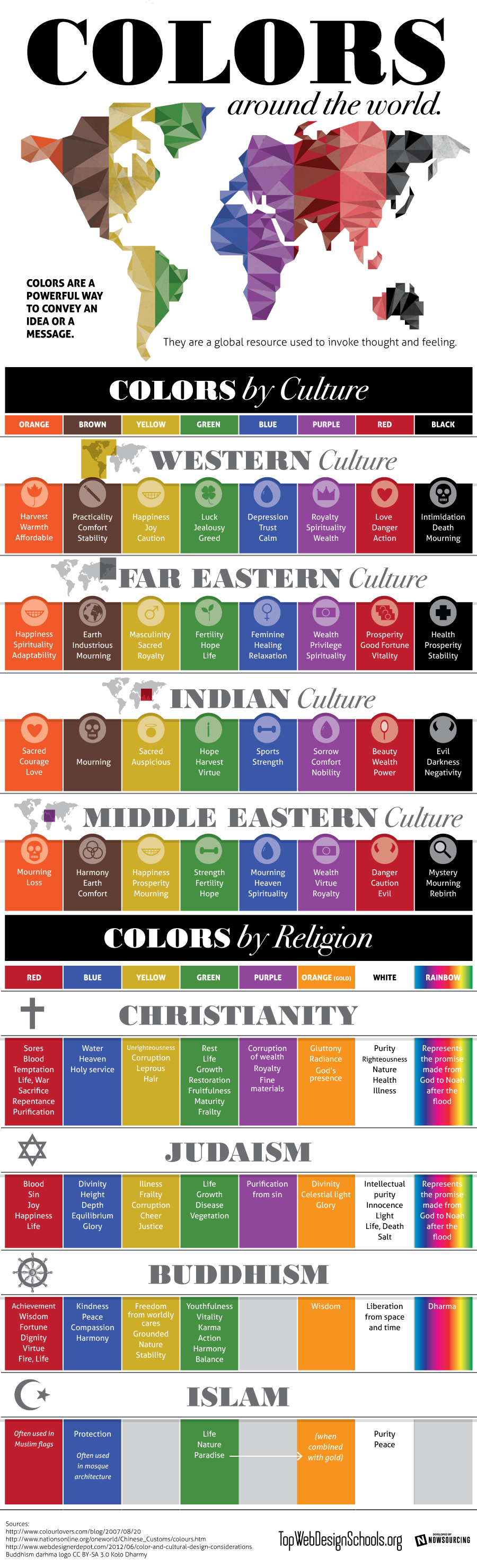
Shared today in Google+ by Lori Sawaya, from The Land of Color, I picked this interesting infographic which showcases prefectly how colours have different meanings according to different cultures. This should be carefully taken in account for designers and corporations when creating new products, specially when dealing with clients that come from a culture other than ours. The image comes from Top Web Design Schools. Enjoy!
Thanks to the many sites I vist in the net while looking for Color and Design news, I found this beautiful video. Not Tango music, but wonderful as well as the chorepgraphy. Dance with color and Enjoy!
It's a little bit early, but it's never too early to prepare your Christmas decoration, and I found a collection of wonderful ideas in Houzz this week. They have thought even of countries celebrating Christmas in summertime!
This week a friend wrote to me to ask me some color advice. She had bought two blouses, one in pale dusty pink and another in a more bright one. She was said by the shop assistant she could combine it with dark blue and she was told about color blocking being trendy. And here came her adressing to me. My friend is a little bit younger than me and I offered to make her a wide colour palette so she could see that there are really many other options apart form color blocking. It is not that I don't like this trend, but I think this is not for all styles. I took my friend's photo and with the help of Photoshop and my Color Wheel, this is what I sent her:
La Colorista
I tried two differendt grounds, one in light warm gray and another in a deeper gray, so she could see how color changes according to the one being next. From left to right I displayed :
1- Complements and split complements, making a happy and casual combination.
2- Neutrals, for a more classic look.
3- Analogues for soft harmonies.
4- Triadic hues.
It would be easy to pick two different bold and bright hues from these to build a color blocking look if you want to. And this is how because a friend trusted my opinion, I found myself being a Color for Image Stylist for one day. I looked at the matter in the same way I would have done to pick colors for Interior or Architectural design and my goal was to offer a wide range of possible Color Combos to my friend. This color Consult was really a very exciting one for me to do and I admit I loved it. So now I have one more field for fun in the Color world.
To end this post, I looked for something to illustrate the Color Blocking Trend and among what I found was this refreshing home video prepared by two young girls, that have a blog called Clothes Encounters. They explain very well what the trend consists of, act as models and explain in a few well chosen words why they love it. Have a look at it and enjoy!
With this one, I begin a sequence of posts on the colours fromBarcelona.At the same time that I try to capture hues, I will explain a few things, in few words, on the chosen places.
Today I'm leading you to the Modernist or Art-Decó colour palette shown in one of the Houses that were constructed in Parc Güell. Built from 1900 to 1914, the "Parc Güell" was the main work, and the most complete, from Antoni Gaudí, who was comissioned to construct a Park-City according to the model of the ones raised in England in the second half of the XIX th. century. Gaudí, who conceived his work as a closed and fenced residential area provided with all the necessary services, was helped by the also catalan architects Josep Mª Jujol and Joan Rubió i Bellver.
In this photo, correspondig to the so called "Rose House" where Gaudí lived for 20 years, you can observe one of the decorating techniques practiced in this period, called sgraffitto, -in the window borders and also in the façade. It was made scratching through a surface to reveal a lower layer of a contrasted colour. Here we have rich muted tones of rose and red together with sandy beige, which contrast with black in the forged-iron fence and a dark shade of green in the window's wooden blinds. If the day had been a sunny one, this bunch of colours would be enhanced by the bright blue of our Mediterranean sky. I'm sure you would love to visit this wonderful place.
More to come...
P.D. - In catalan we call "Modernisme" the period you know as Art-Déco and Art Noveau in English (I have come to observe that you call Modernism to what we know as Rationalism... Just to avoid misinterpreting!)
A few time ago I was asked for my friend designer Joan Moret to create a Color Palette for a Seasonal Tableware in Murano Compatible Glass. I made some investigation and through Ceramist Matoko Araki knew of the japanese tradition to change the Tableware according to the Season of the year. In Japan people have special names for the hues of leaves in the Fall Season and I searched for some inspirational images from there.And these are the colors I selected from the pictures. I imagined how they would look in the precious materials that were supposed to be employed to make an Autumn Tableware and I just loved them!
I made an attempt to draw and paint some plates and dishes, with the help of Photshop and this palette, though not being an expert, and they looked like this:
It was a funny exercise to test some possible combinations to do. As you see, I'm not a real Tableware designer, but I enjoyed triying. I even did a Winter Tableware Palette, but I will show when the White Season begins.
As everybody interested in design knows, Turquoise Blue was declared to be 2010 Colour by Pantone early in January. Surfing LinkedIn I got acquainted with Jack Bredenfoerder , Design Director at Landor Associates, and could read three really interesting blog posts on Colour by him. There he talks about colour trends for this Summer and explains the meaning of Blue Hues. To luminous tropical Turquoise reminding of a possible escape to Paradise, Jack adds International Klein Blue, which according to him "relates to people’s search for a global, let’s-work-together unifying color" and "represents not only the environmental challenges we must solve together but also the social and political ones".He suggests also White, "which reflects a desire to simplify and clear the palette in an uncertain economy",Warm golden yellows, "which are linked to a desire for the stability of a new gold standard", and tropical colours as sunset purples and hot hibiscus reds.
After reading his proposal, and having learnt that Colour Trends are set about three years in advance, I've made my own reflection on which ones I love for Summer, not only because of trends but looking at our Mediterranean colour traditions. There we have white in seashore houses' walls, and blue, green and even red for wooden doors and windows treatment since immemorial times... And of course browns for furnishings or floors. We only need some touch of colour here and maybe an accent wall there to enlighten a cool and relaxing ambient. Seeing this beautiful photo from Hornbeck Design Partners, a California based Interior Design Studio, I realized that in natural entourage we can find all these colours in perfect harmony.That ensures the durability of my proposal, which I have made extracting the colours in the palette from those in the picture.
My choice is much of white, with some notes of blue maybe combining a range of them in some walls. Add natural browns in floor treatments and furniture, and then some colour accents that will make the ambient warm. Do it in cushions, windows treatment, art and whatever you enjoy, from bright yellow to orange or leaves' green and ending in purples.This will make a relaxing but warm place to enjoy your summer season.
Turquoise, green and creamy hues indoors.
Colour accent with bunchs of flowers.
Since a year ago I've been learning about Social Media, positioning in Google and so. I've positioned myself in LinkedIn, in Twitter and I'm more and more present in Facebook. Being in that places has lead me to meet wonderful people and designers and to make some discoveries like the one I'm presenting today.
Interior Designers and Decorators have to handle with COLOUR daily, something I personally love. In Spain it is not usual for people to ask professional advice on this issue. COLOURS have different meanings according to DIVERSE CULTURES in our world, as you see in the pic above.This is something to be very careful about when attending a consultancy from a client belonging to a Culture other than the Designer's one. I thank so much MODENUS, who published the pic in Twitter: this will be very useful for myself. And anybody who needs it, please use it!
Reading blogs in the net I've realized that colour marketing is something carefully planned. I'll be soon publishing my 2010 SUMMER PALETTE, according to tendencies but adapted to my taste and to Mediterranean countries. And long lasting.
I'm very pleased to launch my own blog devoted to design this april 23 rd. 2010, Saint George's Day. This is a lovely day for me, even more since my son bears this name. I begin with an image gently sent by one of my correspondents, Avi Tomàs, a very special person.
This is no day for big words on presenting myself. I'll only tell you this blog will talk about design, interiors, colour and decoration. Saint George's rose reminds us about the beauty of flowers. Flowers can make a day so special, a corner so gorgeous or our workplace so gentle! They fill our life with their beauty. So spread flowers in your and others' lives and enjoy!