Showing posts with label palette. Show all posts

Tuesday, October 11, 2011

Charlotte's Locks Red by Farrow&Balls, their colour 2012?


I love this colour from Farrow&Ball!!!I received it in their Newsletter today and I can't stop watching it!
It reminds me of Juicy Ripe Berry Red, the Colour of the Year proposed by AzkoNobel  for 2012.

Farrow&Ball are highlighting this colour in their UK website and it's beautiful and suggestive name is Charlotte's Locks.The upper half of the image corresponds to this colour in Estate Emulsion and the lower part is the same colour in Full Gloss. This way, a striking, textured look is created and the high sheen gloss finish constrasts wonderfully with the chalky matt appearance of Estate Emulsion for an ultra contemporary feel


According to F&B, "Full Gloss offers an extremely robust and durable finish wherever it is used, inside or outside the home. Ideal for all interior and exterior woodwork and metal and available in 132 colours, its 95% sheen gives a striking finish." It suits front doors, furniture in a need of up-dating, walls and radiators.


I'm seeing lots of red announced everywhere.  For instance, CMG has chosen a red they have called Phidias as the 2012 color for Europe.It has something to do with Juicy Ripe Berry Red...


Or not?

I  had never thought of red in the way I do now. And you? Would you have red in your home?
If you  need any advice, just contact me. I'm here to help you!

Friday, August 5, 2011

Mediterranean coastal architectural colour plaettes 1

This week I went to visit  Vilassar de Mar, a catalan coastal village. I've always been in love with our seashore resorts, I'm fond of their old summer villas and their colours. About a year ago I did something I was wishing to since long time ago. And I did it with the guidance of who has become my paint teacher, Mrs. Marina Berdalet. I dived into the Color World.


I also learned how to create Color Moods for Interior Design with Kate Smith. And thanks to my contacting many Color Consultants worldwide, I  came to discover how Architectural Color for Exteriors is so well worked out in other countries.

Back to my trip to Vilassar, I was fascinated by a collection of old beautifully painted villas raised in the late years of XIX th. century.  Lucky that I had my Android, for I hadn't thought of taking my cam! I shot plenty of photos, pretty enough to begin writing a series of posts on Architectural Color in Catalan coastal villages . Colours here are warm and luminous as our Mediterranean sea...

I will begin with this building, known as  Ca l'Amat, designed by an unknown architect.


Isabel de Yzaguirre, 2011.

As you can see in the archs and can be checked in Wikipedia, this is a XIX th. century building, a historicist one, that mimics arab style. Sgraffitto and ceramic tiles are their more outstanding decorative characteristics.


Isabel de Yzaguirre, 2011

We can see them around doors and windows. Their richness and chromaticity bring the memory of the broad heritage arabs left in Spain many centuries ago.


Isabel de Yzaguirre, 2011.

This is the rich colour palette that was used in this villa's façade: 

Colour palette by La Colorista

This palette has some luminous colours and some muted ones. They are typical in the Catalan Seashore villages and  were most used in the end of  the XIX th. and beginning of the XX th. centuries. They were usual in the period that we know as Modernisme Català, .

I will go on extracting colour palettes and will do a post about some fascinating doors and windows I saw, even if they are not straightly related with colour. Here is one of them, aside of which I left a testimonial of my visit to Vilassar.


IdY, La Colorista.

If you need an improvement or redo in you Architectural Colours, feel free to contact me. I will be happy to help you!

Thursday, July 28, 2011

To create a colour palette out from a beloved object


One way to begin a Colour Consult is to choose an art object we love and create a colour palette to enhance it. This object becomes inspirational because we love its colours, its texture, maybe the memory it awakens or the desired atmosphere we would  like to create around us. At the same time, we could attempt to design the proper scenario to show our treasure at its best. And we would need to choose the right colours for furniture, walls, floor and so on.

This is what I did with this Art-Déco candy box I bought some years ago. And I extracted this collection of beautiful muted rich hues:


I  added some colours of the surrounding furniture to those of the candy box . The palette plays with some complements from the yellow and violet family. There are some analogous as terracotta orange, and silvery and golden hues and  olive green make a great family. Maybe  I will have and accent wall painted in dark red violet and then I will pick the rest of hues...

Friday, June 10, 2011

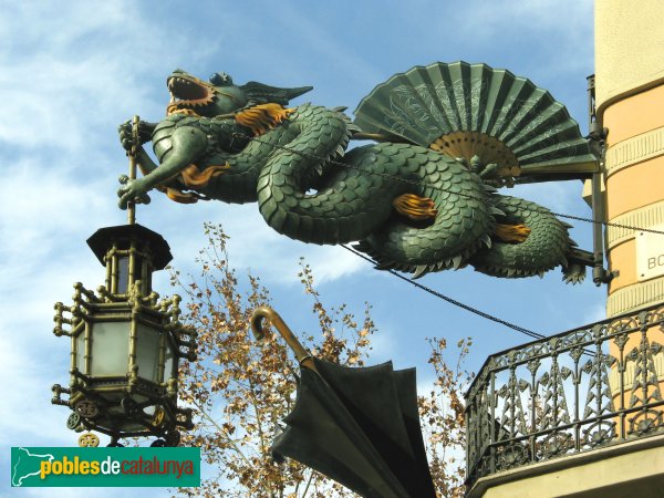
Barcelona's Art Déco Color Palette 2 - The Umbrella's House


The Bruno Cuadras House is situated in Barcelona, in the well known Ramblas. It was built in 1858 and rebuilt between 1883 -1895 by architect Josep Vilaseca i Casanovas, whose  work is a textbook case of the evolution of late neo-Classicism into Modernisme, which took place in Catalan Architecture towards the end of the 19th century.

This house was known by common people as the Umbrella's House, because of it's decoration, and it's façade is classified as being Eclectic. It had clear Egyptian influences coming from the interest that had awakened towards Oriental Culture and Countries these days in the neighbour France after Napoleon's Expedition to Egypt.  This interest was reinforced by the links existing between the city of Barcelona and Mr. Ferdinand de Lesseps, the constructor of the Suez Channel.

As Mr. Vilaseca experienced Modernism in his last days, I take the risk to classify the color palette I extracted from the photo (shot by myself), under the label of Modernist or Art Déco. What I know about Color in Catalan Modernist buildings makes me confident that I'm in good direction. I hope you enjoy it as much as I do.

One more curiosity for you: there used to be an elegant boutique in the ground level of the building in old days. Don't you guess what it was devoted to? To fashionable umbrellas, of course!  And to hand fans, so used these days by ladies to fight against heat . If you ever happen to visit Barcelona, don't miss the dragon's  sculpture hanging in the corner of the Umbrella's House. You will love it!


Sunday, April 24, 2011

Barcelona's Art Déco Palette 1


With this one, I begin a sequence of posts on the colours from Barcelona.At the same time that  I try to capture hues, I will explain a few things, in few words, on the chosen places. 

Today I'm leading you to the Modernist or Art-Decó colour palette shown in one of the Houses that were constructed in Parc Güell. Built from 1900 to 1914, the "Parc Güell" was the main work, and the most complete, from Antoni Gaudí, who was comissioned to construct a Park-City according to the model of the ones raised in England in the second half of the XIX th. century. Gaudí, who conceived his work as a closed and fenced residential area provided with all the necessary services, was helped by the also catalan architects Josep Mª Jujol and Joan Rubió i Bellver.

In this photo, correspondig to the so called "Rose House" where Gaudí lived for 20 years, you can observe one of the decorating techniques practiced in this period, called sgraffitto, -in the window borders and also in the façade. It was made scratching through a surface to reveal a lower layer of a contrasted colour. Here we have rich muted tones of rose and red together with sandy beige, which contrast with black in the forged-iron fence and a dark shade of green in the window's wooden blinds. If the day had been a sunny one, this bunch of colours would be enhanced by the bright blue of our Mediterranean sky. I'm sure you would love to visit this wonderful place.

More to come...

P.D. - In catalan we call "Modernisme" the period you know as Art-Déco and Art Noveau in English (I have come to observe that you call Modernism to what we know as Rationalism... Just to avoid misinterpreting!)

Monday, April 18, 2011

Mural project for a School's Yard

Busy as I was with my Colour for Your Home Consultant Certification at Sensationalcolor, I had given up writing in my blogs for an essential lack of time. Now that I have finished my Winter Class, here I am with a very special project I did in 2010-11. This is  a Mural Project to decorate a concret wall in a yard at the school  where I work, in Moià (Barcelona, SPAIN). I began it in summertime and delivered my work in January. I tried to capture the colours that we can find in nature in different yearly Seasons. Then I translated them into an imagined landscape that shows the Seasons in the same order in which we enjoy them at School, from September to June. From the left of the image to its right we go from Autumn to Summer. And from the bottom to the top of the wall are represented the colours from earth to sky, also according to the Seasons. Here is the final sketch:


This is the wall to be painted:


I picked colours from photos that I had shot in all the annual Seasons and I produced this first messy colour palette ( I have a bit more of phtoshop knowledge right now, but this is a little bit naïve and I love it, between us...) :


After that I translated colours to printable ones  in Pantone Solid Coated, and I arranged seasonal groups and a colour palette for every Season. I have used many colours -not all of them- in the final project. Here you are my Seasonal Colour Palettes:


Winter colour palette, La Colorista


Spring colour palette, La Colorista .

Summer colour palette, La Colorista


Autumn colour palette, La Colorista

As unluckily we are suffering a tough economical recession, our annual  School's budget has currently been reduced about a twenty per cent and we don't know when the mural will be painted. But pupils, parents and my peer teachers seem to love the project and want it done as it is. So I'm feeling happy!!! What else could I ask for?

My next goal is specialising in colour for Architectural Exteriors. Will it be possible for me to fly to USA in 2012? I'd love to!

Saturday, January 8, 2011

Colors of the Year 2011: which one you choose?

Citrus Yellow is one of the trendy colors this year 2011:


Chosen by multinational AzkoNobel, owner of prestigious paint  brands in many countries, as their Color 2011, it contrasts strongly with Pantone's proposed hue, Honeysuckle Pink. In one hand I must state I wouldn't dare to paint an accent wall with such a strong bold color.In the other, I think this pink can work very well in fashion:


I think also it can lighten  and enhance an Interior as a punch of color in some complements and make it look springlike:


Citrus yellow seems to work best for more extensive use in Interiors in its different hues, from buttery  to sherbet yellow, from canary yellow to the most bright and saturated hues of it.


Let's look at this kitchen as an instance. Published in Apartment Therapy Trends 2001 Report it shows yellow in an up-to-date design. Enlightened by white cabinetry and in a bold contrast with the rich brown of the wooden floor, it sems to dialogue by analogy with the peach orange color in the next room. Some punchs of green here and there balance the whole composition.


 In Fashion we can find all kind of clothings and complements in this warm and yet refreshing color:


Font
 With what I love best from all these I have made my own Trendy Palette 2011. Enjoy!

If you are in Catalonia and would love to update your Home's Color and Décoration, I'm here to help you.
Just contact me and let's talk!

Tuesday, November 23, 2010

Autumn Tableware Palette

Autumn Tableware Palette

A few time ago I was asked for my friend designer Joan Moret to create a Color Palette for a Seasonal Tableware in Murano Compatible Glass. I made some investigation and through Ceramist Matoko Araki knew of the japanese tradition to change the Tableware according to the Season of the year. In Japan people have special names for the hues of leaves in the Fall Season and I searched for some inspirational images from there.And these are the colors I selected from the pictures. I imagined how they would look in the precious materials that were supposed to be employed to make an Autumn Tableware and I just loved them!

I made an attempt to draw and paint some plates and dishes, with the help of Photshop and this palette, though not being an expert, and they looked like this:


It was a funny exercise to test some possible combinations to do. As you see, I'm not a real Tableware designer, but I enjoyed triying. I even did a Winter Tableware Palette, but I will show when the White Season begins.