Showing posts with label Colour of the Year. Show all posts

Tuesday, November 1, 2016

Shadow, Benjamin Moore's Color of the Year 2017

Dear friends of mine:

this year has been one of thinking about my life and I haven't been here at all, which I regret. The absence has been good for me to clarify some aspects in my life, and today here I am again. 


"SHADOW", Benjamin Moore's Color of the Year 2017, is to blame for my return. It grabbed my attention today, though it was announced nearly two weeks ago. And I just can say I LOVE this rich, dark, saturated, grayed blue violet.


Friday, December 4, 2015

Evidences In Home Design and Products announcing Pantone's Colours of the Year 2016, Rose Quartz and Serenity, as seen in 2015's Fairs.

As I announced in my previous post, I'm going to analize my Trends Boards and see what products seen in 2015's Fairs support Pantone's election for their Colours of the Year, Rose Quartz and Serenity. I will proceed by Fairs and link to the owners of every image when possible.

Salone del Mobile 2015:


Image by @graziacasa_it in Wbsta.mee


Image by @cryskel in Websta.me

Thursday, December 6, 2012

Emerald, 17-5641, Pantone's color of the Year 2013!!!

And in the end, the new baby is born!!!

We welcome PANTONE 17-5641 Emerald as the New color of the Year 2013. Remember what I said in a previous post, in October the 14 th.? Go to the end of it.I made my bet for Emerald or Grayed Jade. And I nailed it!!!


Before relating  to the official release, my own thoughts:

this election makes a lot of sense to me. This color is very close to that in the Tangerine and Orange tree leaves, and it marries well with previous Tangerine Tango, being it's complement. We go from the Red-Orange Family to the Blue-Green one. So, ladies having bought some Tangerine Tango clothings, don't worry at all! You can complement them with a beautiful Emerald item...


What does the Pantone's team say about this colour? An image is worth a thousand words:


Associated to the gemstone that bears this name, it's a sophisticated and luxurious color. Since antiquity, it has been the color of beauty of new life in many cultures and religions.


As the executive director of the Pantone Color Institute® Leatrice Eiseman says:

“Green is the most abundant hue in nature – the human eye sees more green than any other color in the spectrum.” 

"Symbolically, Emerald brings a sense of clarity, renewal and rejuvenation, which is so important in today’s complex world. This powerful and universally appealing tone translates easily to both fashion and home interiors.”

Since this is my main interest, how can we introduce this hue in Home Interiors?

Add some accents, accessories and paint in Emerald and you will rejuvenate your Home. This jewel-like hue will add a luxurious sense to any room in your home, and it will shine as an accent wall in your living-room.


Source: Thom Filicia, Via Houzz, Via Isabel in Pinterest


Source: Rikki Snyder © 2012 Houzz,  Via Isabel in Pinterest

Font

Bedding, pillows, bath towels and accessories in Emerald will  help you in creating a relaxed, soothing and energizing atpmosphere at the same time.


Via Isabel in Pinterest, from Houzz

"Lively. Radiant. Lush… A color of elegance and beauty                      
                        that enhances our sense of well-being, balance and harmony."


Welcome be this jewelled, luxurious and healthy hue!
Long Life to Emerald Green!!!

Isabel de Yzaguirre,
La Colorista.

Monday, November 19, 2012

A year with Tangerine Tango...

The current year is coming to its end and in a few days Pantone will announce their Colour of the Year 2013.Tangerine Tango  was a surprising choice that enlivened our life in 2012. The Orange family is usually  looked at with much controversy: you love it or you hate it, it's something experts know. Personally I love it for it's optimism and energy, not so strong as red, but still very warm.

Yesterday I was looking at the best Tangerine Tango photos published in Pantone's blog and I collected my favorites in  the Interior Design field. And I'm bringing this anthology to you as my humble homage to this happy hue before it's kingdom comes to an end and we forget about it.


How did Tangerine Tango help us?


Infusing life in a sophisticated neutral room...


In beautiful textiles married with white, yellow-green and green hues.


Combined with bright hues in Folk textiles and ambients.


Being the accent to its complementary.


Creating a sensuous atmosphere in a room.


In a contemporay home.


From the 60's? In Antiques.


In this neutral contemporary home, tangerine makes the sofa's corner a cozy one.


In intimate and warm lighting.


Even in the patio!


In furniture.


More textiles, photo by Leslie Williams.

My wishes are that this year with Tangerine Tango may have made us more daring with colour.That may we have good memories of this passionate hue. And that may you have enjoyed this selection I made for you 

Isabel de Yzaguirre, 
La Colorista.

Sunday, October 14, 2012

Which will be next Colour of the Year 2013?


The time has come when we begin to wonder about this question. And I have come back to think about that after reading Azkonobel’s Color Future’s 2013 and after finding an interesting post by Laura Bielecki reporting the predictions made by the prestigious trend forecaster Lidewij Edelkoort in a meeting in Design Days Dubai 2012.


While we don’t know about Pantone’s choice yet, AzkoNobel and its division Dulux have chosen Indigo as their colour of the Year 2013.


What qualities explain this election?

As they say, Indigo is associated with wisdom and honesty, and gives a sense of tranquility which is very restful. It’s a benevolent colour that has the trustworthy nature and elegance of blue at the same time.


 Font

Indigo is a rich and deep colour that, being scarcely accessible in our natural world, instills a sense of wonder and magic in us.


Within a colour palette, indigo is versatile and pairs well with brights of a similar saturation level, citrus, warmer neutrals and other blues, purples and greens.


Curiously, in her seminar in Dubai, Lidewij Edelkoort presented yellow as being the new pink in Interior Design, and that makes sense with its being the complement to the purple family. According to her predictions, yellow will make for vibrant and stimulating colour palettes, fabrics and fittings. And it will come with more staying power than Tangerine Tango, it seems.


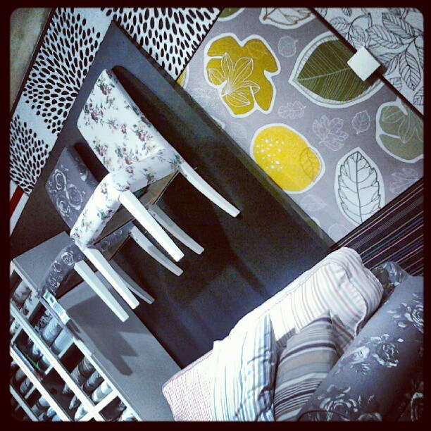
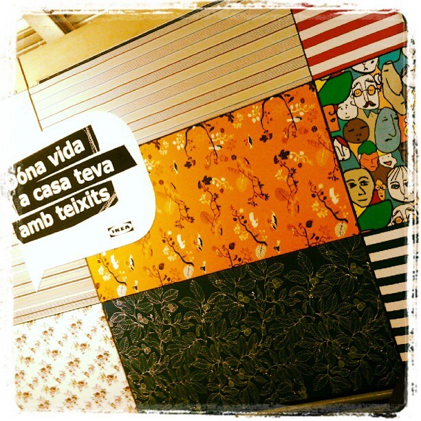
I can say that I have seen that trend for myself in Ikea Barcelona Autumn/Winter Textiles display yet. And yellow adds a vivid and hot accent that makes fabrics look wonderful!


And what about Pantone’s Color of the Year 2013?

Last year they published it in early December, so we won’t know for a while. But there are two colours that I have seen in their Fashion Reports and that have caught my attention. They are Emerald Green and Seafoam, or Grayed Jade, as they call it. If they are not the colour of the Year, I bet something they will be a hit. And they both combine well with blues, purples and yellow families.


While every Corporation publishes its Colour and Trends Forecasting, time will say which of them meet the costumer’s favor. But let me say that, from what I see when comparing Trends Forecasts, all of them are related and interconnected, with special accents to their market.

For me, an exciting Season of the Year has begun, that of Colour Future’s guessing!

Isabel de Yzaguirre,
La Colorista.

Monday, February 20, 2012

AzkoNobel's 2012 Color Trends

Color Futures Via YouTube

In this video AzkoNobel's Color Futures features their four 2012 Color Trends, which are:

  • Delicate Mix: about elegant, refined, understated, subtle, luxurious.
  • One Small Seed: about new life, healthy, precious, fragile.
  • Living Scrapbook: about life, collecting, narrating, sharing...
  • Rediscovered Heroes: about legacy of the past, industrial, robust, revitalized, appreciated.
To develop further in future posts.

Wednesday, December 28, 2011

The year of La Colorista.

If I look backwards, this has been a busy year! 

I had decided to go back to Art Classes in 2010, and there I explored color with Mrs. Marina Berdalet, and I went on in 2011. Those were Happy Days!

Liliums, by Isabel.

I begun doing digital Colour Paletes, just because I liked to. I thank Jaume Orriols for his Photoshop classes. Also  Joan Sunyer Moret, for teaching me some pro tricks and for his conceptual and technical help with my La Colorista logos and card. And Hornbeck Design Partners were so kind to let me use their Monterrey photograph for my now Insignia Palette:

Monterrey Palette.

I wanted to learn Color Consultancy in a more scientific way that I had been taught at the Art School. There are no such studies in Spain and I looked for Online Classes. The one that looked the best was by Sensational Color. I wasn't disappointed at all. I earned my Color for Your Home Consultant Certification with Color Expert Kate Smith. She was and excellent teacher and now is a friend!


In the last days of 2010 I had bought the domain lacolorista.es and very shyly opened a Facebook bizz Page. Now it has 218 followers! To all of you, many, many thanks!!!

I have  gone on publishing my blog in three languages, and this means writing three blogs in one. My English one is the more read and has lead me a lot of traffic -don't forget, I'm a small fish... I have gone from about 3000 visits in the beginning of 2011 to nearly 9000 today. I could never have imagined that. So, to all that have come here to read my posts, or maybe just to have a look at them, many thanks for spending part of your time here!!!

I have tried to do things in my way and have explored trends as well. And my 2011 more read posts have been:

466 visualizations

426 visualizations.


358 visualizations.


And the Winning Award goes to:

586 visualizations until this moment.


Maybe this will seem not much to some, but I had never dreamed of being read by so much people!


To end this yearly review, I designed my logo and card and am launching my service locally.I had Joan Moret's help as mentioned above. But I have a special thank you for Color Expert Teresa Tullio, who kindly offered some free ideas from which my current logo was bornt.

And I have made many wonderful Color Friends. So what else could I ask for? 

Just one thing: please, come back in 2012!!!
Happy New Year to all!!!