
¡SURPRISING –
WARM –
BEAUTIFUL!


A deep colour in an emerging spectrum of reds, pinks and oranges, it showcases a globally more optimistic trend.

According to the current protagonism
of metallic hues in design, this colour reflects and summarizes the
Trends identified for 2015 in this field. These are:
- A warmer attitude and a desire for sharing.
- Natural earthy colour palettes, from clay tones to sunlit yellow strokes.
-
 Copper Orange combines well with:
- PINKS – NEUTRALS – WHITES and ORANGES.
- Also with other metallic hues as GOLD.
 There is a return to using ORANGE as a MAIN COLOUR rather than a mere accent.
 AkzoNobel's motto is:
EVERYDAY + FINDING THE WONDERFUL
The search of wonder in our daily life, this jewel that makes it magic, is a reaction to consumerism – which anchors in sustainability as the core point to make our world a more caring and sharing one.
As for Architecture, the main direction is “EVERY DAY+”. That means: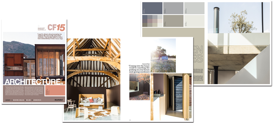 "La Reserva"
- Opening our eyes to the existing beauty around us.
- Looking to the world as a unique place, with a renovated glance at it.
- Colour of the Year 2015, COPPER ORANGE, enhances natural and handcrafted materials.


As an instance, ColorFutures mentions the “La Reserva” House, in La Colina, by Chilean architect Sebastián Irarrazával (upper image).Other applications in Architecture have been seen:
And different Trends Forecastings seem to confirm this direction, as in Haymes:


Eclectic Trends
If you want to se the video of COPPER ORANGE's presentation by AkzoNobel, you've got it HERE.
In coming posts we will deal with the
five 2015 Color Trends provided by ColorFutures,
who have provided all the images shown here, if other sources aren't mentioned.
Hi Isabel - I do loves these colors together, soft and easy, gentle colors. bedroom/diningroom/softspace...
ReplyDeletehow is your consulting business going? I've had a good run of clients this past summer, now, I will see what happens.
Hi, Lynne!
DeleteI love these hues as well, and I'm happy to hear you've had many clients this summer.
Here things are slow,but I'm writing a lot about color, which I love.
Thank you so much for stopping by!