Showing posts with label color palette. Show all posts

Monday, April 1, 2013

A project come true: The Four Seasons Mural for a School's yard.

Whoever has followed me since three years ago maybe remembers a  post on a Mural Project for Josep Orriols i Roca School's yard. The School is located in Moià (Barcelona, SPAIN).

I published the project for the first time when I had been working on it for about nine month, and I had serious doubts about its being  painted because of economical crisis in Spain. But luckily parents were very willing to see it done, and to let their sons and daughters have a more colourful School, no matter what it might cost. They organized events to collect money and provided all the colours that I had specified, whith the sponsoring of our local Paints Store. 


Today I can say the mural has come to life and am offering a view of the whole process until its completion.

The initial goal was to have some of the concrete walls of the yard decorated, and we chose the one in the sight: 


La Colorista, 2010.

My project aimed at representing the colours in the natural landscapes around our village all along the Four Seasons of the Year, in the same order that we experience them since the School Term begins: from Fall to Summer. Colours were picked from photographs shot in Moià's surroundings, and the proposed design was this one:


The Four Seasons' Mural, Isabel de Yzaguirre Maura
(La Colorista),2011.

Sunday, December 16, 2012

A thank you from the heart, and my best wishes...

...to my 20.000 readers in English!!!

By the end of 2011 I reached 10.000 visits. And I have come to 20.000 pretty before the New Year and this means the visits to my blog have increased. I do appreciate the nice comments that some of my pro friends have left. And I have a deep feeling of gratitude for all of you, for your warm welcome. So let me say a big thank you and wish you all the best with this image of Christmas Decoration Colours that I shot some days ago.

La Colorista in Tumblr.

Let the light, the deep blue, turquoise, white and gold soothe and warm your hearts at the same time.
And may your Christmas Season be full of love, peace, prosperity and all kind of blessings!
Merry Chirstmas and Happy 2013!

Isabel de Yzaguirre,
La Colorista,

Saturday, September 10, 2011

My colour Style...

If I could wear the things I have in my Style Board in Pinterest, today I would choose this beautiful coral-red cardigan to begin:


This would combine with an awsome long skirt in different blues with big flower patterns in white, blue and bold red:


And I would fly rather than walk with these red angel-winged platform shoes!


Red and blue in a perfect Complementary Scheme as you see... Mmm, I love it!!!
I will go on dreaming...

All pictures from Anthropologie.


Wednesday, August 24, 2011

How Colour Trends are set

Colour Trends are set a minimum of three years in advance to a certain year, as many of you know. Trend setters work for great Trending Companies, establish trends according to many indicators and then follow the market to see which ones are early adopted or not. All kind of industries consult Color Trends Forecasting Books and Companies, so their products adapt to the market. This is how we see colours adopted and loved by costumers: they are made to enjoy them by industry. As Colour Marketing Group's tagline says, "Color Sells"!


And as Frank H. Mahnke explains in his book "Color and Light in Man-made environments", psychological studies carried in a very serious way demonstrate we humans need colour in our lives. That's why we love it! And we also need variation to avoid boredom.


That is where Trends come to make sense, as well as seasonal colour changes at our homes. 

I follow as many fonts as I can in order to know about Colour Trends. I love reading Mix Magazine from Globalcolor, they provide really good information that focuses in different markets. There are many other fonts of course.Then this is up to the Color Detective to make his, her colour work and choose. I'm working on my Colour Focus for the next months in 2011 and yesterday I came through this jewel: AzkoNobel Colour Trends 2012. I will come back soon with very intersting news on that!

Friday, July 29, 2011

Color Styling for a Wardrobe and the Color Blocking Trend

This week a friend wrote to me to ask me some color advice. She had bought two blouses, one in pale dusty pink and another in a more bright one. She was said by the shop assistant she could combine it with dark blue and she was told about color blocking being trendy. And here came her adressing to me. My friend is a little bit younger than me and I offered to make her a wide colour palette so she could see that there are really many other options apart form color blocking. It is not that I don't like  this trend, but I think this is not for all styles. I took my friend's photo and with the help of Photoshop and my Color Wheel, this is what I sent her:


La Colorista

I tried two differendt grounds, one in light warm gray and another in a deeper gray, so she could see how color changes according to the one being next. From left to right  I displayed :

1- Complements and split complements, making a happy and casual combination.
2- Neutrals, for a more classic look.
3- Analogues for soft harmonies.
4- Triadic hues.

It would be easy to pick two different bold and bright hues from these to build a color blocking look if you want to. And this is how because a friend trusted my opinion, I found myself being a Color for Image Stylist for one day. I looked at the matter in the same way I would have done to pick colors for Interior or Architectural design and my goal was to offer a wide range of possible Color Combos to my friend. This color Consult was really a very exciting one for me to do and I admit I loved it. So now I have one more field for fun in the Color world


To end this post, I looked for something to illustrate the Color Blocking Trend and among what I found was this refreshing home video prepared by two young girls, that have a blog called Clothes Encounters. They explain very well what the trend consists of, act as models and explain in a few well chosen words why they love it. Have a look at it and enjoy!


Friday, June 10, 2011

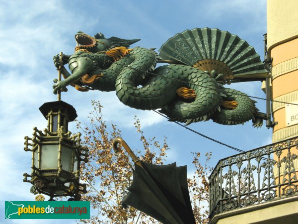
Barcelona's Art Déco Color Palette 2 - The Umbrella's House


The Bruno Cuadras House is situated in Barcelona, in the well known Ramblas. It was built in 1858 and rebuilt between 1883 -1895 by architect Josep Vilaseca i Casanovas, whose  work is a textbook case of the evolution of late neo-Classicism into Modernisme, which took place in Catalan Architecture towards the end of the 19th century.

This house was known by common people as the Umbrella's House, because of it's decoration, and it's façade is classified as being Eclectic. It had clear Egyptian influences coming from the interest that had awakened towards Oriental Culture and Countries these days in the neighbour France after Napoleon's Expedition to Egypt.  This interest was reinforced by the links existing between the city of Barcelona and Mr. Ferdinand de Lesseps, the constructor of the Suez Channel.

As Mr. Vilaseca experienced Modernism in his last days, I take the risk to classify the color palette I extracted from the photo (shot by myself), under the label of Modernist or Art Déco. What I know about Color in Catalan Modernist buildings makes me confident that I'm in good direction. I hope you enjoy it as much as I do.

One more curiosity for you: there used to be an elegant boutique in the ground level of the building in old days. Don't you guess what it was devoted to? To fashionable umbrellas, of course!  And to hand fans, so used these days by ladies to fight against heat . If you ever happen to visit Barcelona, don't miss the dragon's  sculpture hanging in the corner of the Umbrella's House. You will love it!