Showing posts with label project. Show all posts

Monday, April 1, 2013

A project come true: The Four Seasons Mural for a School's yard.

Whoever has followed me since three years ago maybe remembers a  post on a Mural Project for Josep Orriols i Roca School's yard. The School is located in Moià (Barcelona, SPAIN).

I published the project for the first time when I had been working on it for about nine month, and I had serious doubts about its being  painted because of economical crisis in Spain. But luckily parents were very willing to see it done, and to let their sons and daughters have a more colourful School, no matter what it might cost. They organized events to collect money and provided all the colours that I had specified, whith the sponsoring of our local Paints Store. 


Today I can say the mural has come to life and am offering a view of the whole process until its completion.

The initial goal was to have some of the concrete walls of the yard decorated, and we chose the one in the sight: 


La Colorista, 2010.

My project aimed at representing the colours in the natural landscapes around our village all along the Four Seasons of the Year, in the same order that we experience them since the School Term begins: from Fall to Summer. Colours were picked from photographs shot in Moià's surroundings, and the proposed design was this one:


The Four Seasons' Mural, Isabel de Yzaguirre Maura
(La Colorista),2011.

Thursday, August 9, 2012

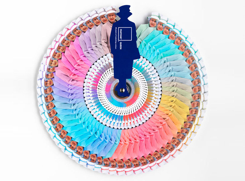
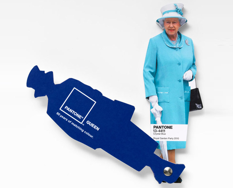
Interesting facts about Pantone Queen Colours Guide

I don't come to explain something new, since this has been in the press for a while. But I found this video so interesting that I thought I would share it with you. Here the different professionals involved in the creation and making of Pantone's Queen Guide explain how everything was done. I hope you enjoy it!


As you know, this was a commission to Leo Burnett London agency and the limited edition of this fan deck of course has been delivered by Pantone.


Designboom

On the other hand Vogue UK also followed the Queen colour choices for one year and made this beautiful chart. It turned out that she wore blue on 29% of her public appearances! Look at the different shades of blue, amazing! This can give you a slight idea on how important colour choices are...

Font

According to Apartment Therapy, Pantone hypothesized that Queen Elizabeth dresses monochromatically to make herself look taller. That makes sense, since cool colours tend to contract or recede visually. 

And remember Colour Psychology

As Kate Smith explains, blue -the colour of the oceans and the sky- is seen as trustworthy, dependable and committed. And this are the most desirable associations that a Queen would love to awaken to the citizens of her Kingdom! So, no wonder about this colour choice. This is the best proof about how COLOUR MATTERS.

So be wise, and if you need colour advice, come and ask for professional help. It will be my pleasure!

Thursday, July 28, 2011

To create a colour palette out from a beloved object


One way to begin a Colour Consult is to choose an art object we love and create a colour palette to enhance it. This object becomes inspirational because we love its colours, its texture, maybe the memory it awakens or the desired atmosphere we would  like to create around us. At the same time, we could attempt to design the proper scenario to show our treasure at its best. And we would need to choose the right colours for furniture, walls, floor and so on.

This is what I did with this Art-Déco candy box I bought some years ago. And I extracted this collection of beautiful muted rich hues:


I  added some colours of the surrounding furniture to those of the candy box . The palette plays with some complements from the yellow and violet family. There are some analogous as terracotta orange, and silvery and golden hues and  olive green make a great family. Maybe  I will have and accent wall painted in dark red violet and then I will pick the rest of hues...

Sunday, April 24, 2011

Barcelona's Art Déco Palette 1


With this one, I begin a sequence of posts on the colours from Barcelona.At the same time that  I try to capture hues, I will explain a few things, in few words, on the chosen places. 

Today I'm leading you to the Modernist or Art-Decó colour palette shown in one of the Houses that were constructed in Parc Güell. Built from 1900 to 1914, the "Parc Güell" was the main work, and the most complete, from Antoni Gaudí, who was comissioned to construct a Park-City according to the model of the ones raised in England in the second half of the XIX th. century. Gaudí, who conceived his work as a closed and fenced residential area provided with all the necessary services, was helped by the also catalan architects Josep Mª Jujol and Joan Rubió i Bellver.

In this photo, correspondig to the so called "Rose House" where Gaudí lived for 20 years, you can observe one of the decorating techniques practiced in this period, called sgraffitto, -in the window borders and also in the façade. It was made scratching through a surface to reveal a lower layer of a contrasted colour. Here we have rich muted tones of rose and red together with sandy beige, which contrast with black in the forged-iron fence and a dark shade of green in the window's wooden blinds. If the day had been a sunny one, this bunch of colours would be enhanced by the bright blue of our Mediterranean sky. I'm sure you would love to visit this wonderful place.

More to come...

P.D. - In catalan we call "Modernisme" the period you know as Art-Déco and Art Noveau in English (I have come to observe that you call Modernism to what we know as Rationalism... Just to avoid misinterpreting!)

Tuesday, November 23, 2010

Autumn Tableware Palette

Autumn Tableware Palette

A few time ago I was asked for my friend designer Joan Moret to create a Color Palette for a Seasonal Tableware in Murano Compatible Glass. I made some investigation and through Ceramist Matoko Araki knew of the japanese tradition to change the Tableware according to the Season of the year. In Japan people have special names for the hues of leaves in the Fall Season and I searched for some inspirational images from there.And these are the colors I selected from the pictures. I imagined how they would look in the precious materials that were supposed to be employed to make an Autumn Tableware and I just loved them!

I made an attempt to draw and paint some plates and dishes, with the help of Photshop and this palette, though not being an expert, and they looked like this:


It was a funny exercise to test some possible combinations to do. As you see, I'm not a real Tableware designer, but I enjoyed triying. I even did a Winter Tableware Palette, but I will show when the White Season begins.

Sunday, July 4, 2010

My Summer Palette 2010


Original image by courtesy from Hornbeck Design Partners

As everybody interested in design knows, Turquoise Blue was declared to be 2010 Colour by Pantone early in January. Surfing LinkedIn I  got acquainted with Jack Bredenfoerder , Design Director at Landor Associates, and could read three really interesting blog posts on Colour by him. There he talks about colour trends for this Summer and explains the meaning of Blue Hues. To luminous tropical Turquoise reminding of a possible escape to Paradise, Jack adds International Klein Blue, which according to him "relates to people’s search for a global, let’s-work-together unifying color" and "represents not only the environmental challenges we must solve together but also the social and political ones".He suggests also  White, "which reflects a desire to simplify and clear the palette in an uncertain economy",Warm golden yellows, "which are linked to a desire for the stability of a new gold standard", and tropical colours as sunset purples and hot hibiscus reds.

 Interior of Danish summer house by LASC Studio

After reading his proposal, and having learnt that Colour Trends are set about three years in advance, I've made my own reflection on which ones I love for Summer, not only because of trends but looking at our Mediterranean colour traditions. There we have white in seashore houses' walls, and blue, green and even red for wooden doors and windows treatment since immemorial times... And of course browns for furnishings or floors. We only need some touch of colour here and maybe an accent wall there to enlighten a cool and relaxing ambient. Seeing this beautiful photo from Hornbeck Design Partners, a California based Interior Design Studio, I realized that in natural entourage we can find all  these colours in perfect harmony.That ensures the durability of my proposal, which I have made extracting the colours in the palette from those in the picture.

My choice is much of white, with some notes of blue maybe combining a range of them in some walls. Add natural browns in  floor treatments and furniture, and then some colour accents that will make the ambient warm. Do it in cushions, windows treatment, art and whatever you enjoy, from bright yellow to orange or leaves' green and ending in purples.This will make a relaxing but warm place to enjoy your summer season.

Turquoise, green and creamy hues indoors.
Colour accent with bunchs of flowers.

Kitchen treatment, from jenjhoner blog and published in
House of Turquoise.

Outdoors come indoors in flowing harmony
Published in House of Turquoise.


Saturday, June 26, 2010

Bimbolles Series: Trissona footlamp


Trissona is a very special footlamp, a genuine design from Joan Sunyer "Moret". Those who are acquainted to him know that he has triplet nephews whom he adores. He was inspired  by them to design this lamp with three branches that are born of a common origin. And we named the lamp Trissona (Triplet) after  the triplet kids. It had to be  this way!


Trissona,  zenital view.

In the Exhibition at ES TALLER, Santanyí , when opening the Showroom and presenting the BimBolles Series, they were shown with lampshades customized by local artist "Mir a mà", very suitable for kids' ambients.

Lampshades customized by "Mir a mà"

Eventually here you are one of Trissona's constructive details. Joan Sunyer "Moret" , as the excellent designer and craftsman he is, takes extreme care of them.


Constructive detail of Trissona's foot, varnished iron tube on Santanyí's stone base.
Hope you enjoy!

Sunday, June 13, 2010

The meaning of colour in different Cultures


Since a year ago I've been learning about Social Media, positioning in Google and so. I've positioned myself in LinkedIn, in Twitter and I'm more and more present in Facebook. Being in that places has lead me to meet wonderful people and designers and to make some discoveries like the one I'm presenting today.
Interior Designers and Decorators have to handle with COLOUR daily, something I personally love. In Spain it is not usual for people to ask professional advice on this issue. COLOURS have different meanings according to DIVERSE CULTURES in our world, as you see in the pic above.This is something to be very careful about when attending a consultancy from a client belonging to a Culture other than the Designer's one.  I thank so much MODENUS, who published the pic in Twitter: this will be very useful for myself. And anybody who needs it, please use it!


Reading blogs in the net I've realized that colour marketing is something carefully planned. I'll be soon publishing my 2010 SUMMER PALETTE, according to tendencies but adapted to my taste and to Mediterranean countries. And long lasting.

Friday, April 23, 2010

Saint George's Day


I'm very pleased to launch my own blog devoted to design this april 23 rd. 2010, Saint George's Day. This is  a lovely day for me, even more since my son bears this name. I begin with an image gently sent by one of my correspondents, Avi Tomàs, a very special person.

This is no day for big words on presenting myself. I'll only tell you this blog will talk about design, interiors, colour and decoration. Saint George's rose reminds us about the beauty of flowers. Flowers can make a day so special, a corner so gorgeous or our workplace so gentle! They fill our life with their beauty. So spread flowers in your and others' lives and enjoy!