Showing posts with label decorator. Show all posts

Friday, June 10, 2011

Barcelona's Art Déco Color Palette 2 - The Umbrella's House


The Bruno Cuadras House is situated in Barcelona, in the well known Ramblas. It was built in 1858 and rebuilt between 1883 -1895 by architect Josep Vilaseca i Casanovas, whose  work is a textbook case of the evolution of late neo-Classicism into Modernisme, which took place in Catalan Architecture towards the end of the 19th century.

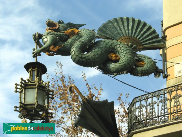
This house was known by common people as the Umbrella's House, because of it's decoration, and it's façade is classified as being Eclectic. It had clear Egyptian influences coming from the interest that had awakened towards Oriental Culture and Countries these days in the neighbour France after Napoleon's Expedition to Egypt.  This interest was reinforced by the links existing between the city of Barcelona and Mr. Ferdinand de Lesseps, the constructor of the Suez Channel.

As Mr. Vilaseca experienced Modernism in his last days, I take the risk to classify the color palette I extracted from the photo (shot by myself), under the label of Modernist or Art Déco. What I know about Color in Catalan Modernist buildings makes me confident that I'm in good direction. I hope you enjoy it as much as I do.

One more curiosity for you: there used to be an elegant boutique in the ground level of the building in old days. Don't you guess what it was devoted to? To fashionable umbrellas, of course!  And to hand fans, so used these days by ladies to fight against heat . If you ever happen to visit Barcelona, don't miss the dragon's  sculpture hanging in the corner of the Umbrella's House. You will love it!


Tuesday, November 23, 2010

Autumn Tableware Palette

Autumn Tableware Palette

A few time ago I was asked for my friend designer Joan Moret to create a Color Palette for a Seasonal Tableware in Murano Compatible Glass. I made some investigation and through Ceramist Matoko Araki knew of the japanese tradition to change the Tableware according to the Season of the year. In Japan people have special names for the hues of leaves in the Fall Season and I searched for some inspirational images from there.And these are the colors I selected from the pictures. I imagined how they would look in the precious materials that were supposed to be employed to make an Autumn Tableware and I just loved them!

I made an attempt to draw and paint some plates and dishes, with the help of Photshop and this palette, though not being an expert, and they looked like this:


It was a funny exercise to test some possible combinations to do. As you see, I'm not a real Tableware designer, but I enjoyed triying. I even did a Winter Tableware Palette, but I will show when the White Season begins.

Sunday, July 4, 2010

My Summer Palette 2010


Original image by courtesy from Hornbeck Design Partners

As everybody interested in design knows, Turquoise Blue was declared to be 2010 Colour by Pantone early in January. Surfing LinkedIn I  got acquainted with Jack Bredenfoerder , Design Director at Landor Associates, and could read three really interesting blog posts on Colour by him. There he talks about colour trends for this Summer and explains the meaning of Blue Hues. To luminous tropical Turquoise reminding of a possible escape to Paradise, Jack adds International Klein Blue, which according to him "relates to people’s search for a global, let’s-work-together unifying color" and "represents not only the environmental challenges we must solve together but also the social and political ones".He suggests also  White, "which reflects a desire to simplify and clear the palette in an uncertain economy",Warm golden yellows, "which are linked to a desire for the stability of a new gold standard", and tropical colours as sunset purples and hot hibiscus reds.

 Interior of Danish summer house by LASC Studio

After reading his proposal, and having learnt that Colour Trends are set about three years in advance, I've made my own reflection on which ones I love for Summer, not only because of trends but looking at our Mediterranean colour traditions. There we have white in seashore houses' walls, and blue, green and even red for wooden doors and windows treatment since immemorial times... And of course browns for furnishings or floors. We only need some touch of colour here and maybe an accent wall there to enlighten a cool and relaxing ambient. Seeing this beautiful photo from Hornbeck Design Partners, a California based Interior Design Studio, I realized that in natural entourage we can find all  these colours in perfect harmony.That ensures the durability of my proposal, which I have made extracting the colours in the palette from those in the picture.

My choice is much of white, with some notes of blue maybe combining a range of them in some walls. Add natural browns in  floor treatments and furniture, and then some colour accents that will make the ambient warm. Do it in cushions, windows treatment, art and whatever you enjoy, from bright yellow to orange or leaves' green and ending in purples.This will make a relaxing but warm place to enjoy your summer season.

Turquoise, green and creamy hues indoors.
Colour accent with bunchs of flowers.

Kitchen treatment, from jenjhoner blog and published in
House of Turquoise.

Outdoors come indoors in flowing harmony
Published in House of Turquoise.


Sunday, June 13, 2010

The meaning of colour in different Cultures


Since a year ago I've been learning about Social Media, positioning in Google and so. I've positioned myself in LinkedIn, in Twitter and I'm more and more present in Facebook. Being in that places has lead me to meet wonderful people and designers and to make some discoveries like the one I'm presenting today.
Interior Designers and Decorators have to handle with COLOUR daily, something I personally love. In Spain it is not usual for people to ask professional advice on this issue. COLOURS have different meanings according to DIVERSE CULTURES in our world, as you see in the pic above.This is something to be very careful about when attending a consultancy from a client belonging to a Culture other than the Designer's one.  I thank so much MODENUS, who published the pic in Twitter: this will be very useful for myself. And anybody who needs it, please use it!


Reading blogs in the net I've realized that colour marketing is something carefully planned. I'll be soon publishing my 2010 SUMMER PALETTE, according to tendencies but adapted to my taste and to Mediterranean countries. And long lasting.

Sunday, May 2, 2010

BimBolles: the beginning.


BimBolles lighitngs: first sketches.

Once upon a time  Joan  and Mariantònia had some rice paper lanterns and wished to do something new with them. They wished to design new linghtings by adding some value to this beautiful white spheres. Joan told me about that and I began sketching. That's how the BimBolles were born. Joan was pleased with my drawings and encouraged me to explore many possibilities -table lighting, cieling and wall lighting... He chose the ones that pleased him and developed them, or created new ones. He did the hard part: he worked on the prototypes and solved problems on them.


Bimbolles: a tree lighitng.

 On march 27th. 2010  ES TALLER JOAN MORET was launched at Santanyí (Mallorca, SPAIN) and our Bimbolles were presented to our friends and guests.They wore lanterns customized by four young local artists:  Catalina Obrador, Catalina Vidal Oliver -known as Mir a mà-, Gabriela Meunié and Guillem Vicens, all of them from Santanyí. We had also our dear Marina Ramos, from JiM.

The BimBolles series consists of different lights, all of them handicrafted at ES TALLER, where you can buy them on request. The first I'll show you is the smallest one, Ble.


Bimbolles lighting: Ble

With Santanyí stone foot and varnished tubular iron, Joan Sunyer "Moret"  designed the mechanism that lets the light to hold the lantern, as this was designed in origin to hang.
Ble, BimBolles lighting family.

Ble can be done in different heigths. So you can have two or three of them and play with  their sizes to decorate a room. Maybe one for your coffee table, another in that special corner you love...and you'll easily create a symphony that will lighten your home and make it worm.

Blens have a walk...

Ble are so joyfull and gentle and all together make such a happy familiy that I can only say: if you wish some light in your life have a Ble

BimBolles: making off


Així es va muntar l'Expo de les Bimbolles a ES TALLER JOAN MORET

Friday, April 23, 2010

Saint George's Day


I'm very pleased to launch my own blog devoted to design this april 23 rd. 2010, Saint George's Day. This is  a lovely day for me, even more since my son bears this name. I begin with an image gently sent by one of my correspondents, Avi Tomàs, a very special person.

This is no day for big words on presenting myself. I'll only tell you this blog will talk about design, interiors, colour and decoration. Saint George's rose reminds us about the beauty of flowers. Flowers can make a day so special, a corner so gorgeous or our workplace so gentle! They fill our life with their beauty. So spread flowers in your and others' lives and enjoy!